Mobile app for renting storage units and warehouse storage
Context
An IOS app for managing automated storage units next to apartment blocks, with courier drop-off to the warehouse.
The brief
The success and scale of the whole business depend on attracting partners: buying enough premises outright is unrealistic. The company collects subscriptions into its own account and pays partners monthly, less the management and acquiring commission. So the product exists to serve that commission model and let the partner network scale.
Result
In 2 months a team of four handed the MVP to development — the customer app and the partner dashboard. My tracks were the partner side and warehouse drop-off, which moved to the second iteration.
Technical constraints
- an access control system with an open API to integrate with;
- the entrance door and unit locks open over BLE (Bluetooth) — crucially, without an internet connection;
- Face ID for sign-in;
- Payments: saved cards, instant bank transfer, refunds;
- Push notifications mirrored to SMS, email and a Telegram bot;
- IOS first, Android in the next iteration.
200+
Screens
46+
Flows and screen states
4
People on the team
1. Getting into the problem and benchmarking
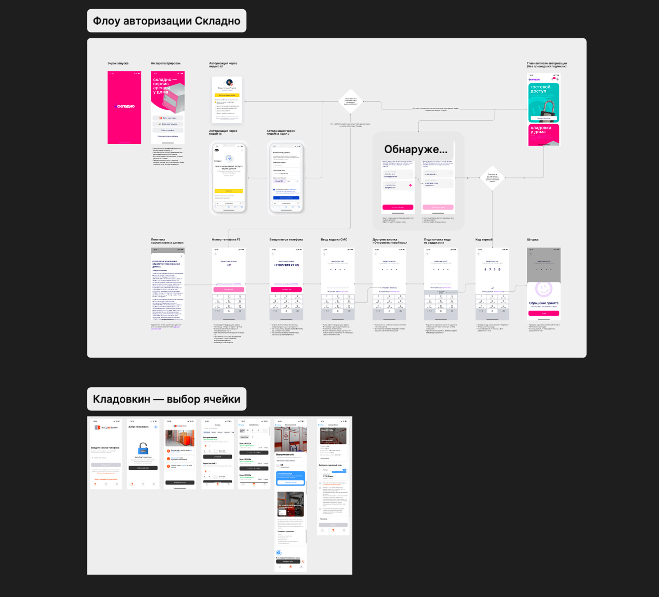
I went through the three main competitors: Skladno, Kladovkin and Mnogo Mesta. We had a lucky starting position — the studio had built the first version of Skladno back in 2021, so the basic flows were already in hand. But the market had moved on in five years, so I walked the user journey in each app and wrote down the pain points we had to avoid repeating.
Competitor pain points
Too long a path to the goal
Five or more steps just to pick a unit — needless friction and lost users.
Hard to judge the unit size
No relatable comparisons, so people cannot picture which size they actually need.
No transparency about availability
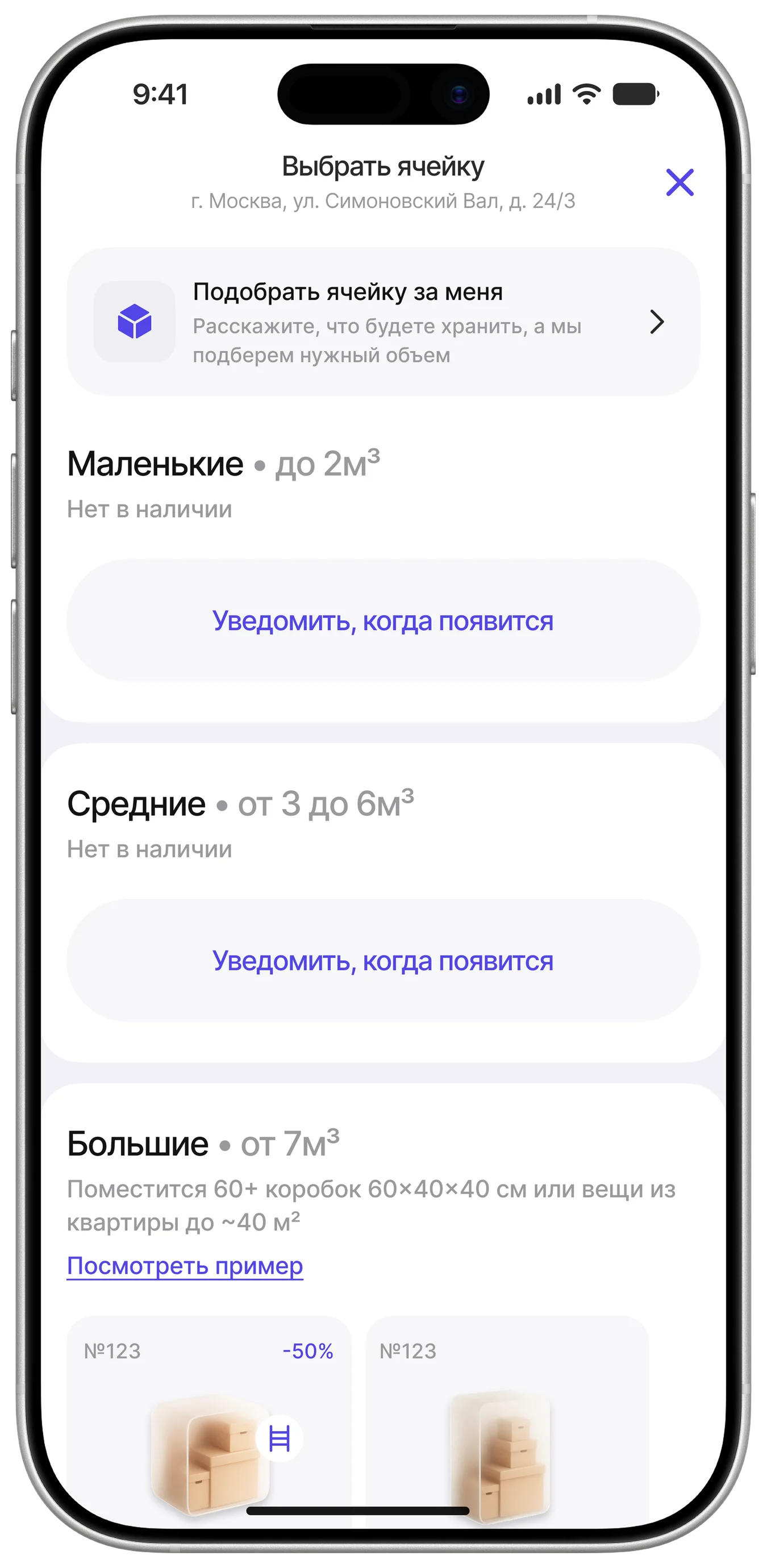
Sold-out units are not flagged, so people waste time and get annoyed.
Awkward onboarding and sign-in
Documents are demanded up front, with no quick sign-in options.
Little is done to build trust
No onboarding, no terms, no examples of how the service is used.
Unit access depends on the internet
A critical UX failure in a basement or a lift.
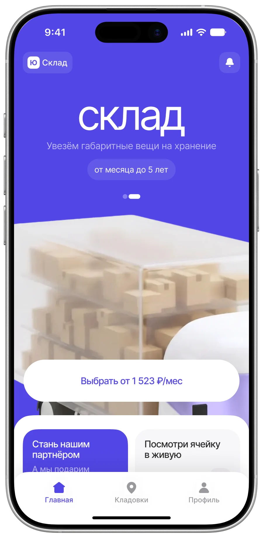
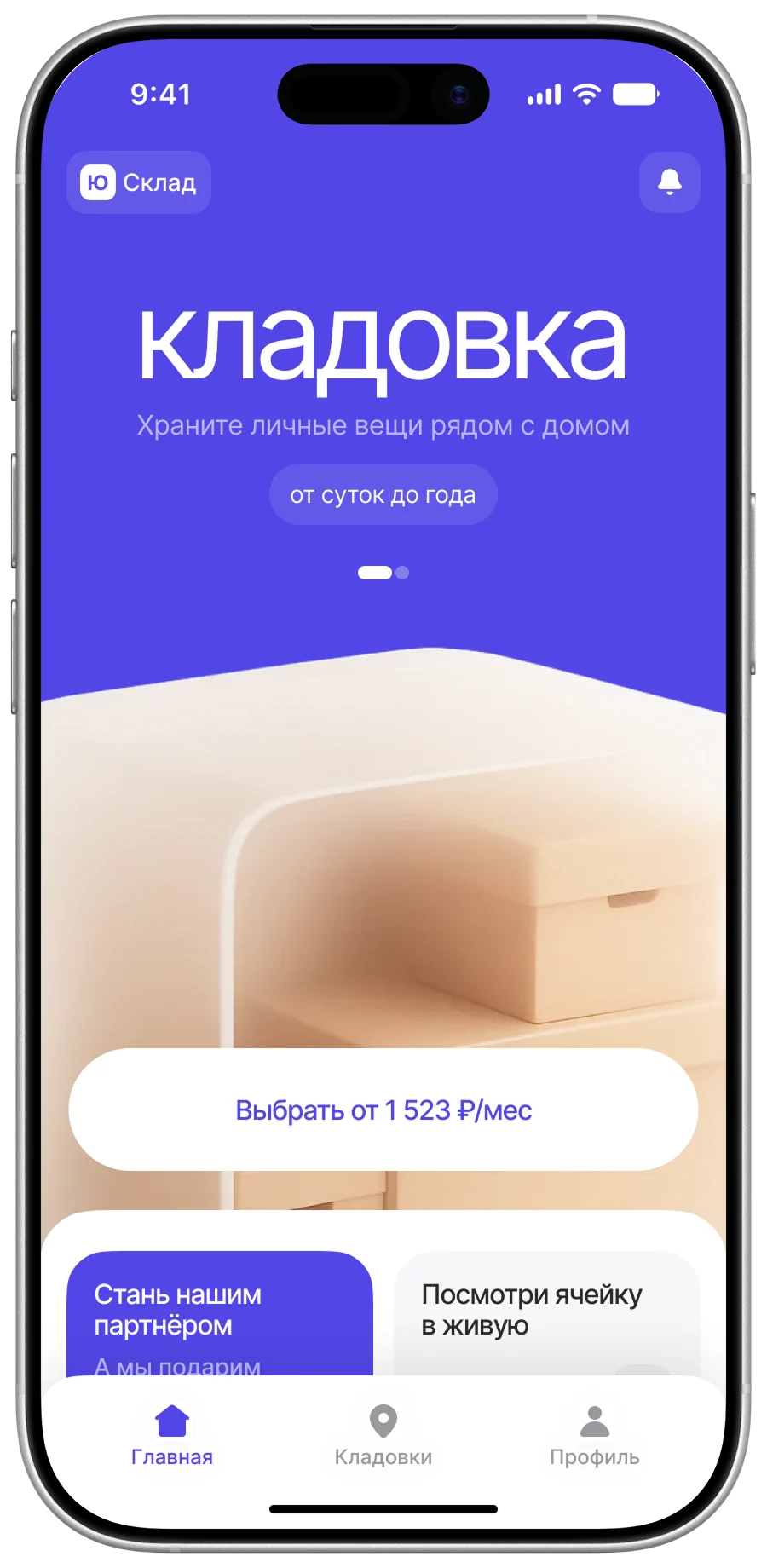
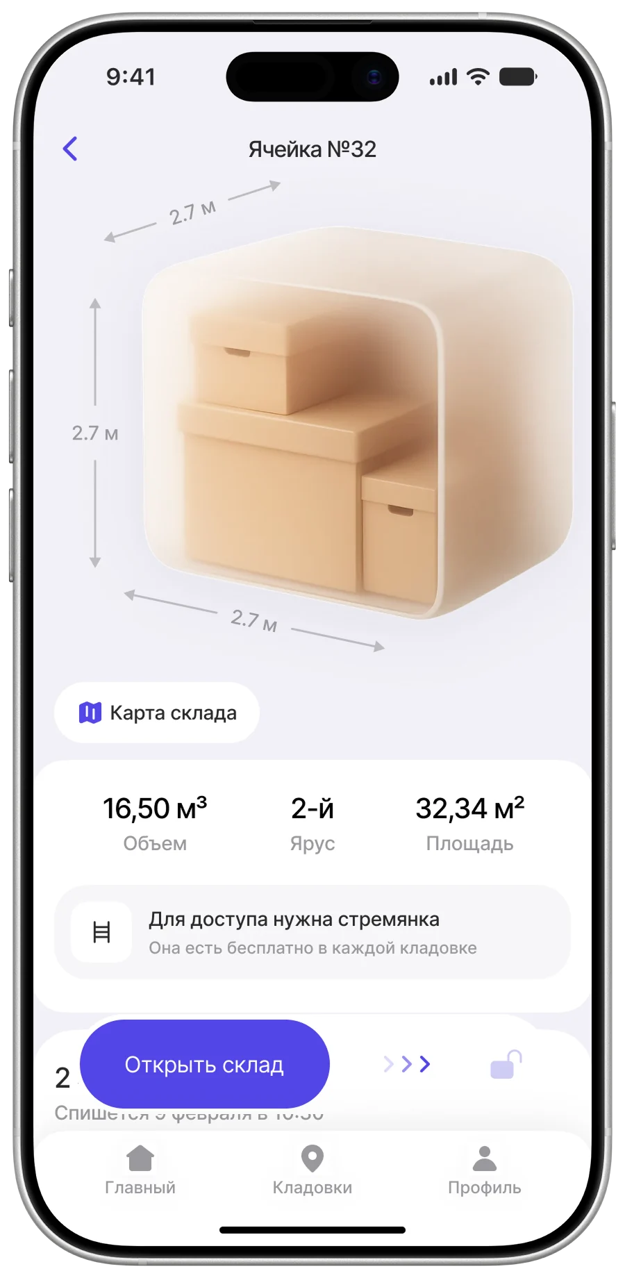
The customer home screen
Just so the page is not all text
1.1 Hypotheses
On choosing a size
If each unit size comes with a visual hint — what real belongings actually fit — people will choose faster and more confidently, which should lift booking conversion.
On flagging constraints
If access constraints are shown up front — a unit that needs a stepladder, say — there will be fewer bad surprises and cancellations, which should improve NPS and take load off support.
On document verification
If there are alternative ways to verify identity, fewer verifications will fail, and more people will make it through to actually renting.
On offline access
If a unit can be opened without an internet connection, over Bluetooth Low Energy, there will be fewer failed attempts and support tickets, and happier customers.
On sharing access
If handing someone access takes one or two taps, shared access will be used more often, which should help retention.
On cloud storage
If we launch a format where a courier collects the items, a new segment appears — people willing to pay for convenience — raising the average order value and giving us an edge.
2. Structure
We sketched the structure straight in Figma
The deadline was tight, so we worked in short loops: calls with the team several times a day, running the flows for logical gaps and filling in missing states. Where it made sense we reused proven flows from Skladno — but not blindly: every screen was re-examined against the benchmarking, since the original was five years old.
There was nowhere to look for partner screens
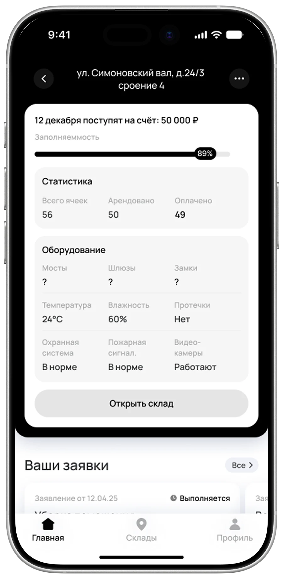
Running a storage business from a phone is rare: in almost every case it is a separate web service with large dashboards, staff permissions and reports. There are barely any public references — I managed to dig up a couple of screens from Skladno, and neither was revealing. But the client insisted everything had to live inside the app. So the partner side was designed from scratch, leaning on structure rather than on other people’s solutions.
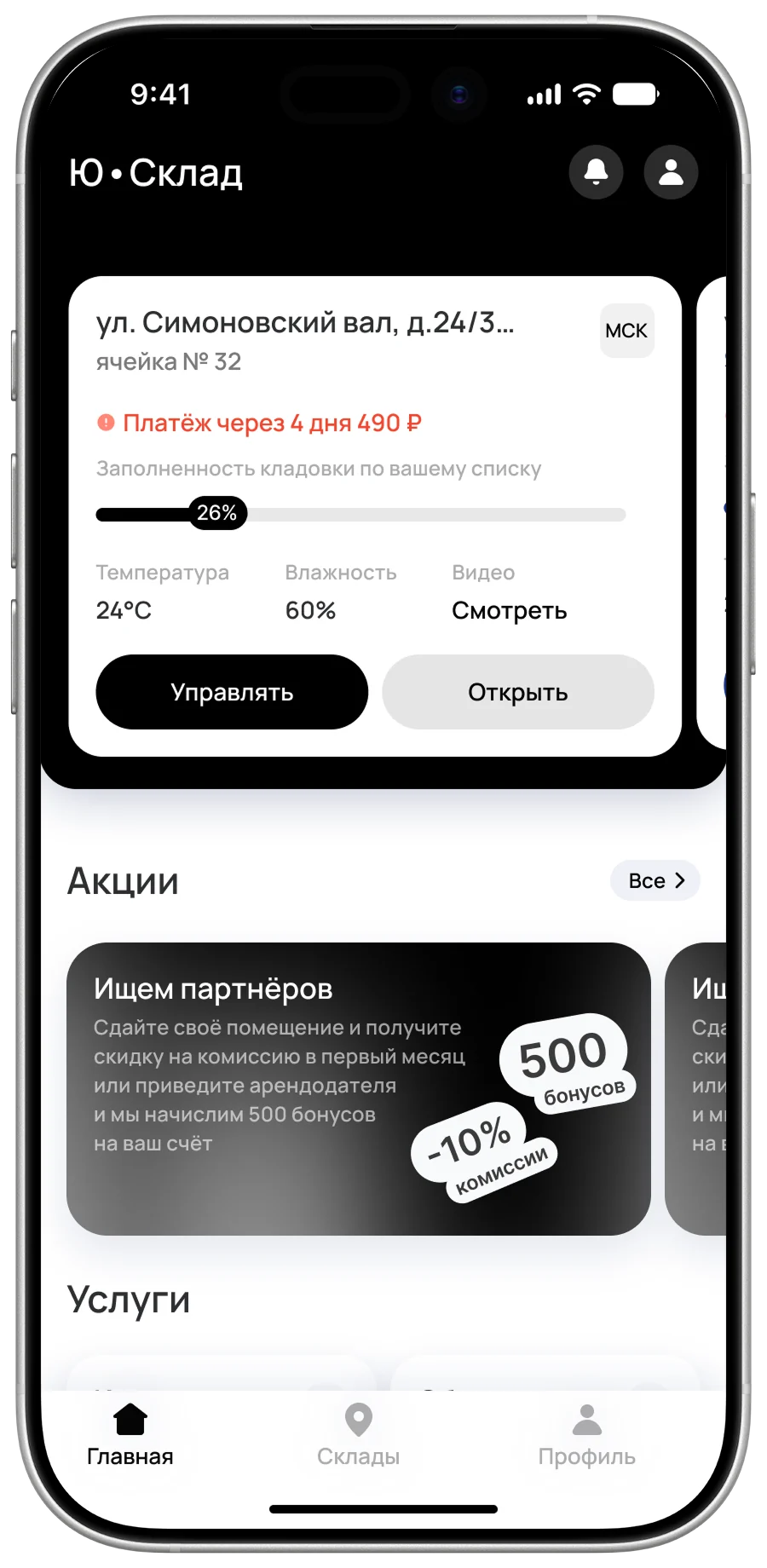
The first prototypes
Put together for the first client meeting — talking about a product on real screens beats talking about it in the abstract
3. Visual concept
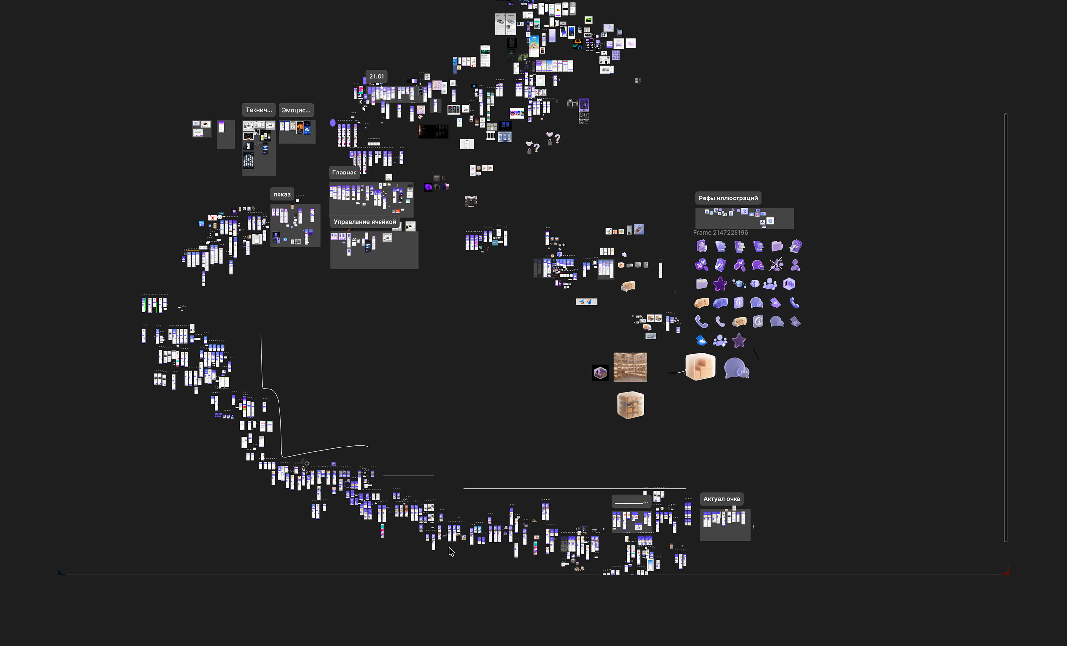
Concept sketches
During concepting we deliberately switched off the constraints — no components, no auto layout, just speed and the search for ideas. Tidying the file and laying the screens out neatly could wait: at that stage finding a direction matters more than keeping order.
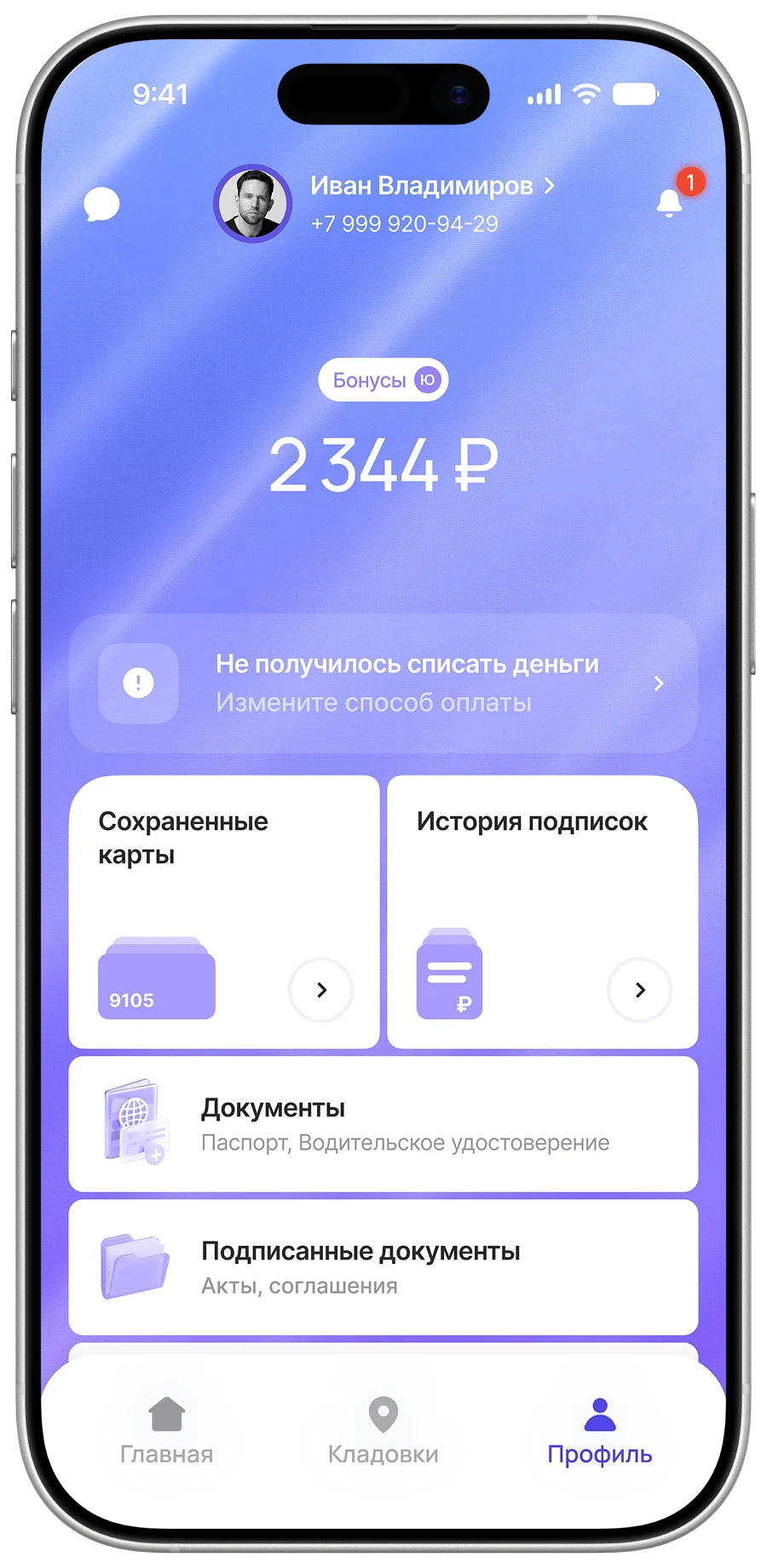
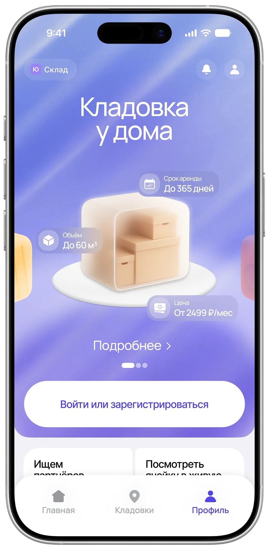
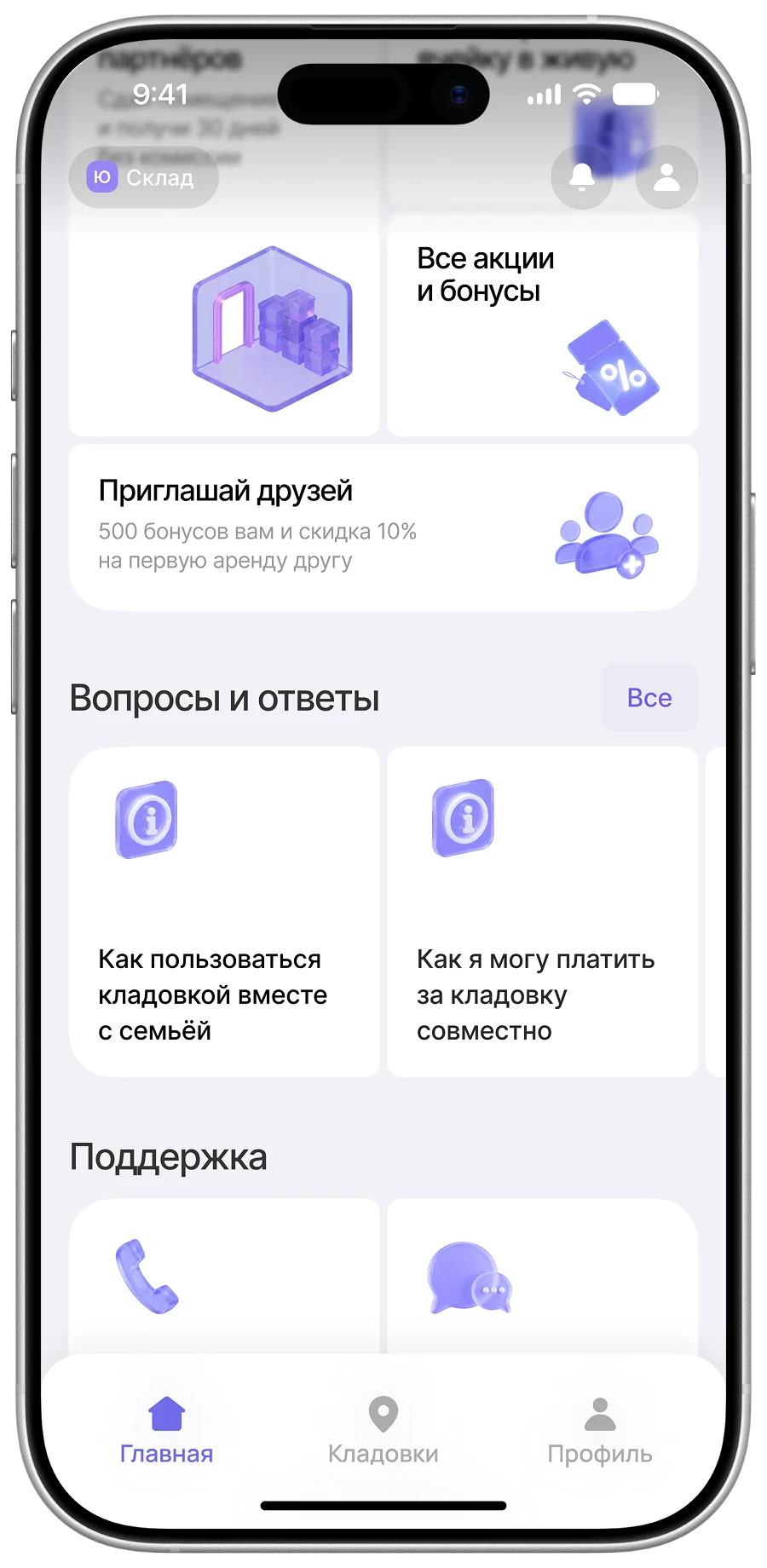
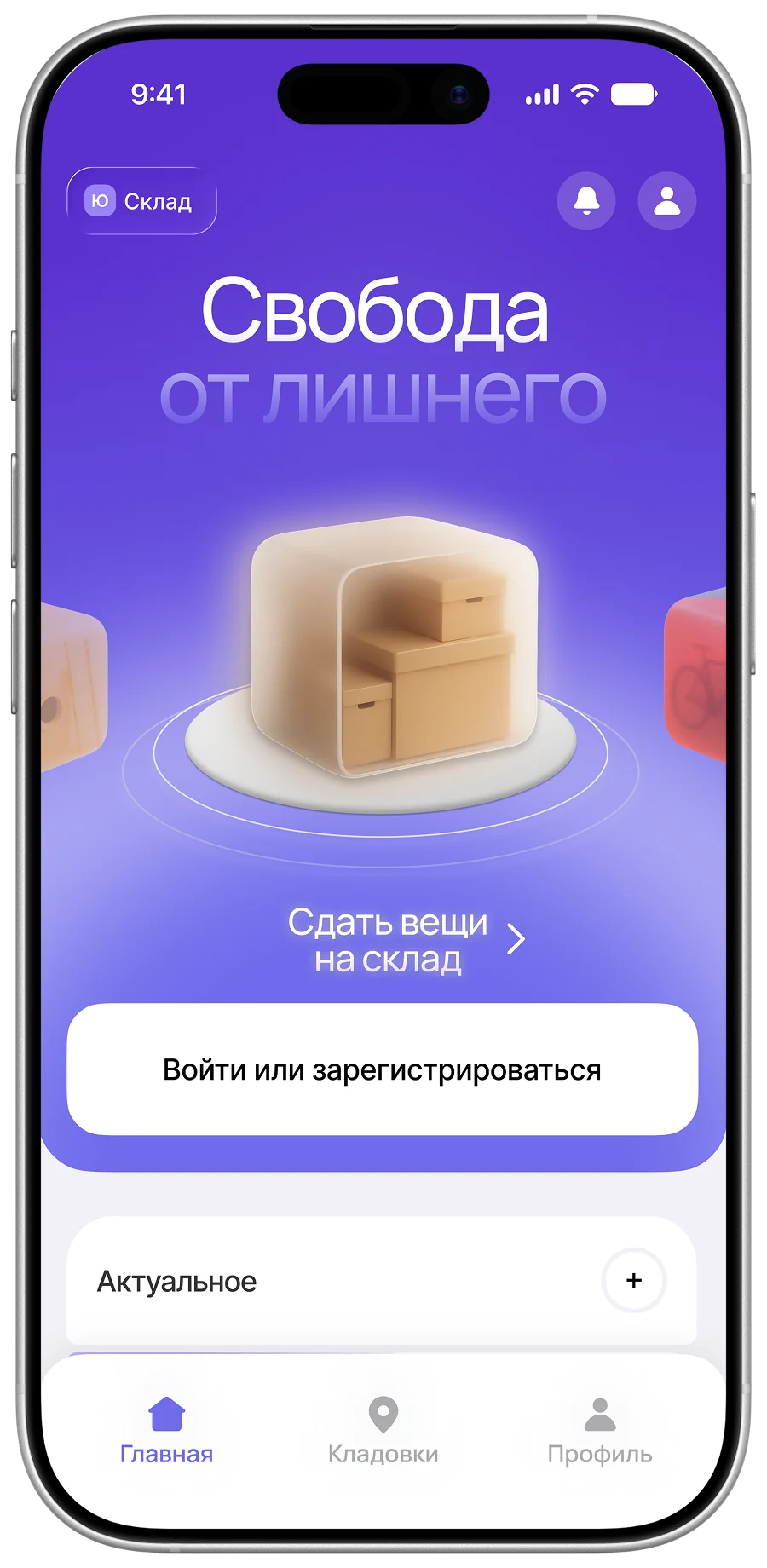
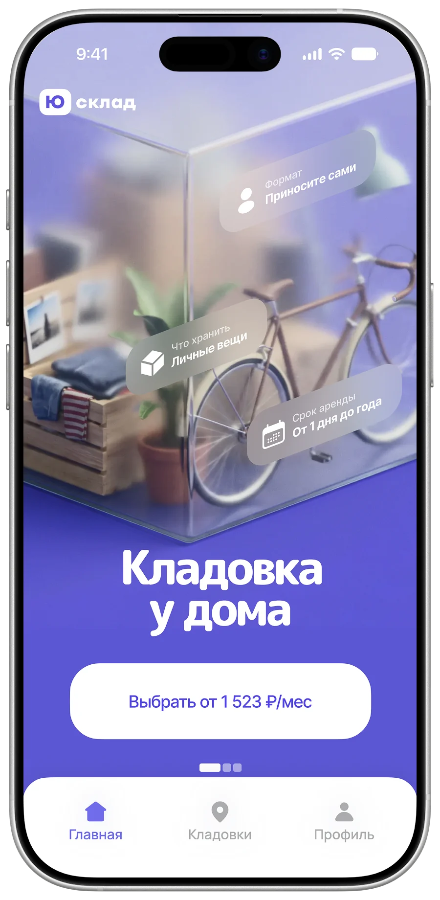
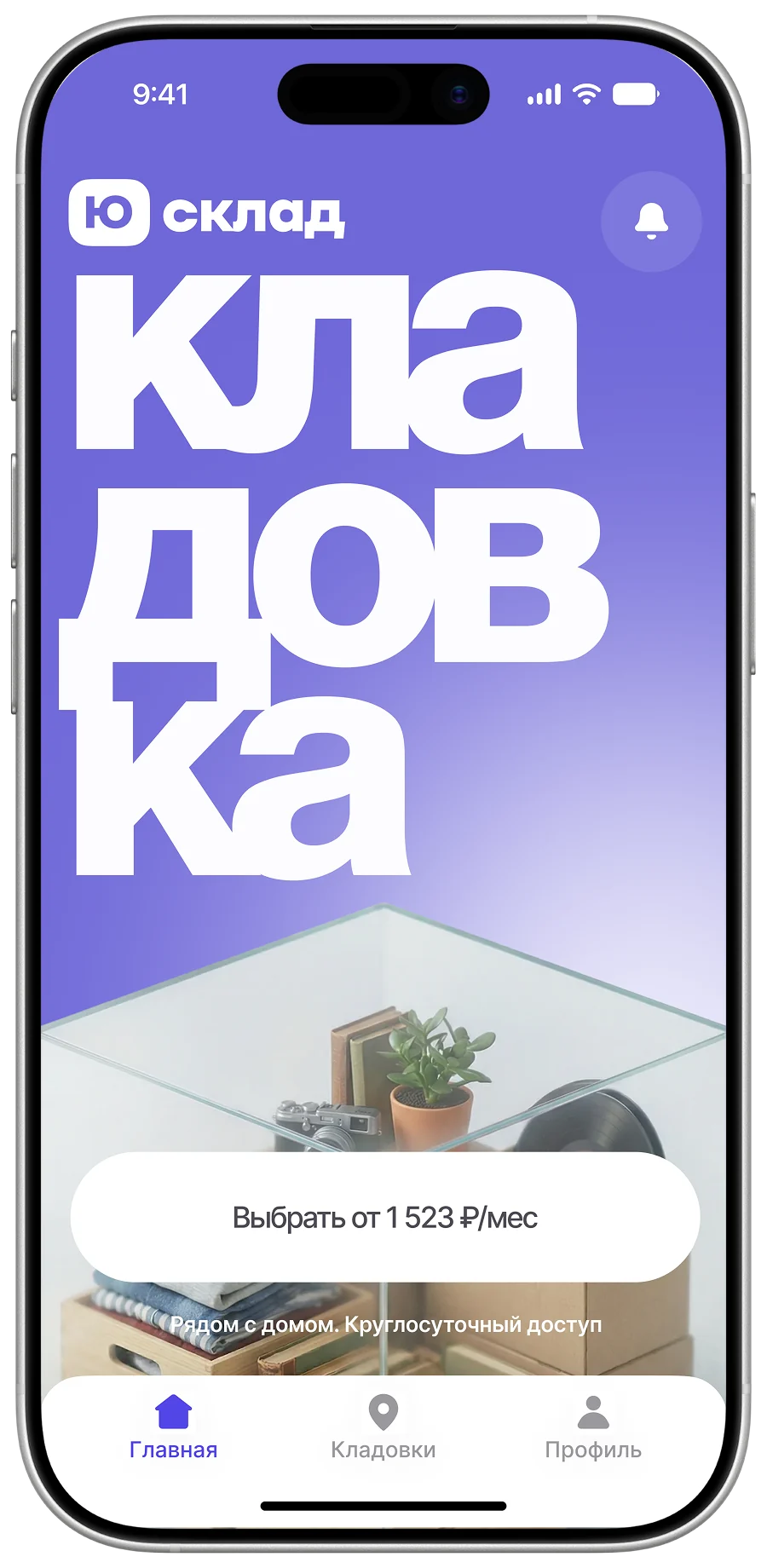
The hardest part of concepting is stopping in time
To keep the search from running forever we set a rhythm: the art director gave direction daily and helped hold focus, and once a week the whole team ran a design review — quick feedback on logic, visual consistency and whether the states were complete. Options got filtered out fast and for good reasons.
This is where we landed
- Full-width blocks
- Light grey cards on white
- Plenty of air inside buttons, chips and banners
- Generous corner radii
- Filled icons
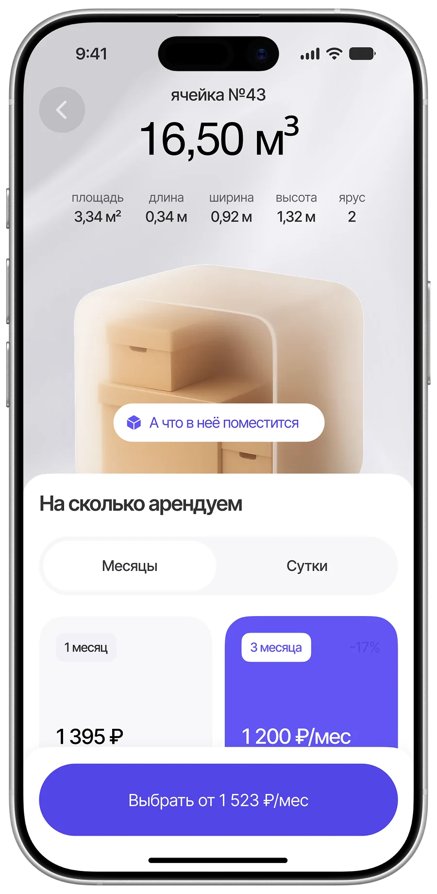
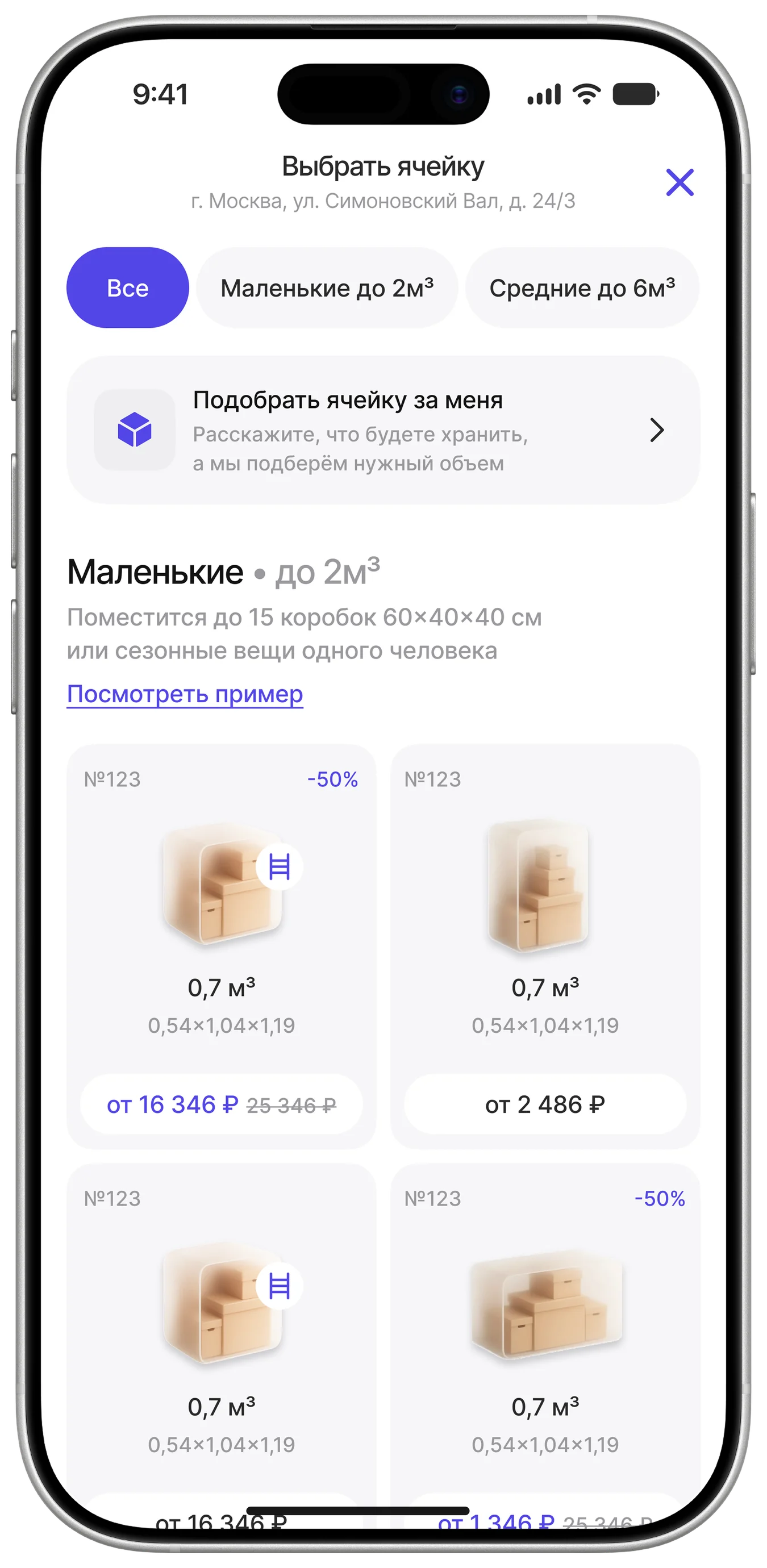
- Warm-toned illustrations that do a job: showing the shape of a unit and what will fit inside
4. Design system
Now the scattered rules had to become one system
There were four of us, and without shared rules we would have drawn four different apps. We fixed the typography and the colours first — that became the team’s common language.
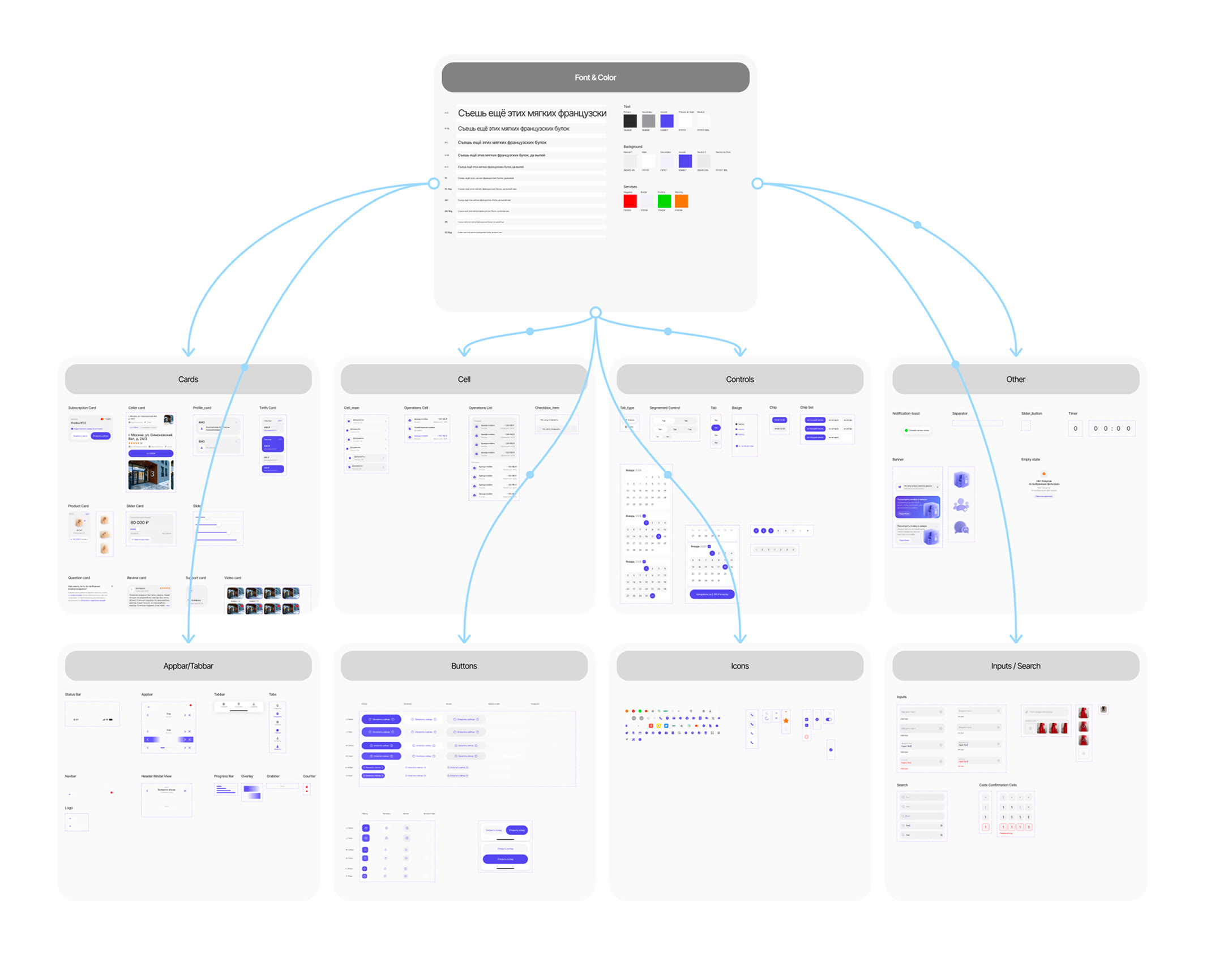
After long discussions a minimal system emerged
Components, spacing, radii and effects — just enough for four designers to draw as one. The system is deliberately minimal: it grew as the project went, instead of trying to anticipate everything up front.
4.1 My part in the design system
One row instead of three
Rows in checkout, in the payment method modal and in lists were separate components, though they barely differed. I merged them into one where the icon, border, title, description and caption are toggles.
Cards in S and M
Cards weren't components and got rebuilt in different configurations each time. I made universal ones in two sizes for different amounts of content.
Icons in one place
Icons came from different libraries. I gathered them in one place — a single source for both the team and developers.
System components up to IOS 18
Mock-ups still used components from older IOS versions, like the nav bar. I brought them in line with the IOS 18 guidelines, showed the team how to use the updated system and swapped out outdated components myself whenever I spotted them.
5. Final UI
Then we split up the work
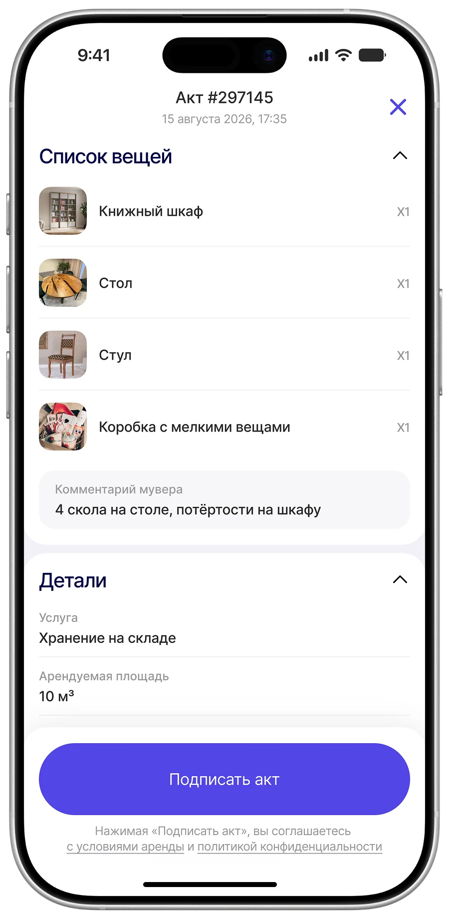
My area was the drop-off flow, from the entry point to signing the handover act. Alongside it I worked on the home screen, the profile, the partner side and sign-in.
5.1 Cloud storage
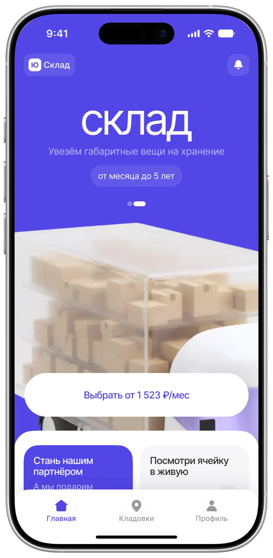
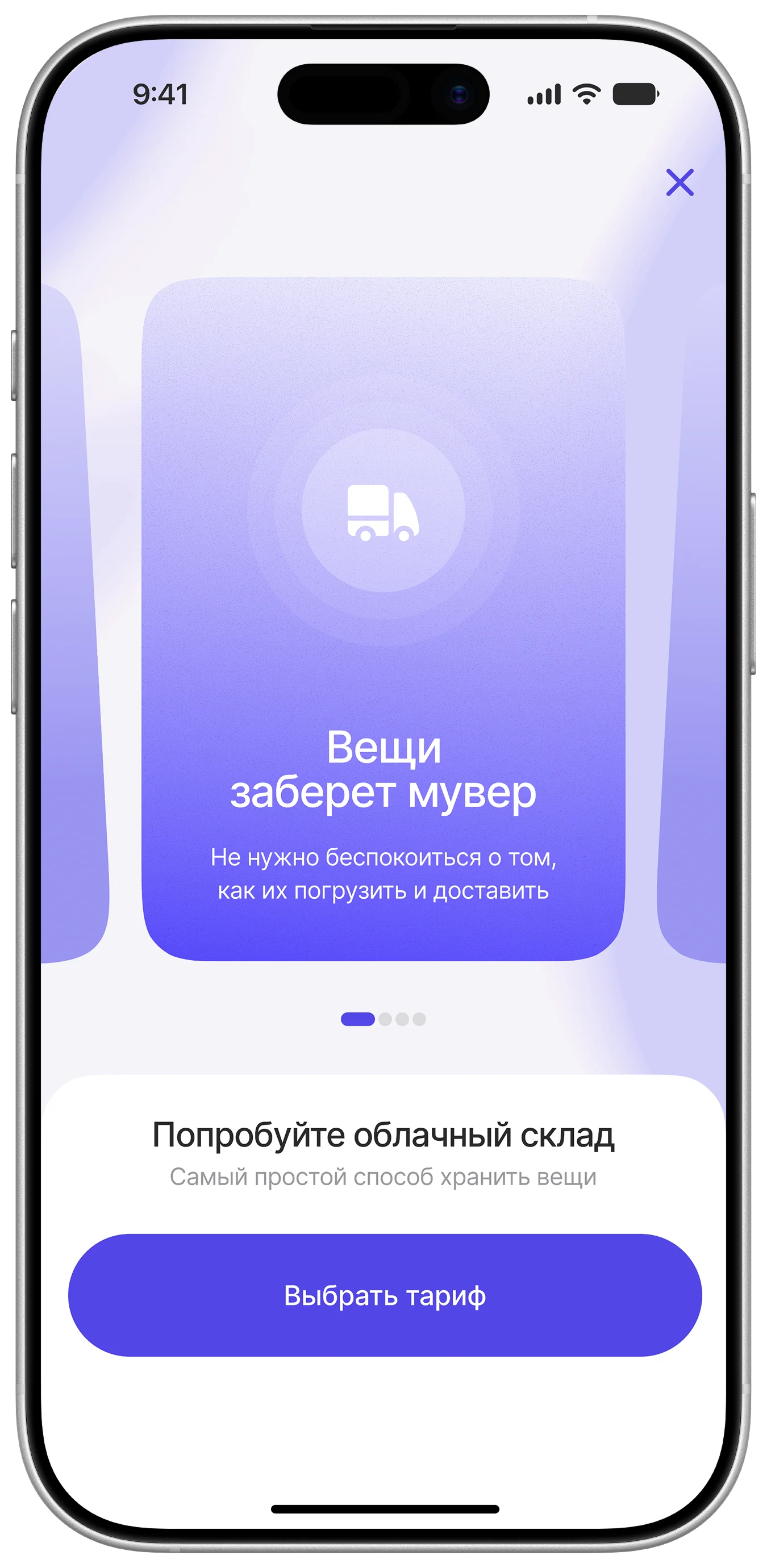
Entry point
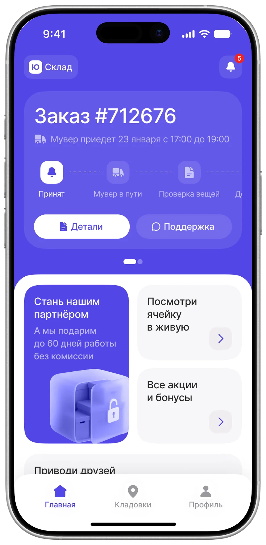
The service finds the user: it sits on the home screen and in notifications. Before checkout there is a short onboarding that removes the barrier of an unfamiliar service.
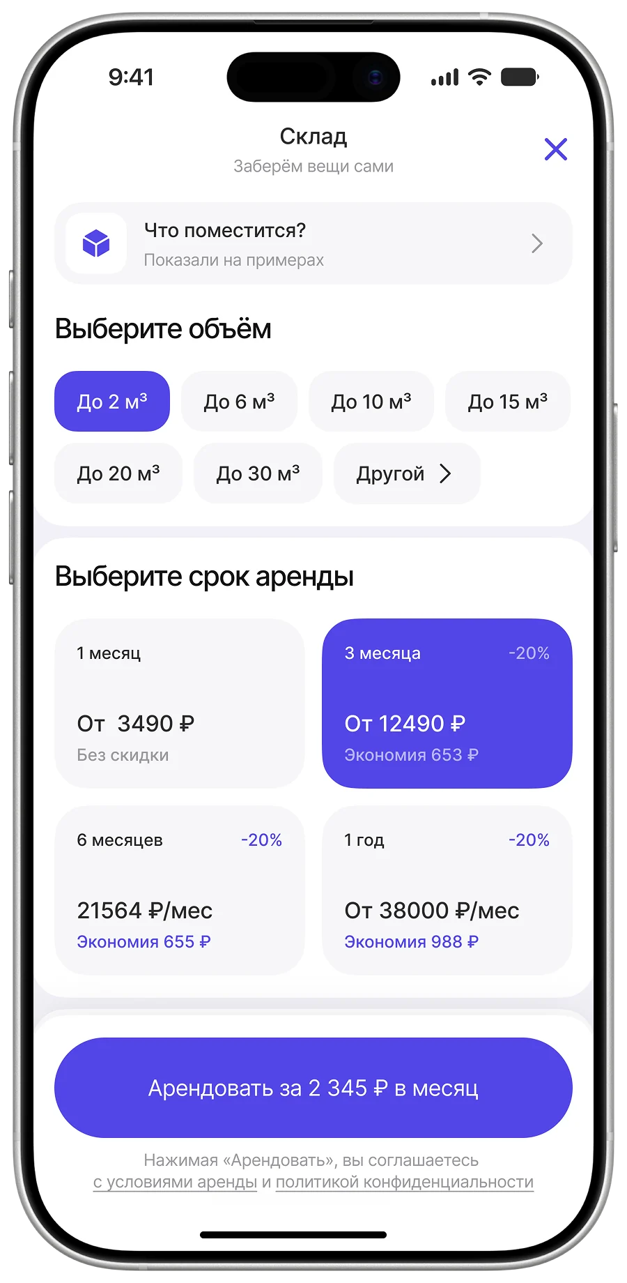
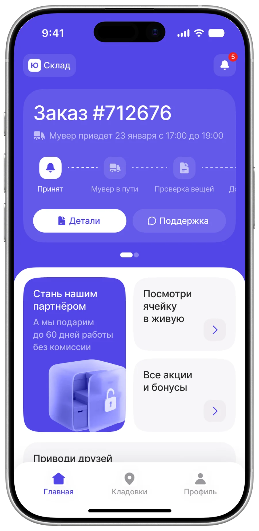
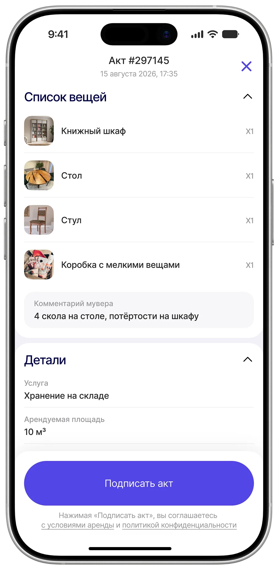
The main storage screens
Order status sits on the home screen, storage volume is unlimited, and the handover act is signed in a couple of taps — no paper, no couriers.
5.2 Choosing a unit
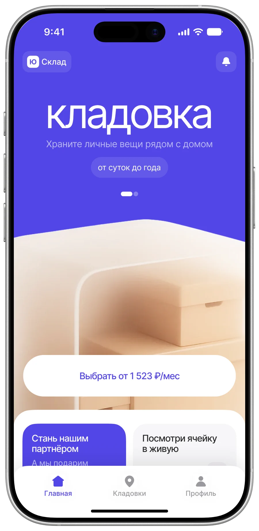
Entry point
Like storage, right on the home screen: every key service is one tap away
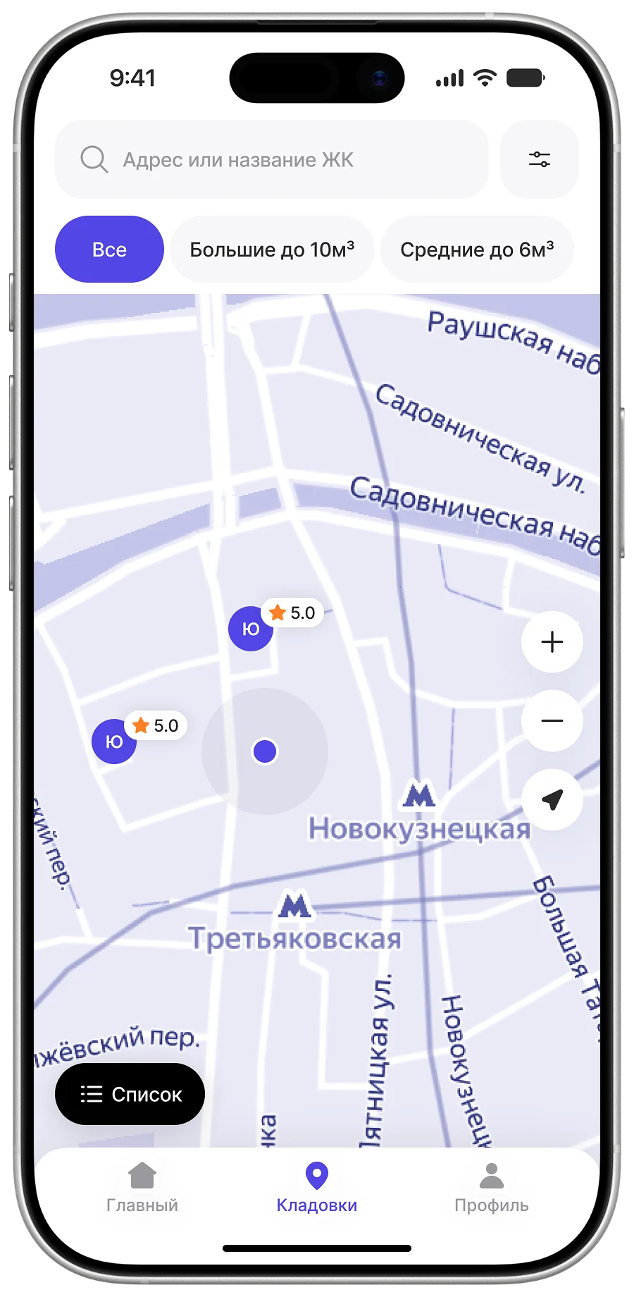
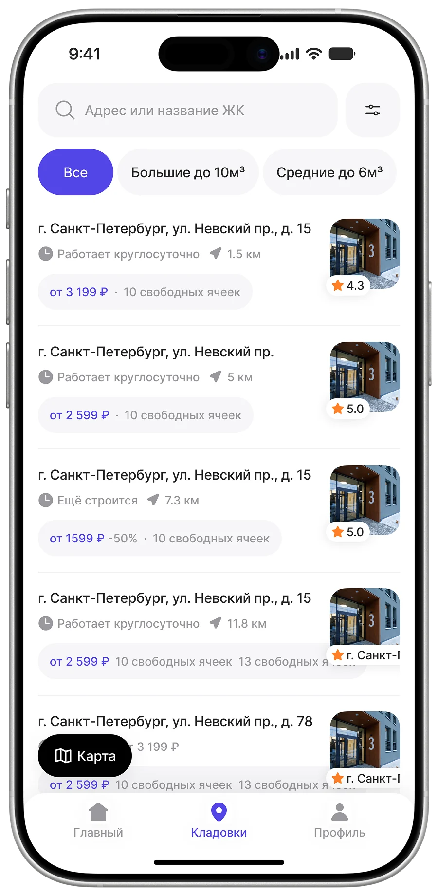
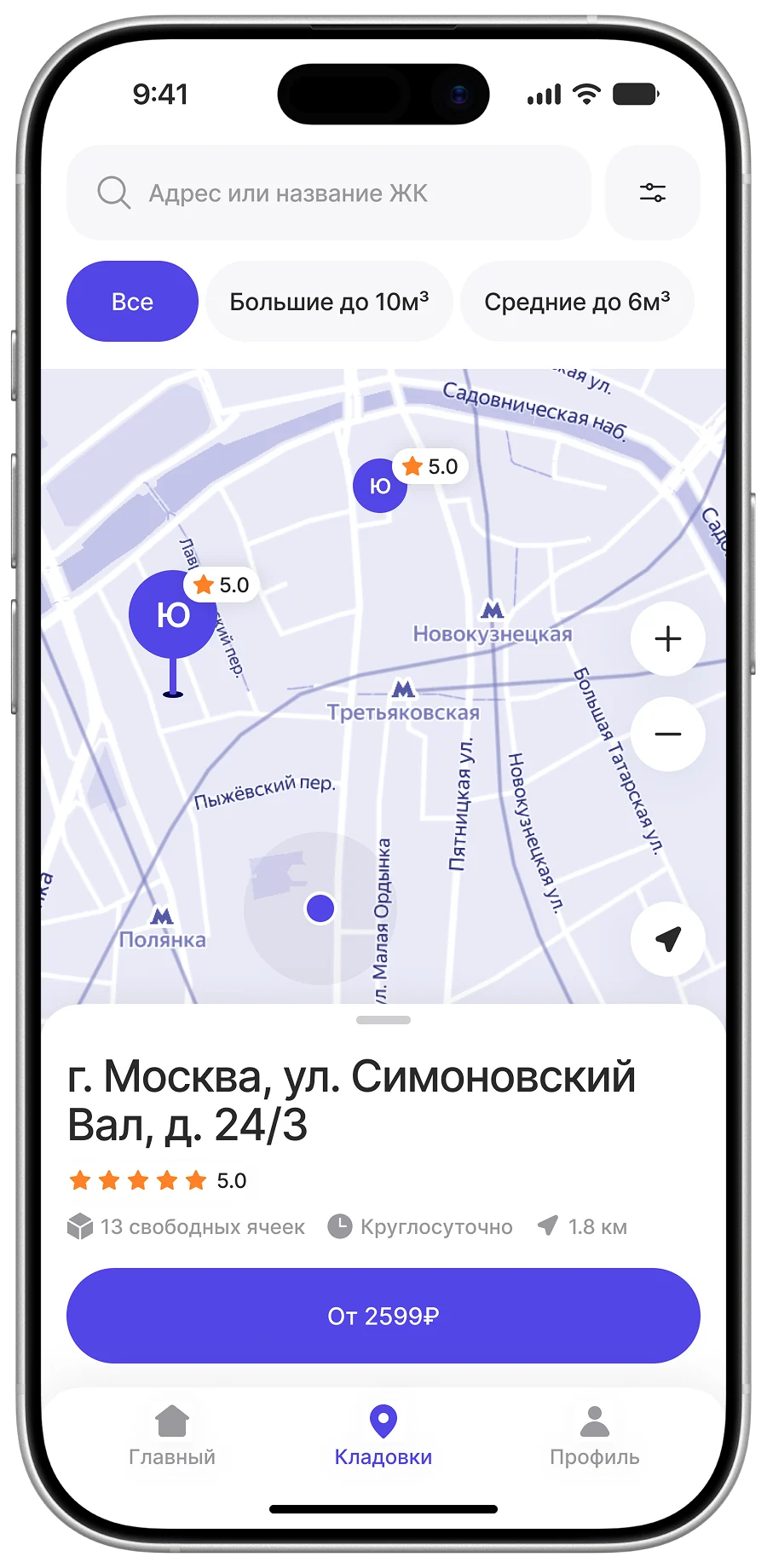
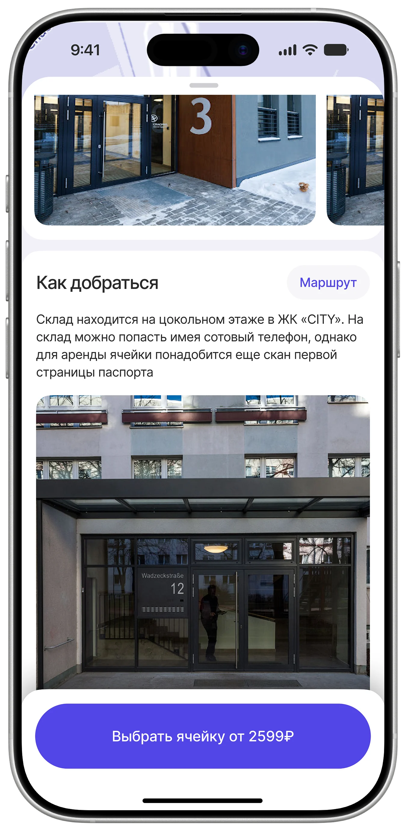
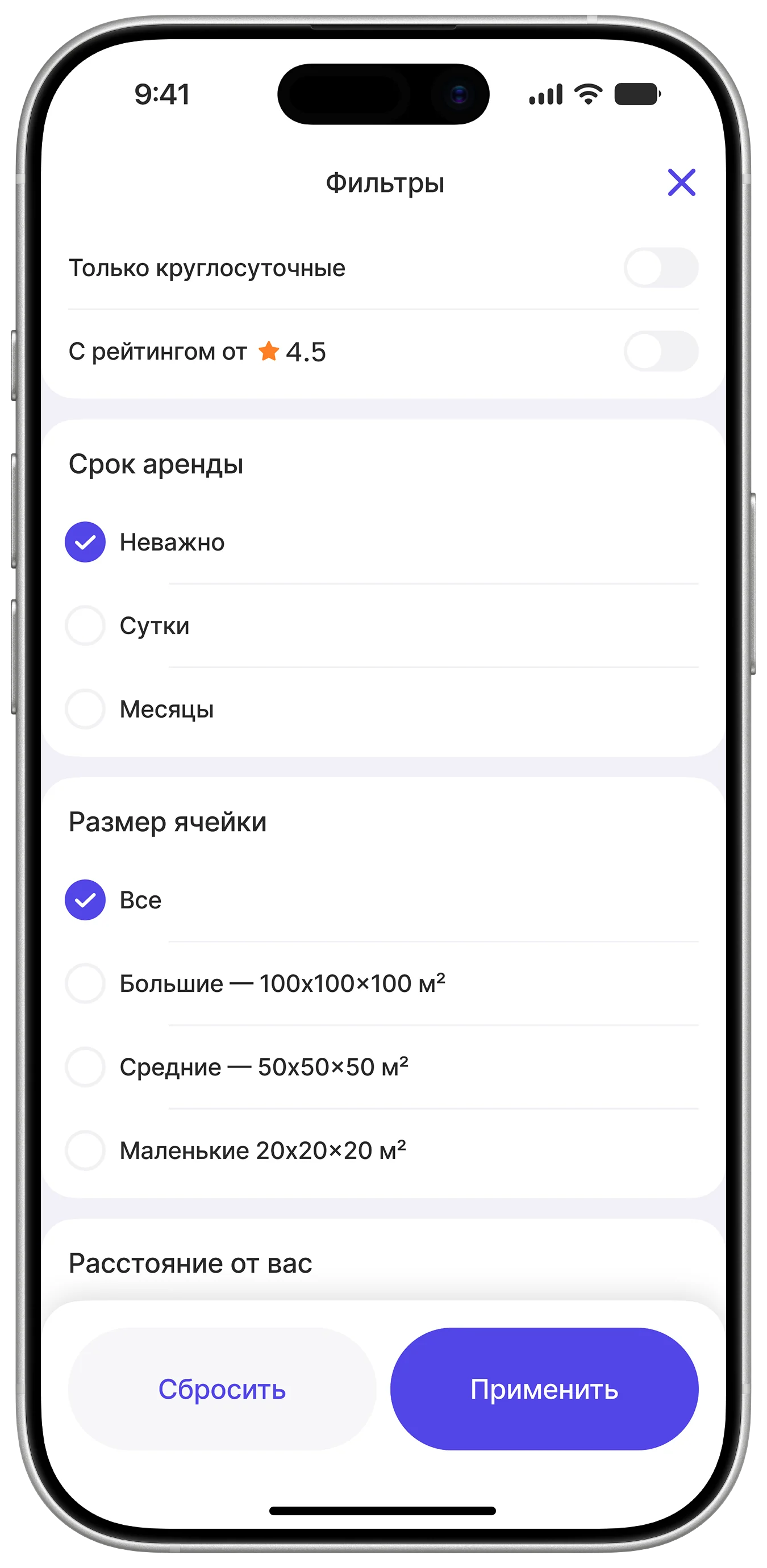
Searching on the map
A list or a map, whichever feels natural. Tapping a pin opens the site without leaving the map. The filters are the ones people actually use: distance, size and term.
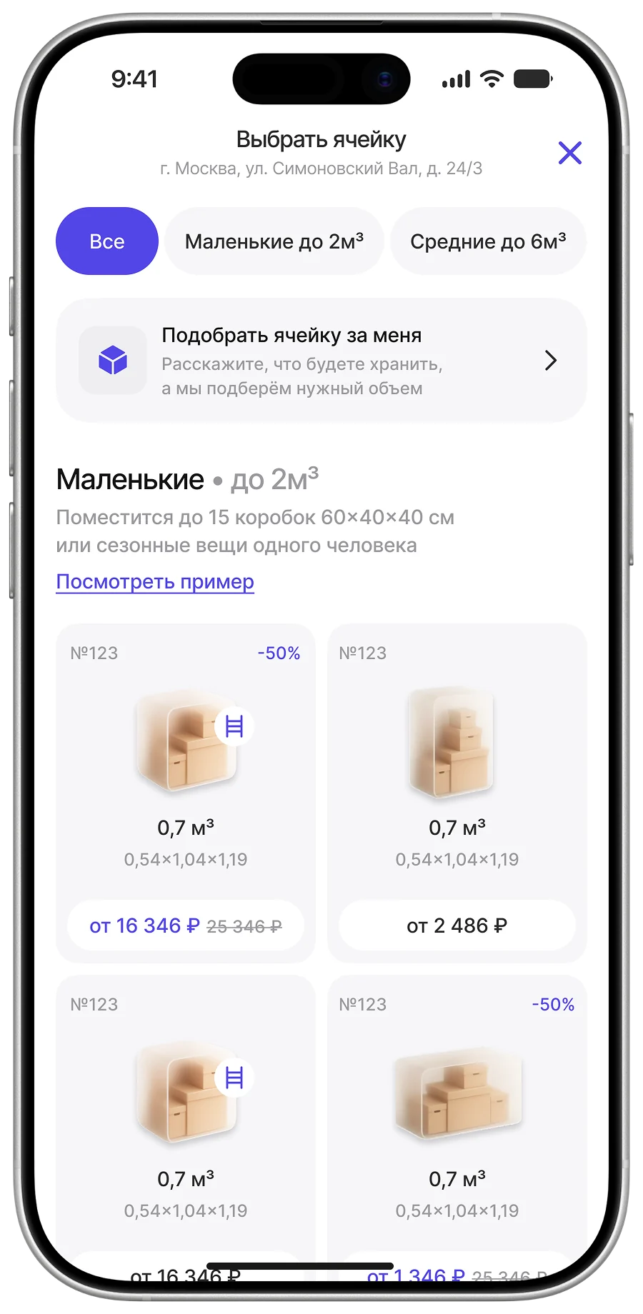
The warehouse page
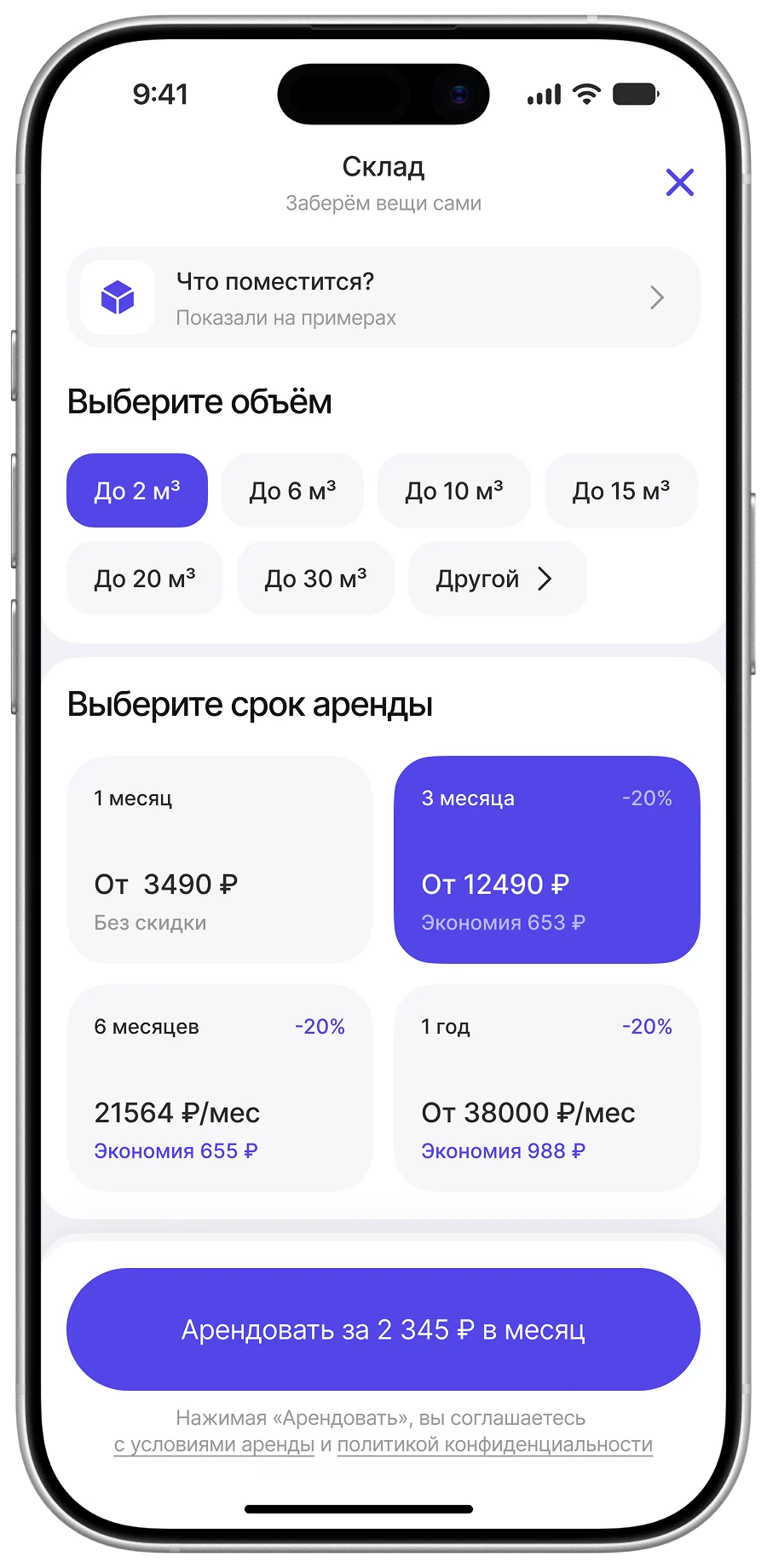
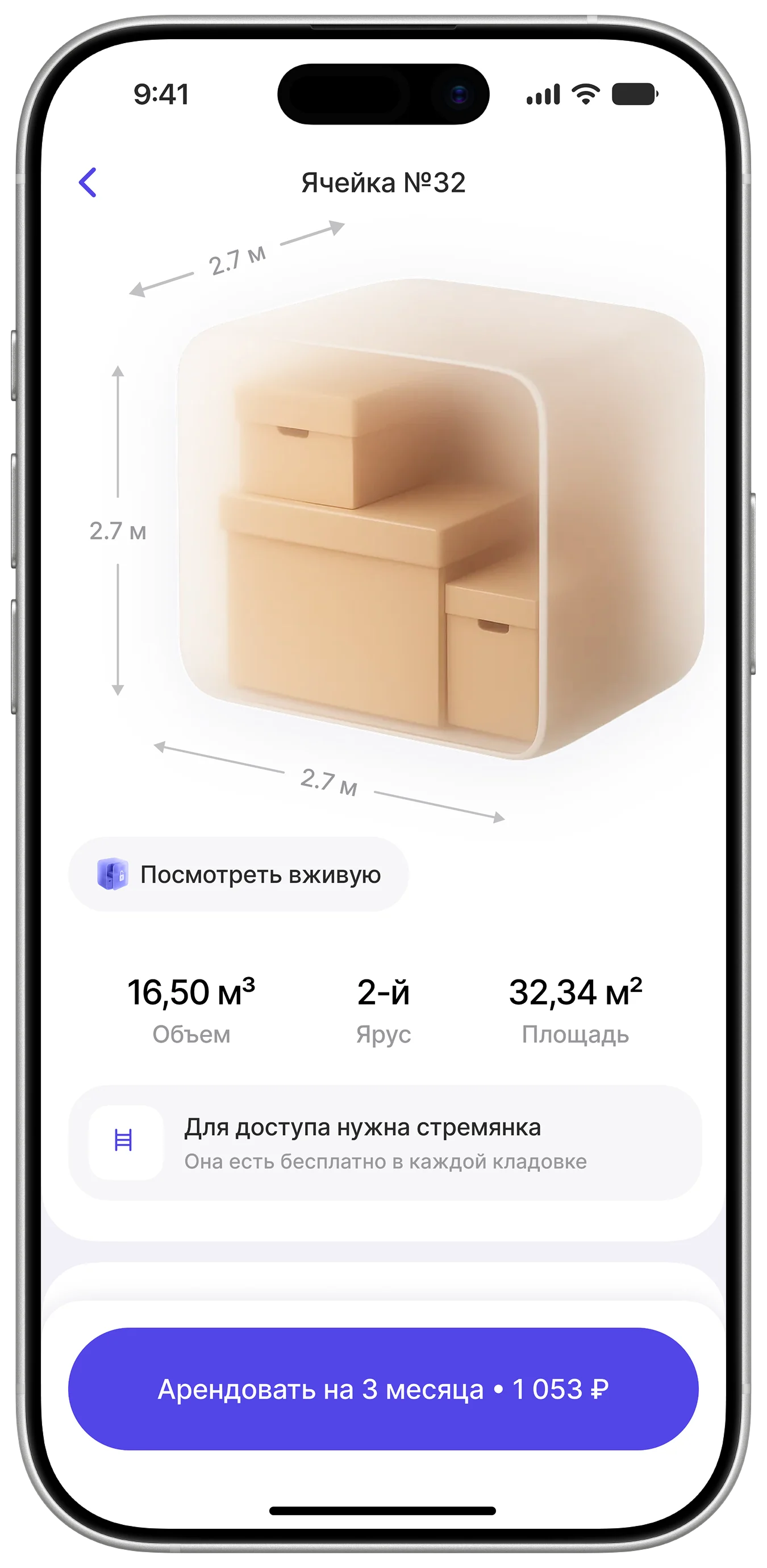
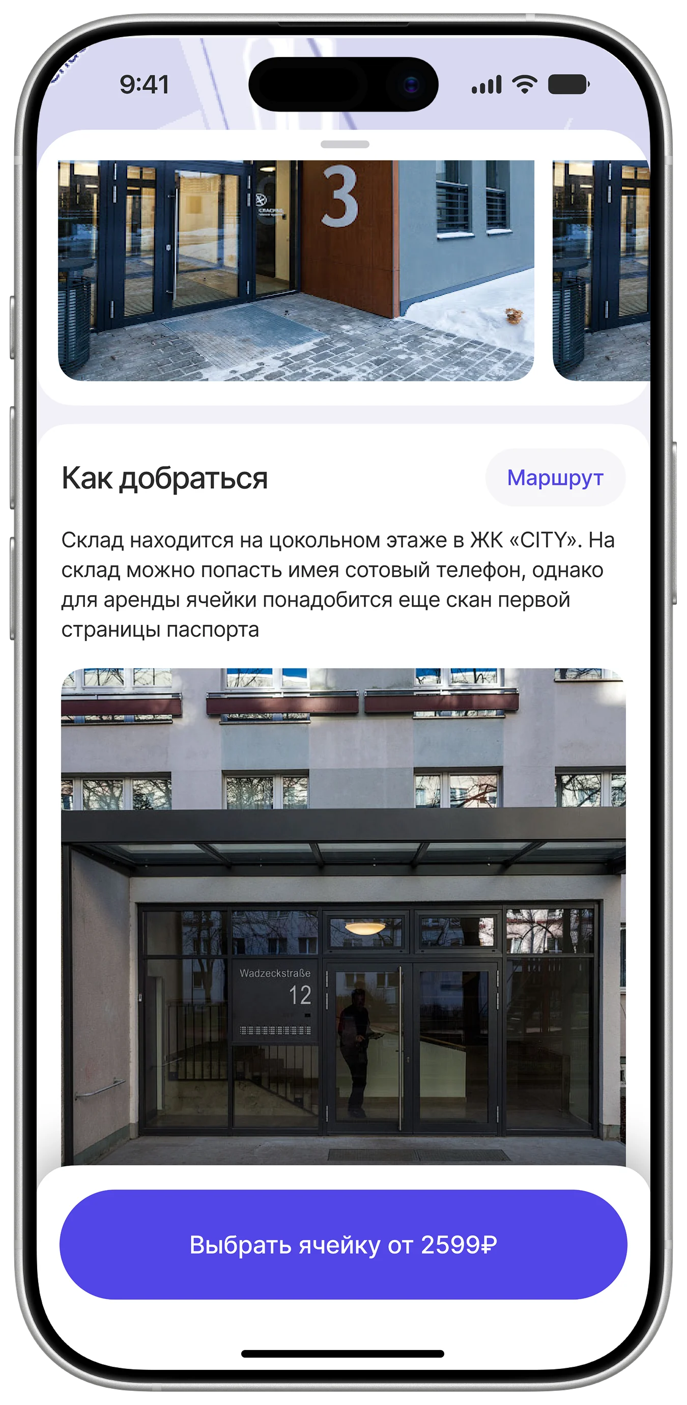
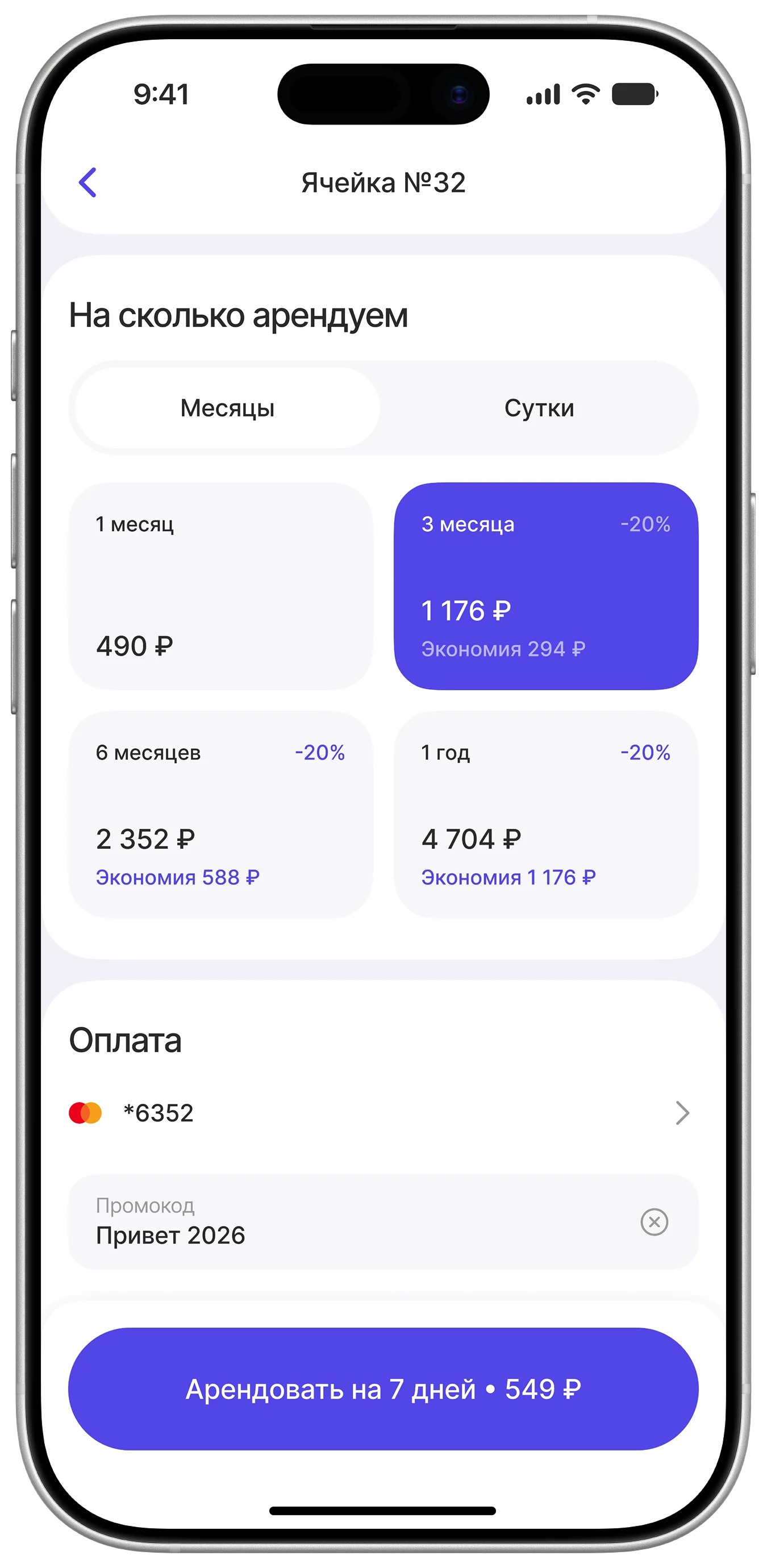
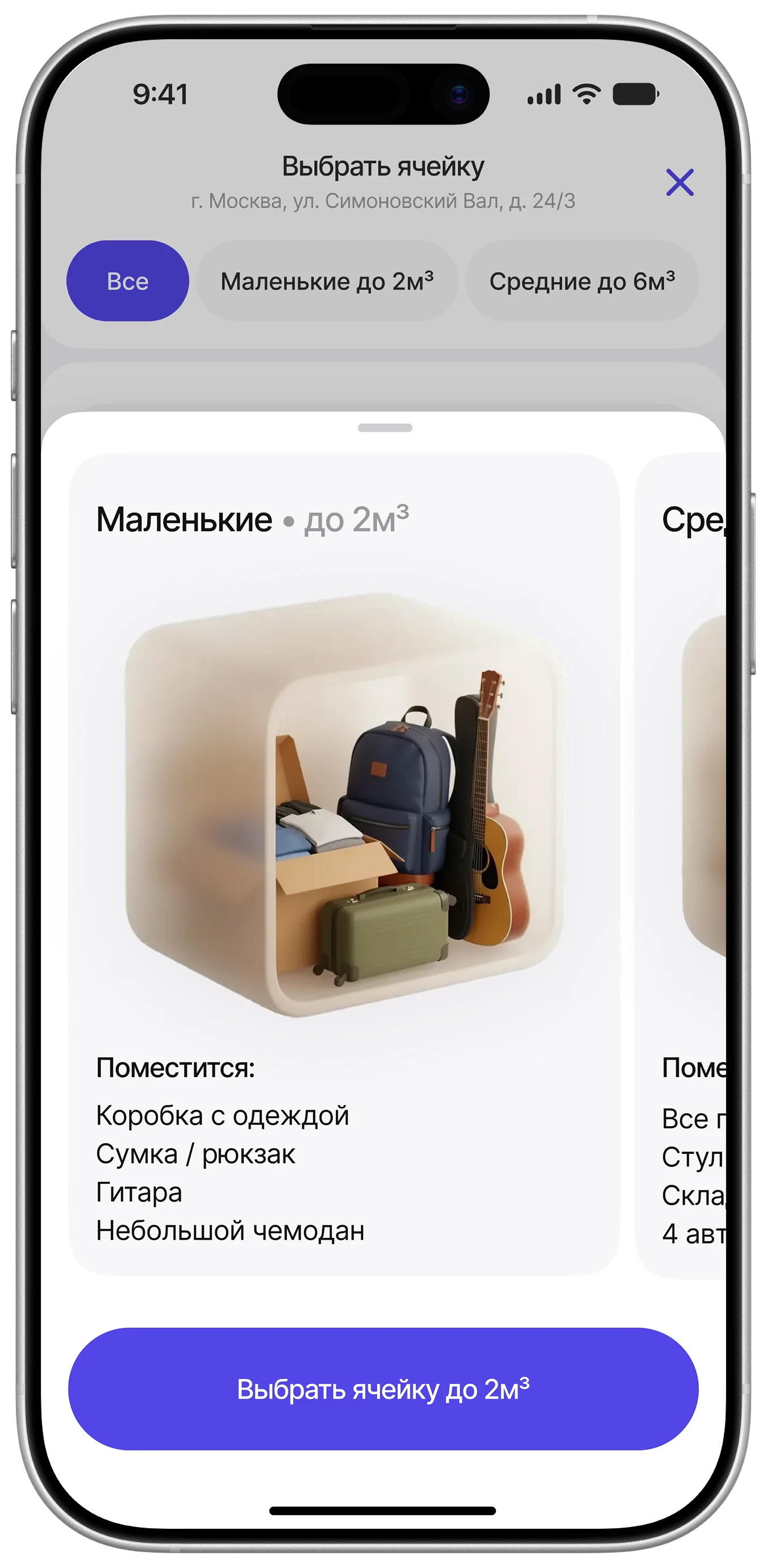
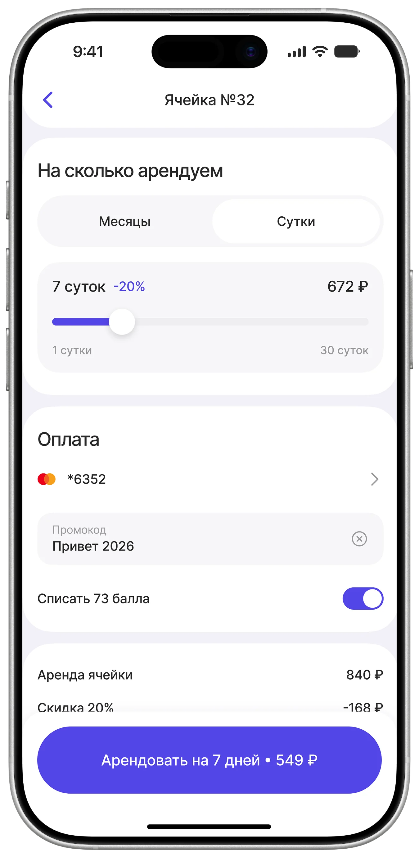
Three unit sizes, rentals from a day to a year. The key find is capacity hints shown with real objects: instead of cubic metres a person sees that “a wardrobe and four boxes fit in here”. That closes the volume-choice pain.
Belongings insurance
During benchmarking I didn't find insurance at any competitor, so I proposed it. The user adds their items, sets their market value and sees the price of cover right on the button. For the business it's extra revenue on every rental; for the customer it answers the fear of “what if something happens to my things”. I built it into both unit checkout and warehouse drop-off.
5.3 The partner side
Entry point
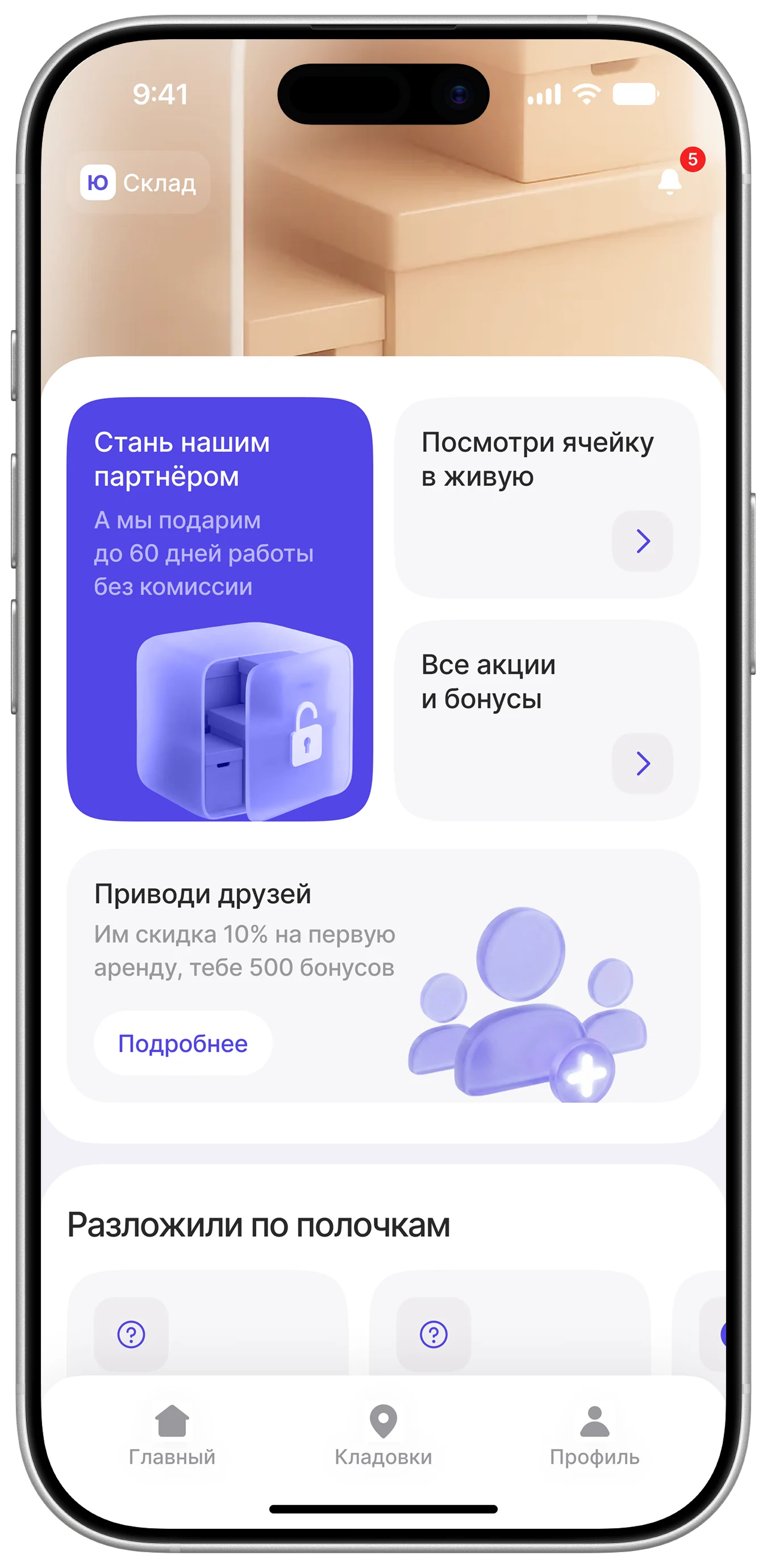
The emphasis is on the franchise, which follows straight from the business goal: early success is measured in partners signed up, so the invitation to become one meets you on the home screen.
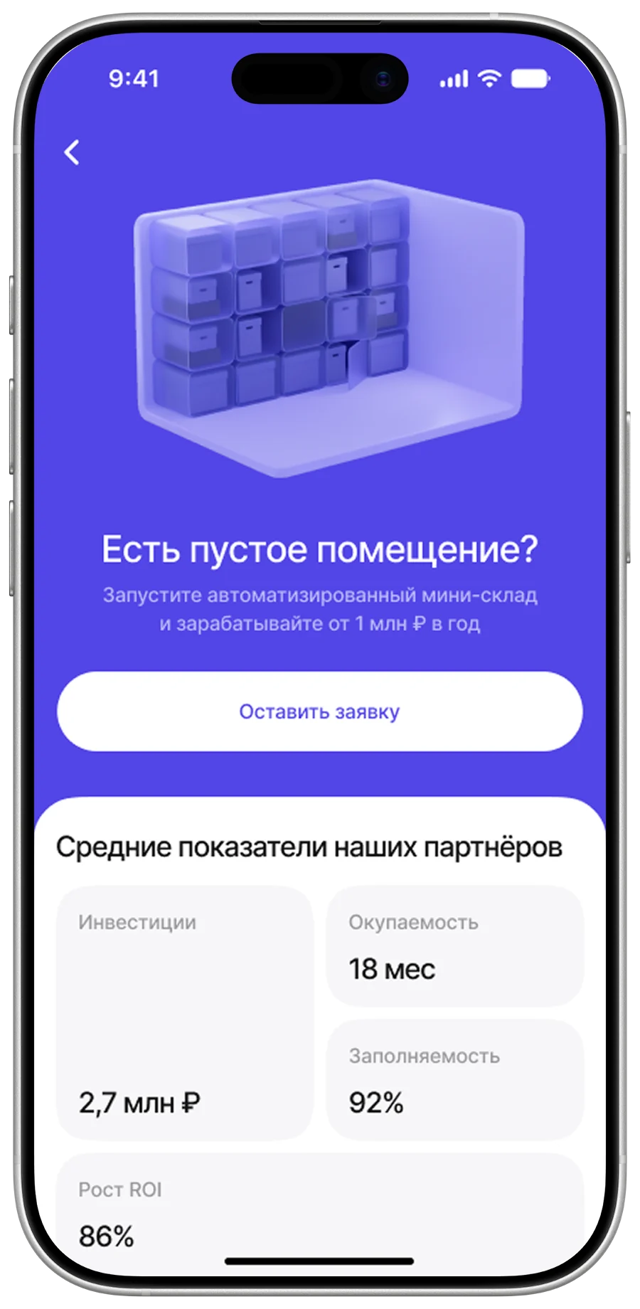
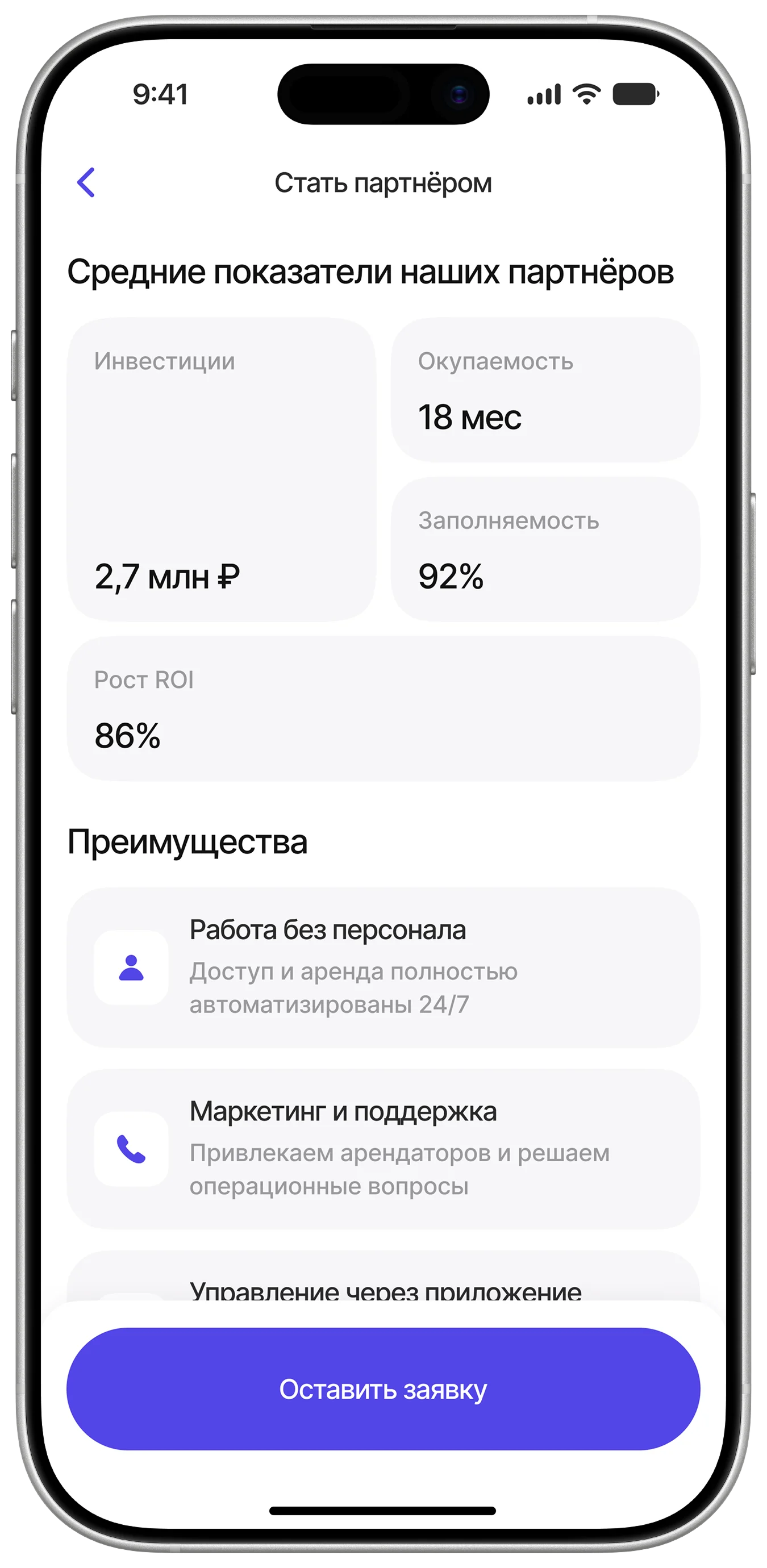
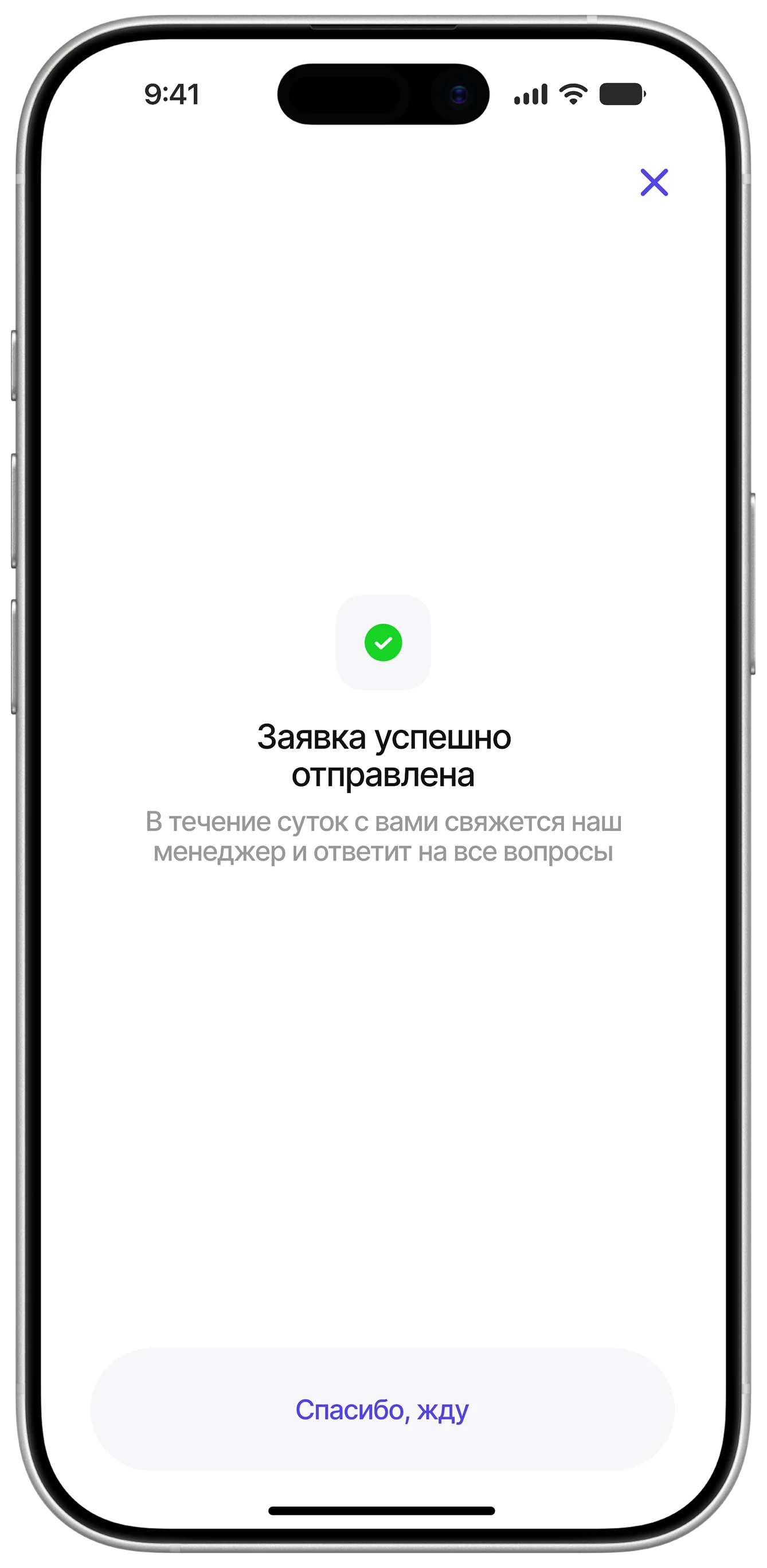
Screens about the franchise benefits
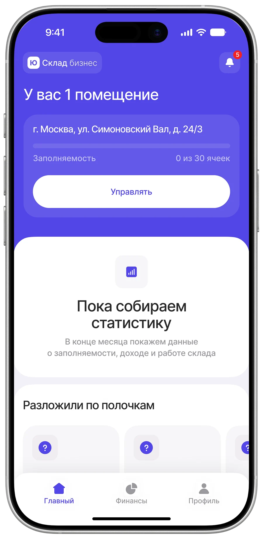
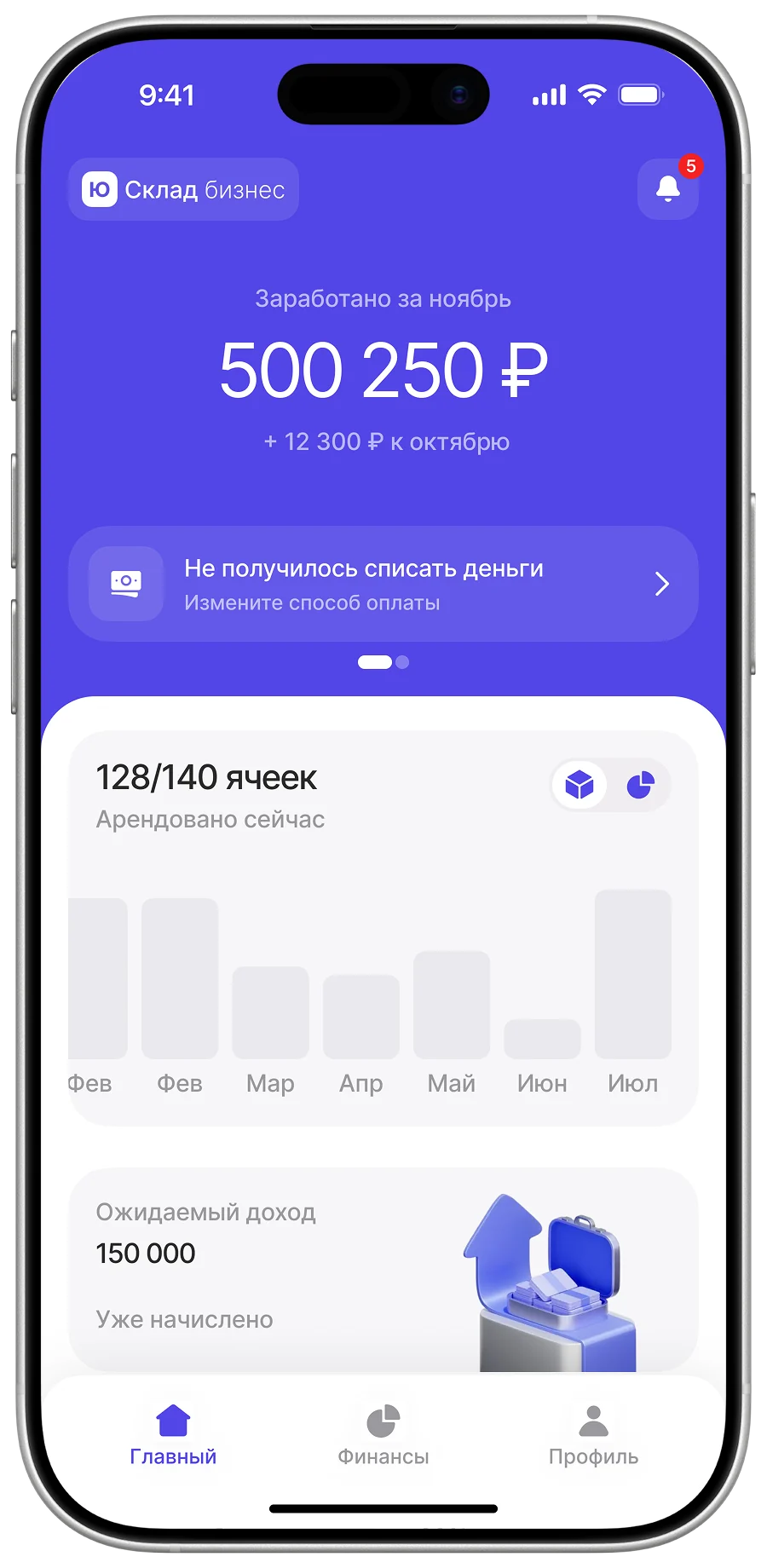
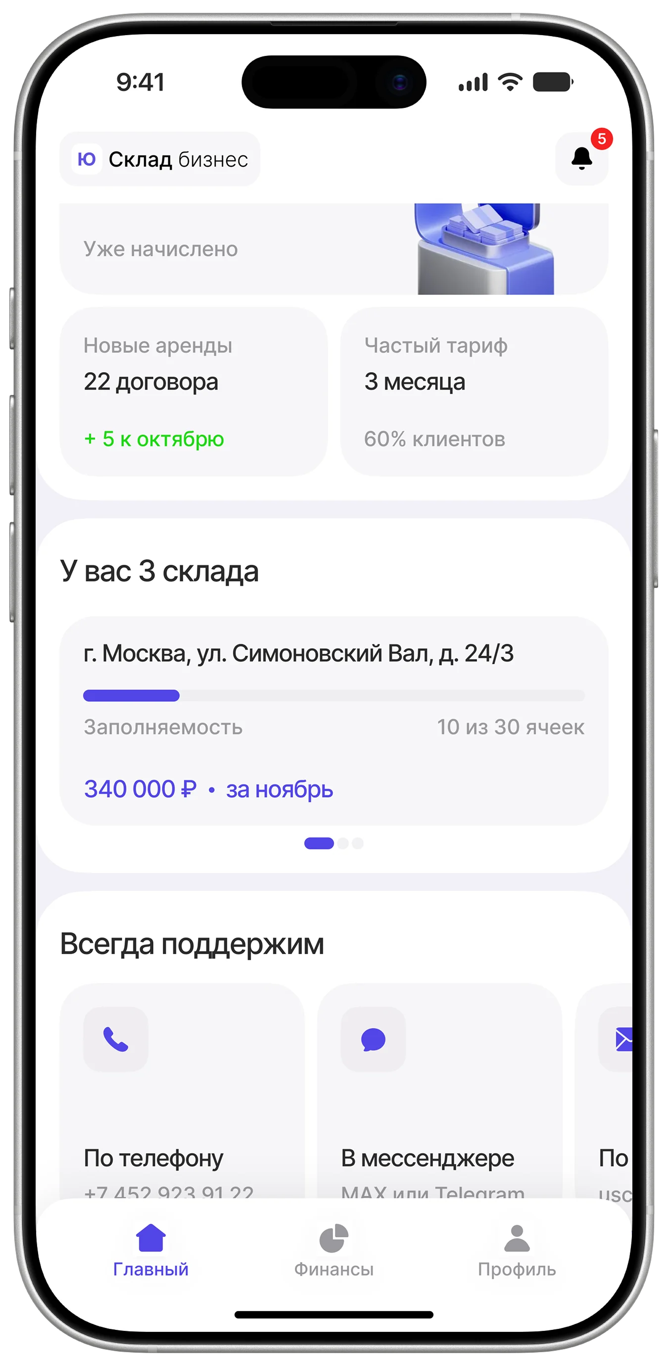
Home
The first screen answers the question “how is business?”: revenue, weekly rental dynamics, the most popular plan. Deeper analytics was deliberately left out of the MVP.
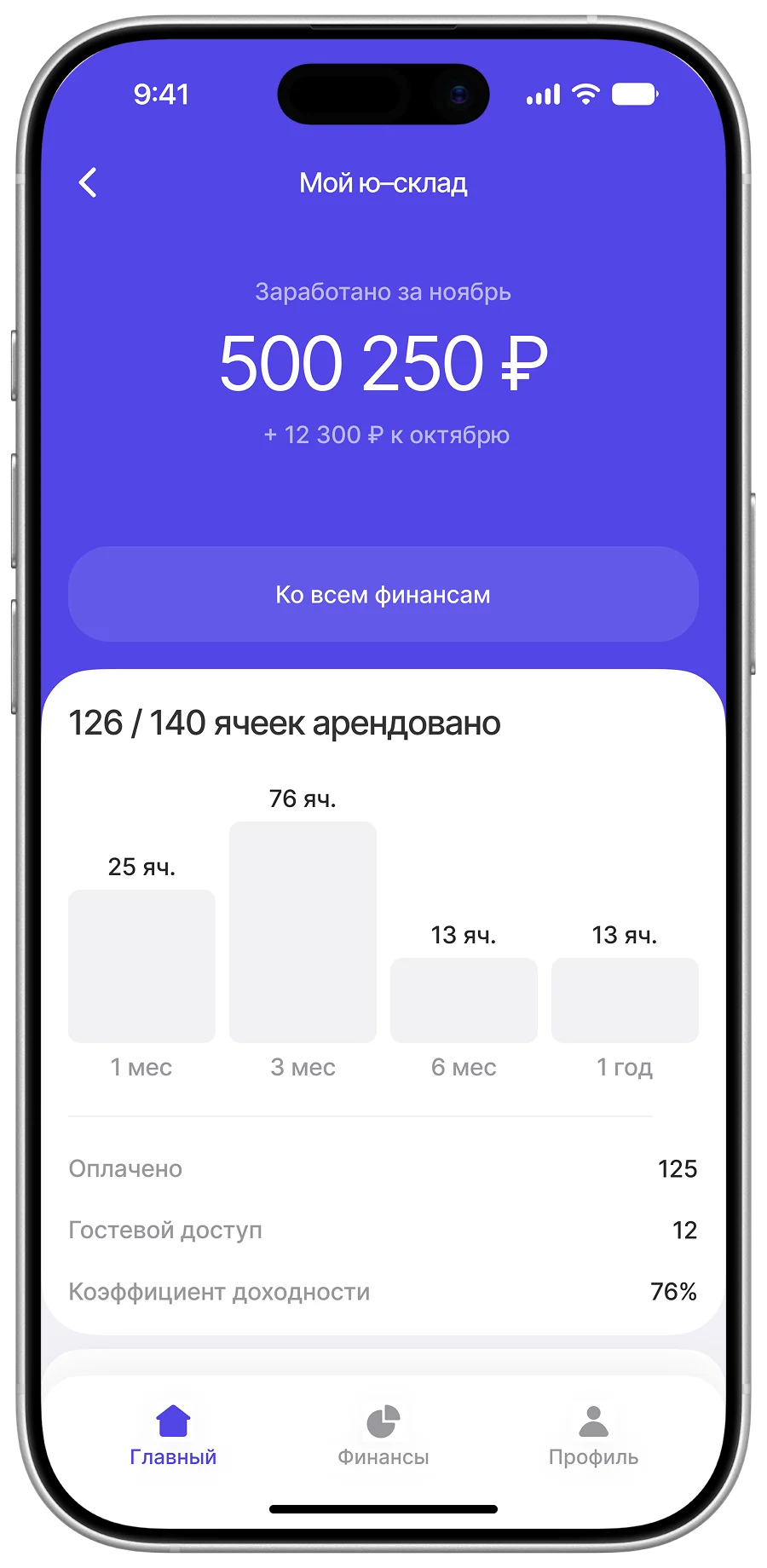
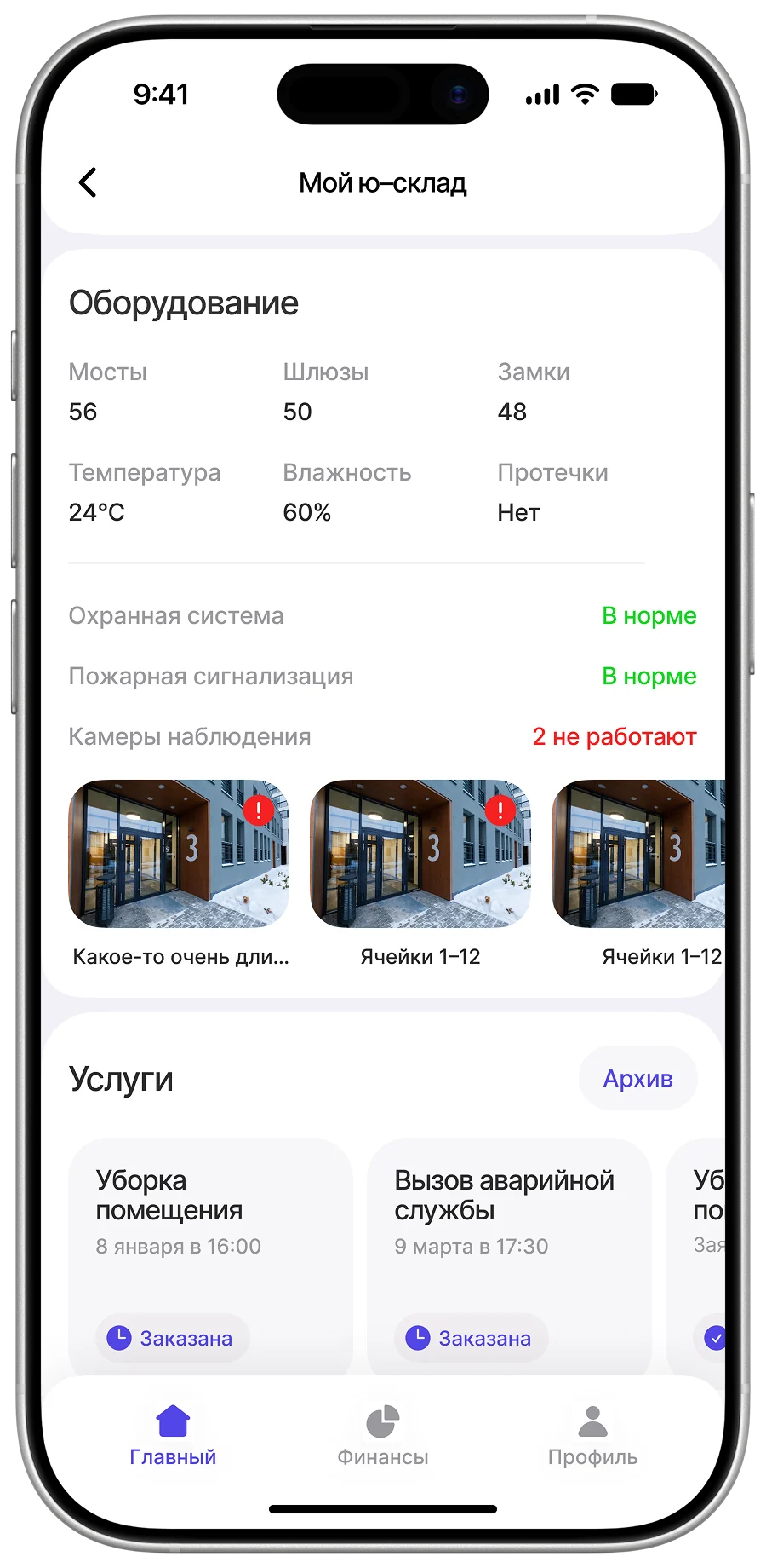
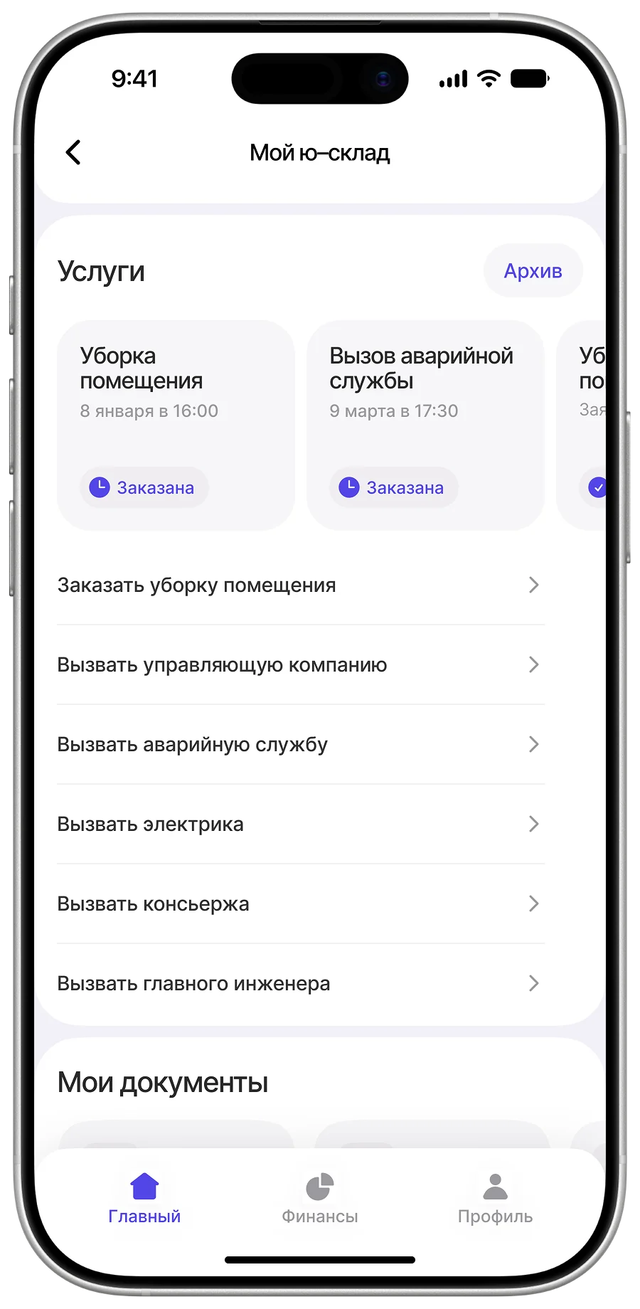
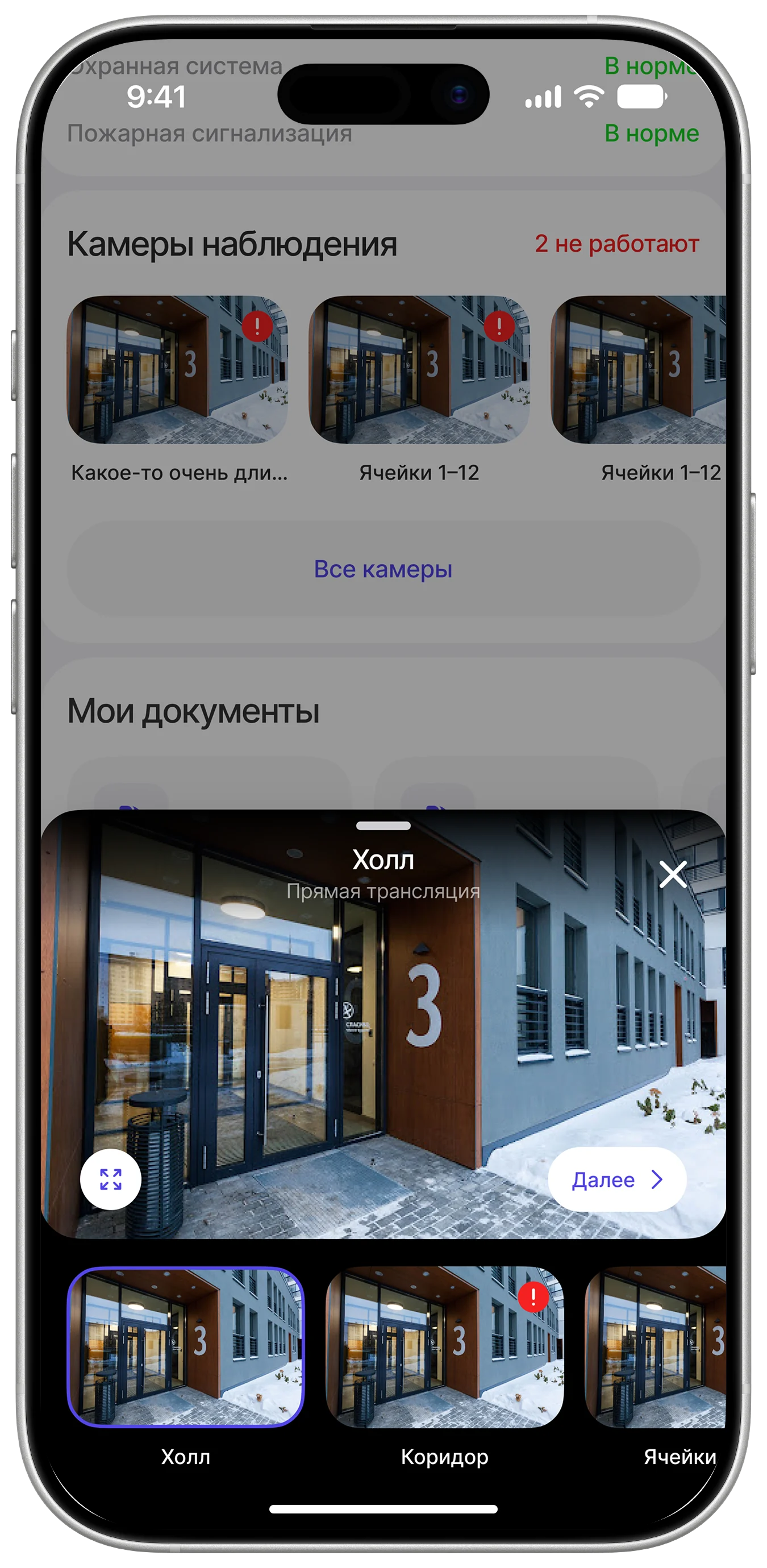
The site page
A control panel for the site, in a phone: finances, equipment and network status, cameras, ordering cleaning and refills, documents. The very thing there was “nowhere to look at”, designed from scratch.
Finances
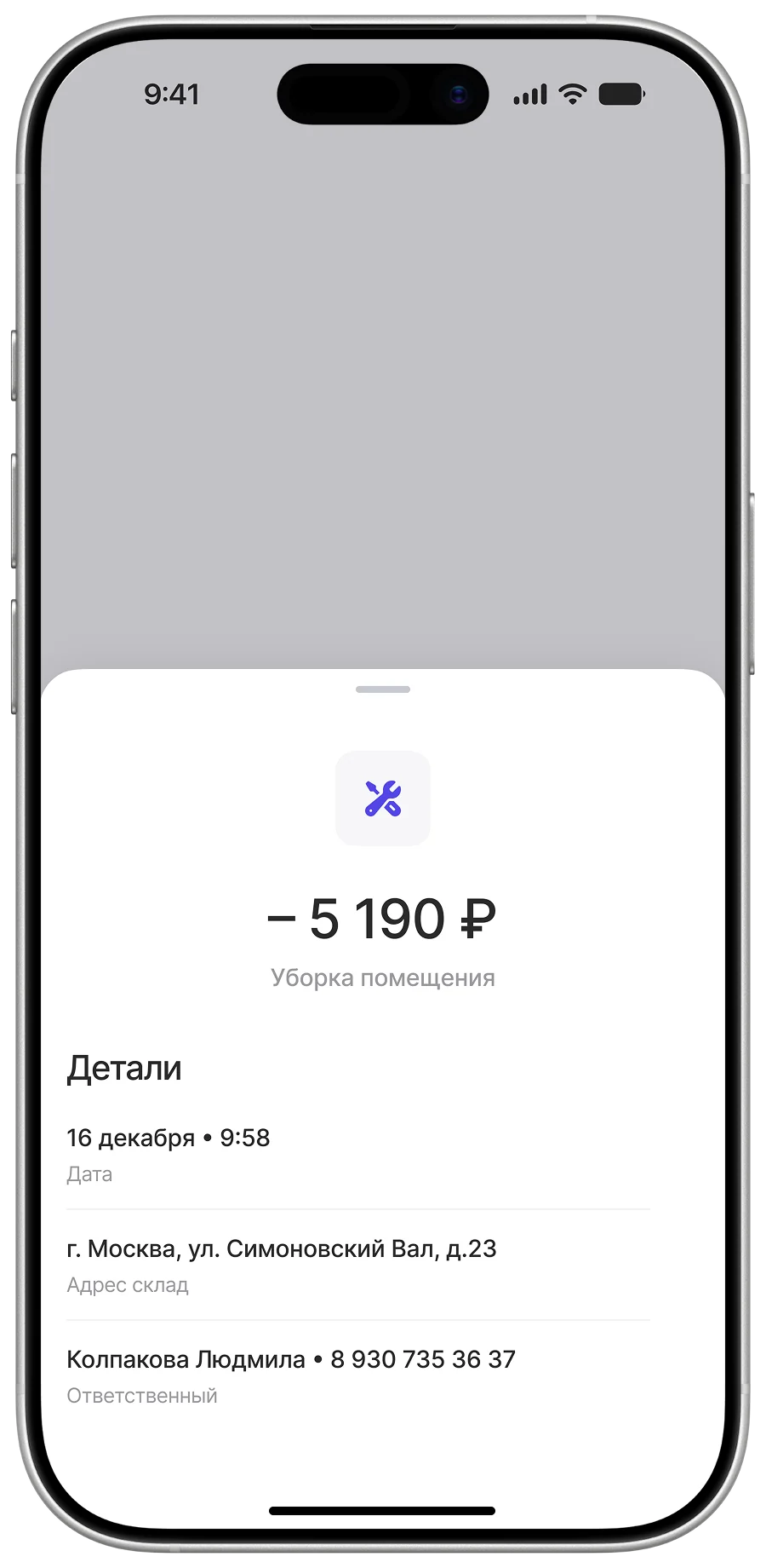
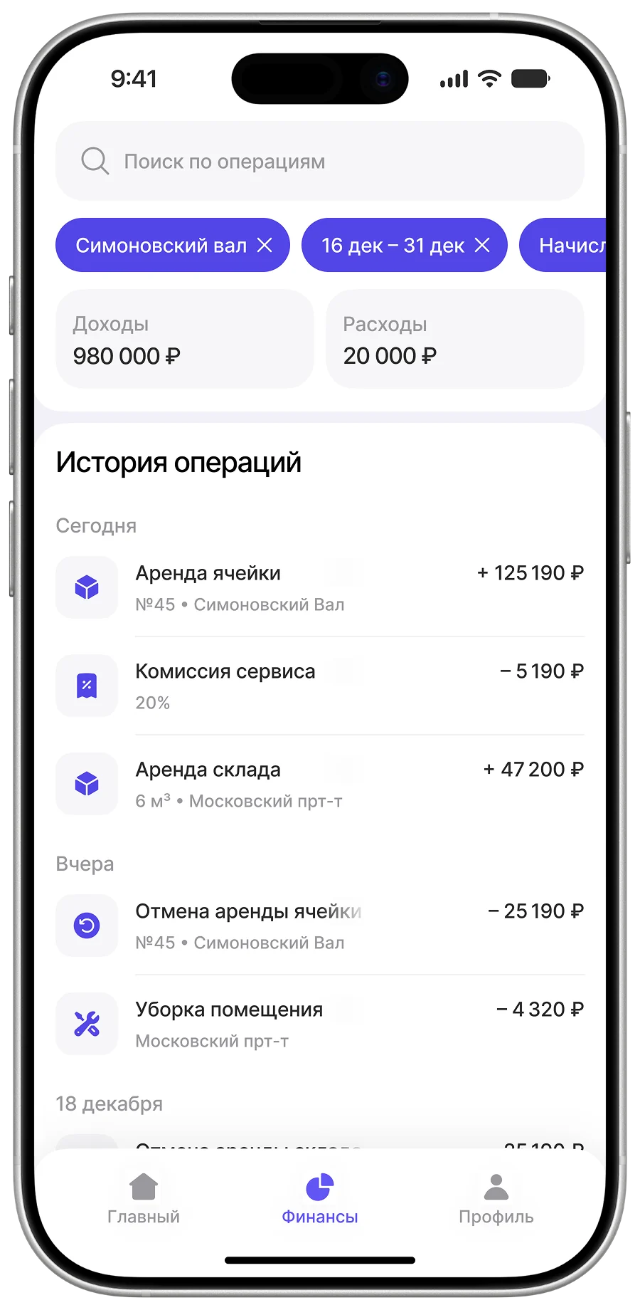
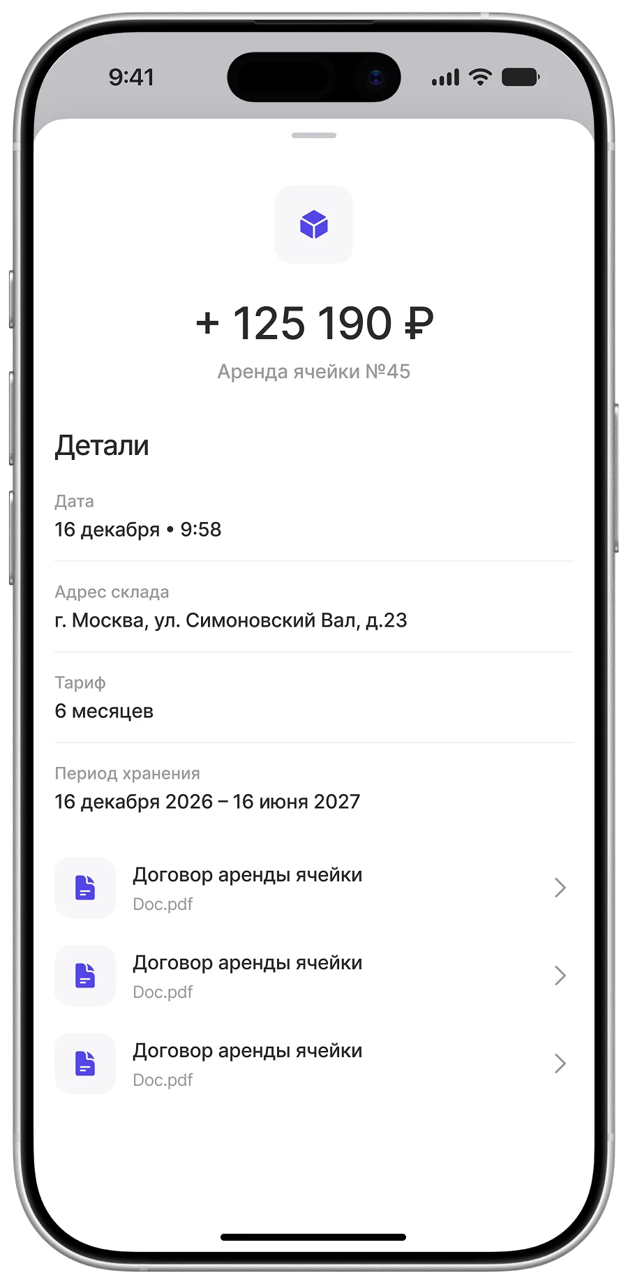
Transparency is what makes a commission model trustworthy, so every transaction is visible: rent coming in, the service fee, charges for extra services. A partner can always see how their payout adds up.
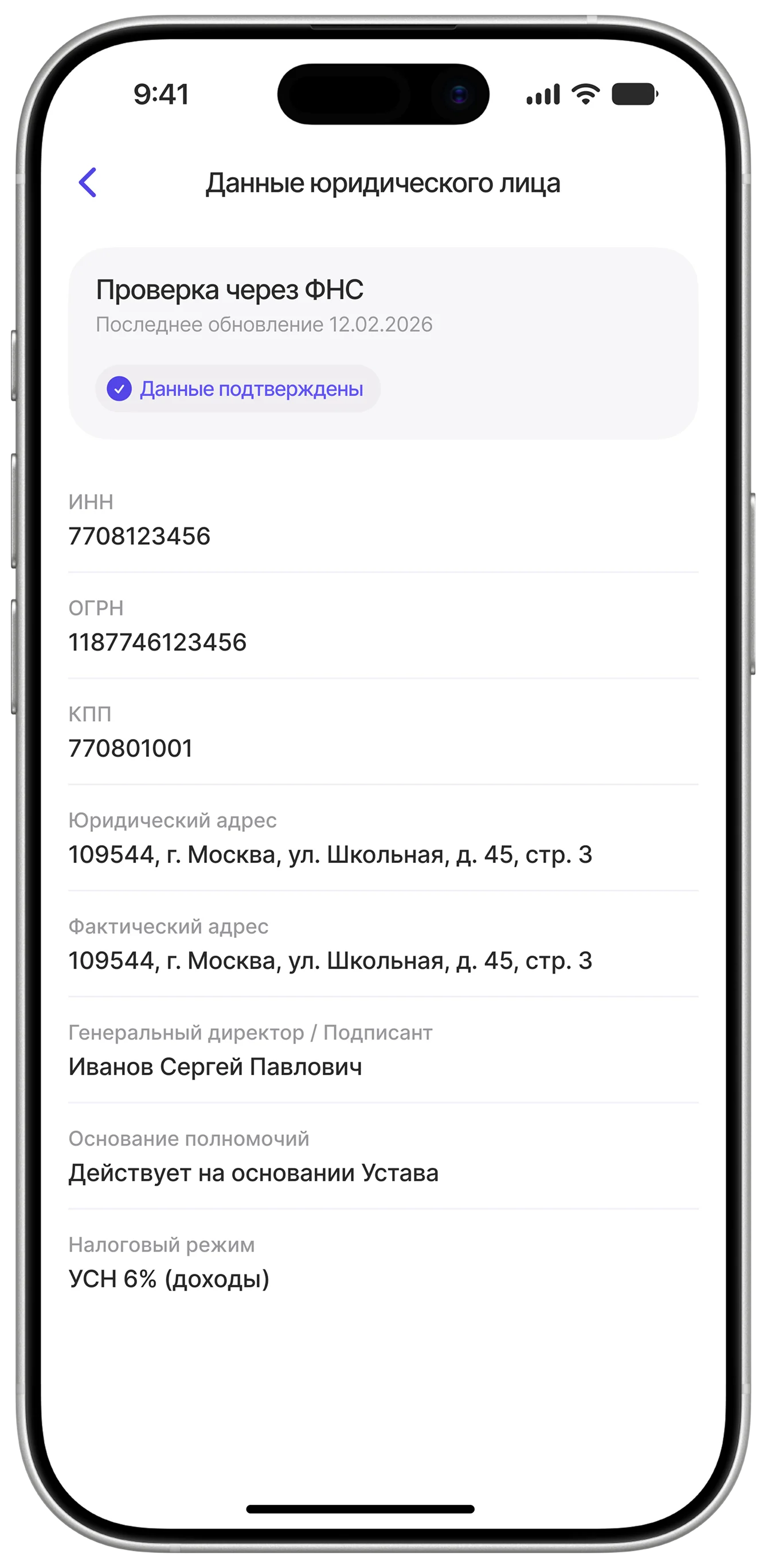
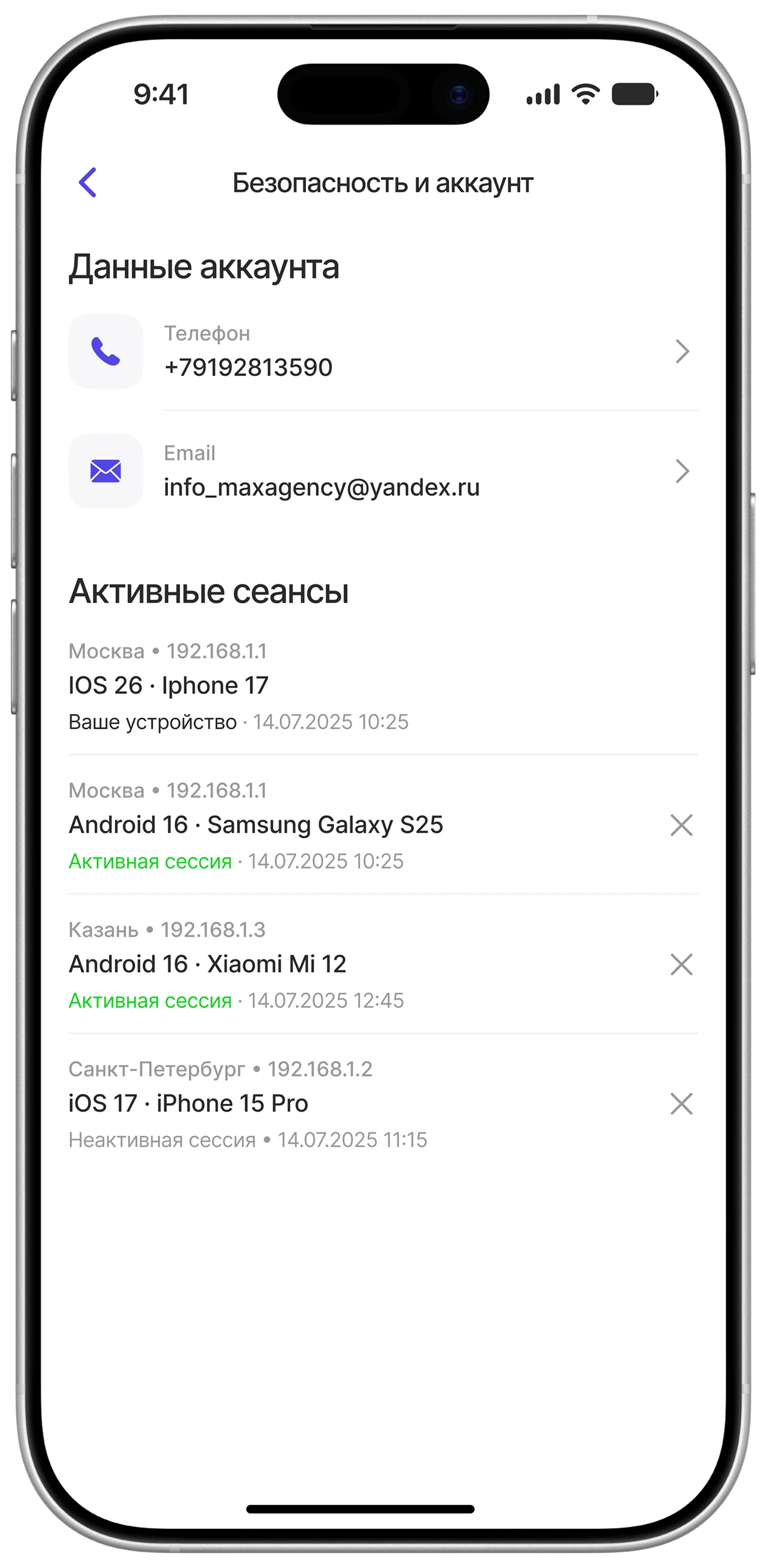
Profile
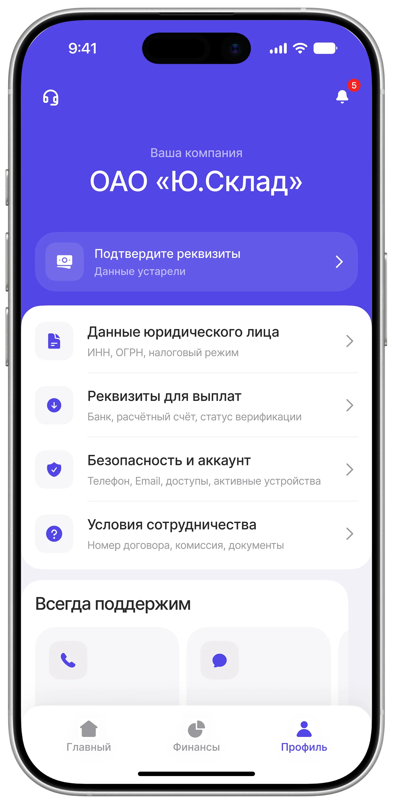
Everything legally important in one place: company details, payout information, account settings and active sessions. A dull but critical area, where a mistake costs someone their payment.