Adapting a marketplace seller dashboard for mobile
Context
Tandem is a marketplace for equestrian goods and services. Sellers run everything from a web dashboard: products, services, orders, finances, stores, chats and reviews.
The brief
The client wanted the dashboard to work fully from a phone. Not a trimmed-down version, but the same flows as on desktop — from creating a product to handling a refund. Tables, long forms and navigation were the hard parts.
My role
I adapted the desktop flows to mobile patterns under the guidance of senior designer Valeria.
Outcome
The mobile dashboard is in production. Every desktop flow works from a phone with nothing cut: sellers add products, handle orders and refunds, and track payouts.
290+
Mobile screens
41
Dashboard flows
200+
Desktop screens
2. Adaptation rules
Table → card
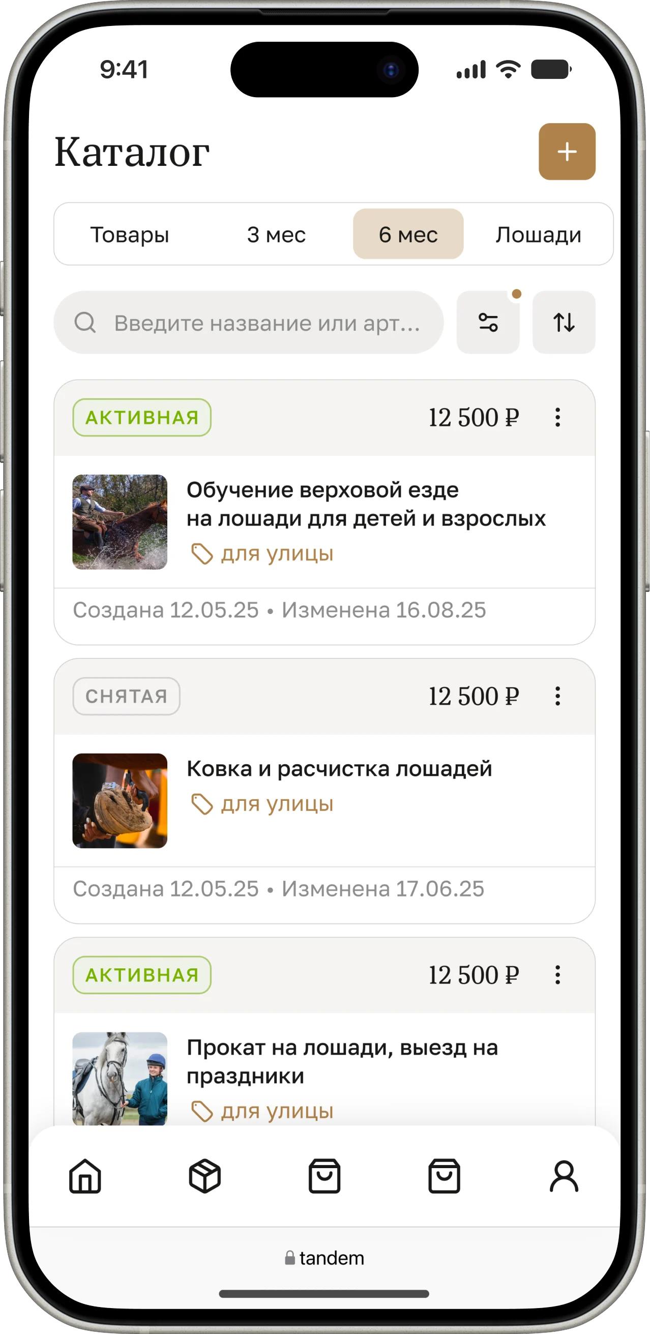
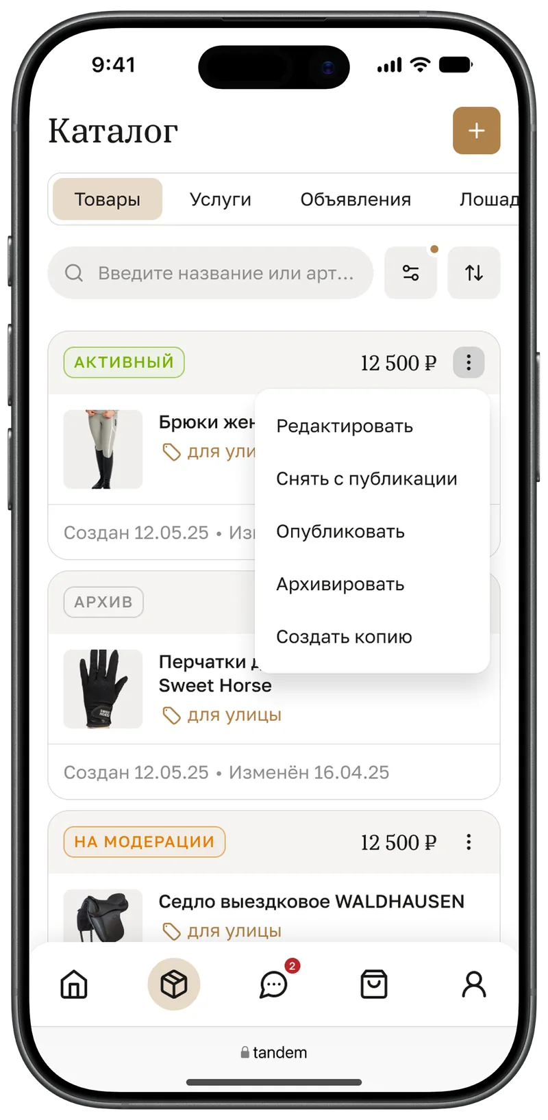
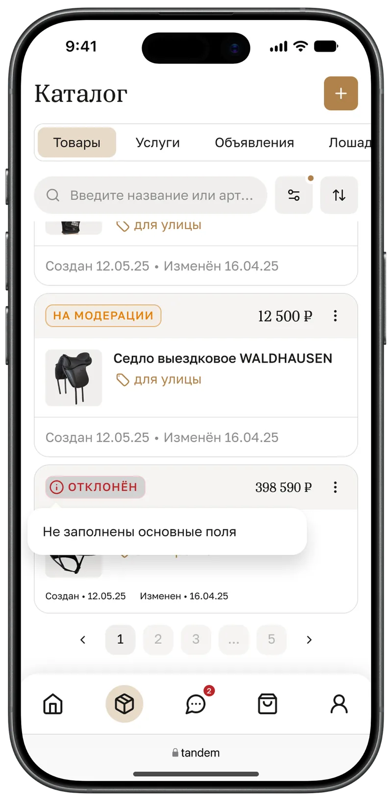
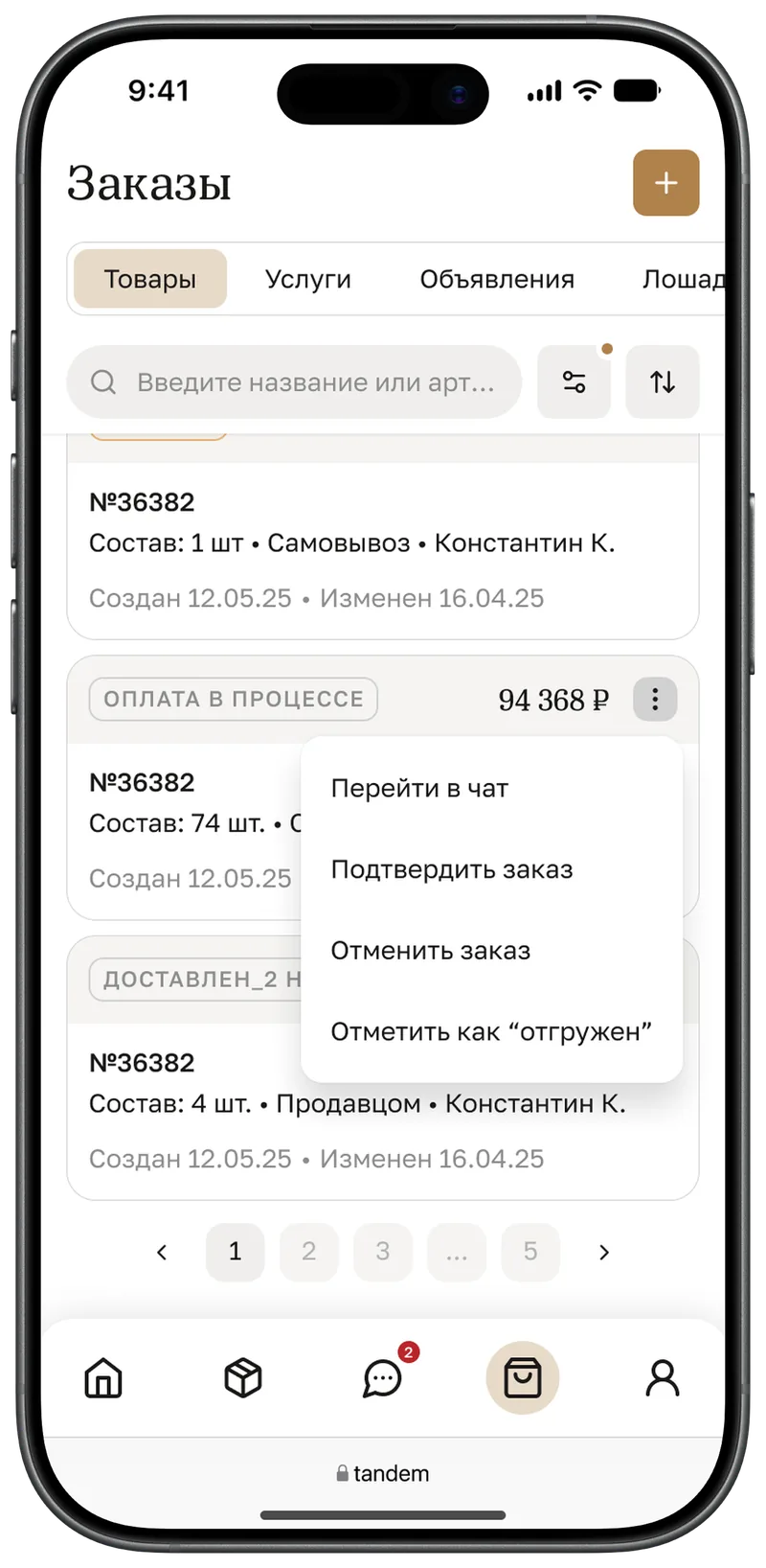
A row becomes a card: status and amount in the header, the item itself in the middle, dates in the footer.
Filters → sheet
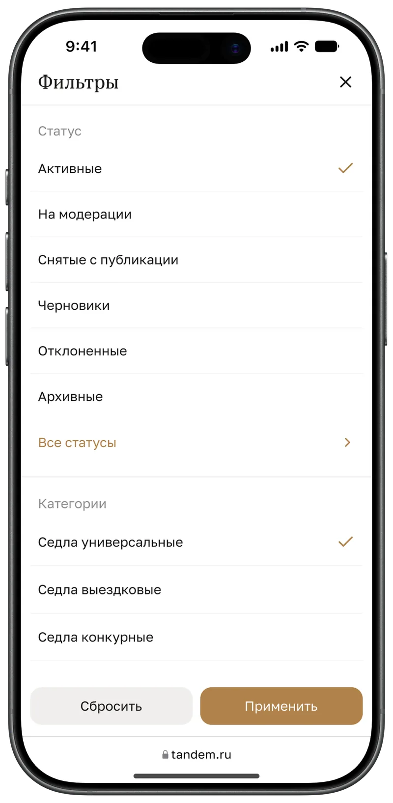
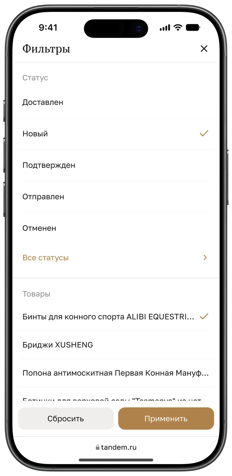
A row of dropdowns collapses into one button. Every filter opens in a full-screen sheet with “Reset” and “Apply”.
Hover → tap
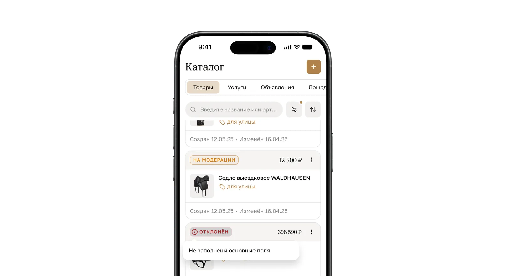
Tooltips that appeared on hover on desktop now open on tap.
Primary actions at the bottom
Buttons from the page header move to a pinned bottom bar, within thumb reach.
Sidebar → tab bar
The most frequent sections live in the tab bar at the bottom of the screen.
Tabs scroll
Tabs neither wrap nor shrink — they scroll horizontally.
3. Navigation

How the sidebar became a tab bar
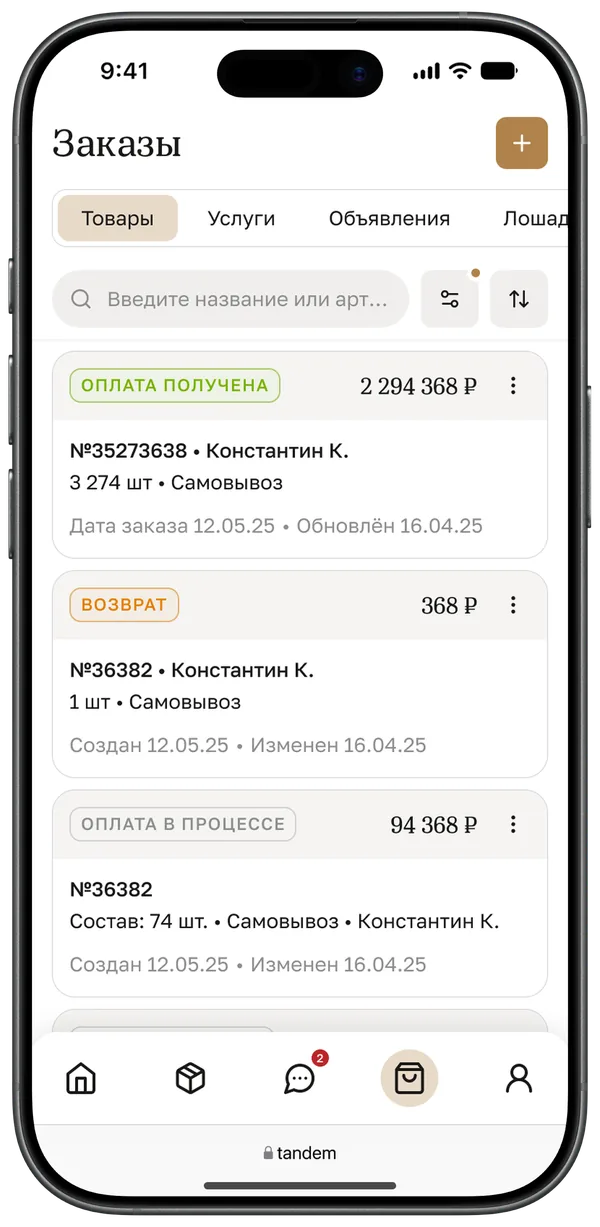
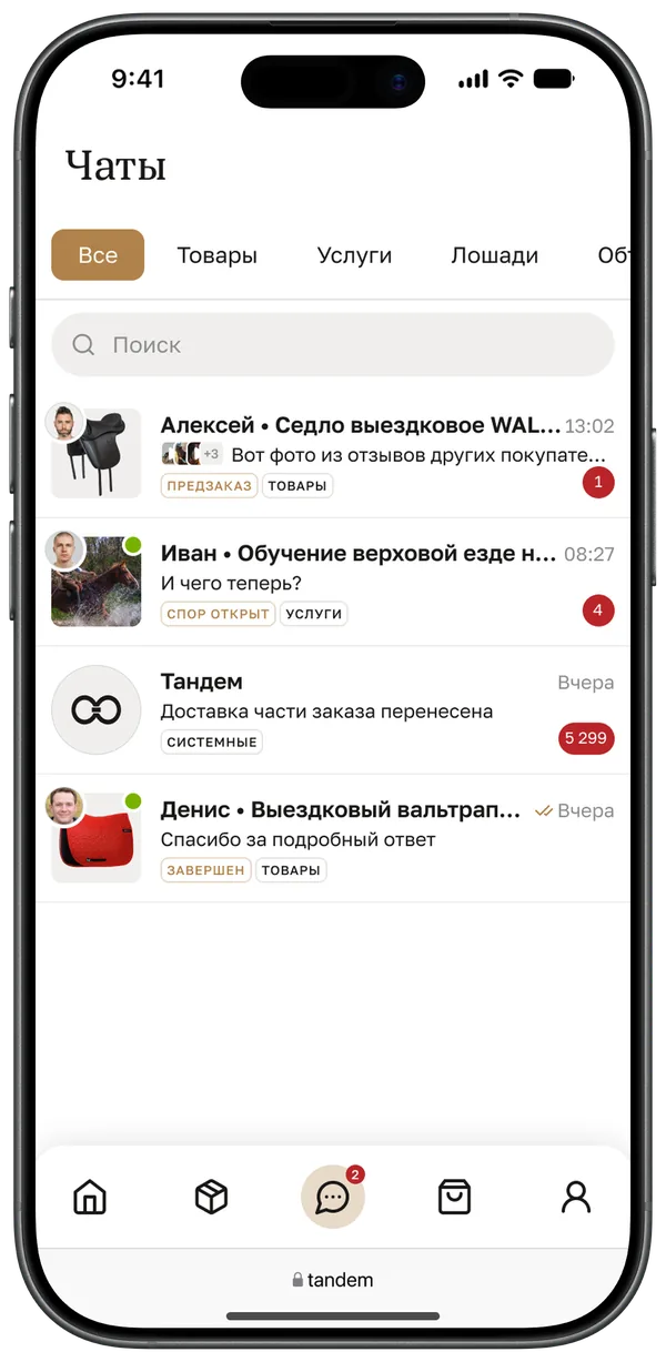
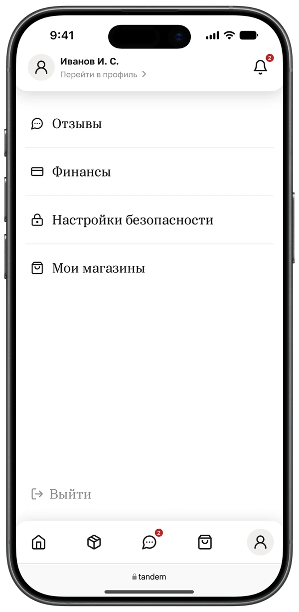
The sidebar splits the dashboard by what you sell: products and services each have their own lists and their own orders, listings get a section of their own. Eleven items don’t fit into a tab bar, so on mobile the axis flipped. A tab now answers “what do I want to do” — browse the catalogue, handle orders, reply in chat — while products, services and listings became tabs inside a section. Everything frequent sits under the thumb, and going from products to services no longer means a trip back to the menu.
Catalogue and orders
“My products”, “My services” and “My listings” are gathered into “Catalogue”; product and service orders into “Orders”. Both sections share the same tabs, search and filters: learn one screen and you know the other.
Chats move to the tab bar
On desktop, chats are one item out of eleven. On a phone sellers reply to buyers on the move, so chats got their own tab, and the unread counter is visible from any screen.
Rare things live in the profile
Reviews, finances, security settings and stores aren’t opened every day. They moved to “Profile” — a four-row list one tap from the tab bar. “Log out” sits there too, on its own at the bottom of the screen.
Store header
The store switcher and the QR code from the sidebar header moved into “My stores”: with more than one store the section opens as a list, and the QR code lives on the store page.
4. Tables into cards
How a table turns into cards
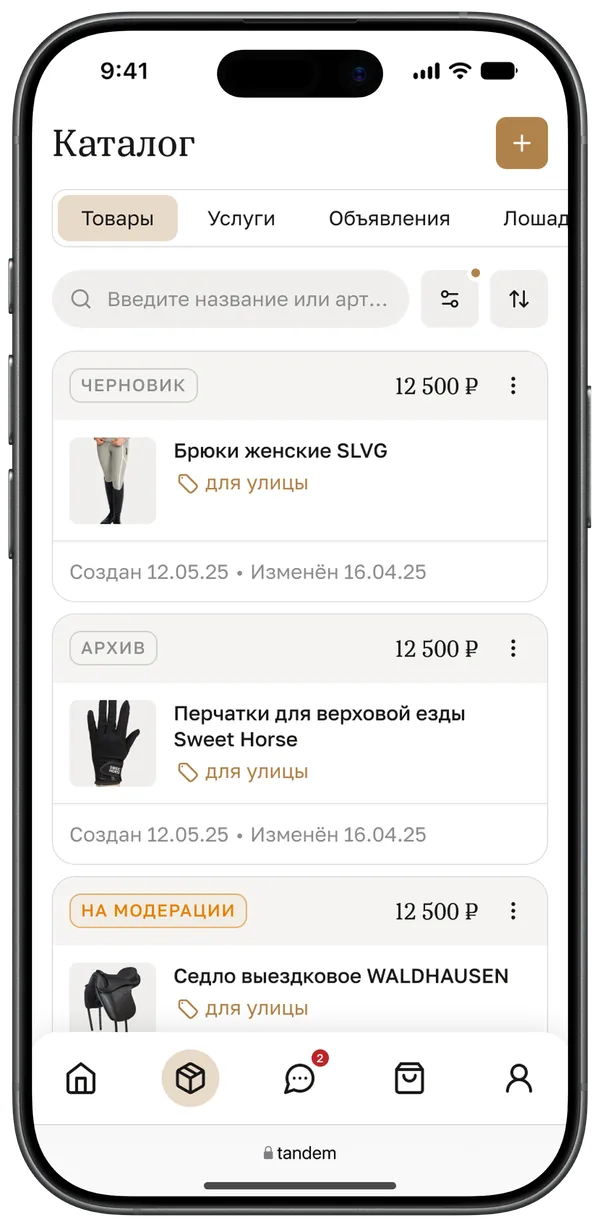
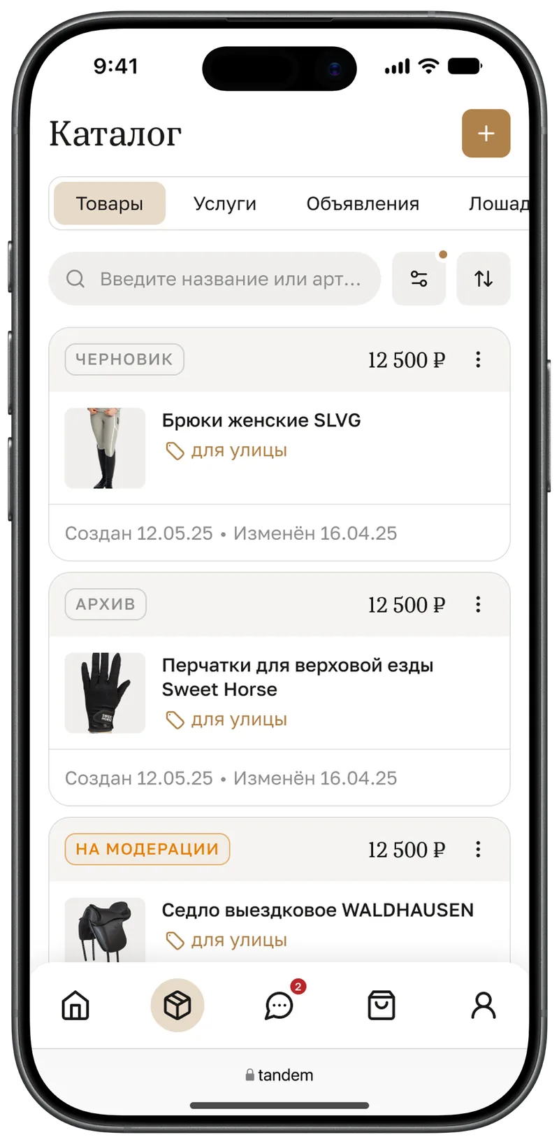
A table row becomes a card: status and amount rise into the header, the category becomes a tag under the title, dates drop into the footer. The row of filters folds into one button, and the sidebar into a tab bar.
My products
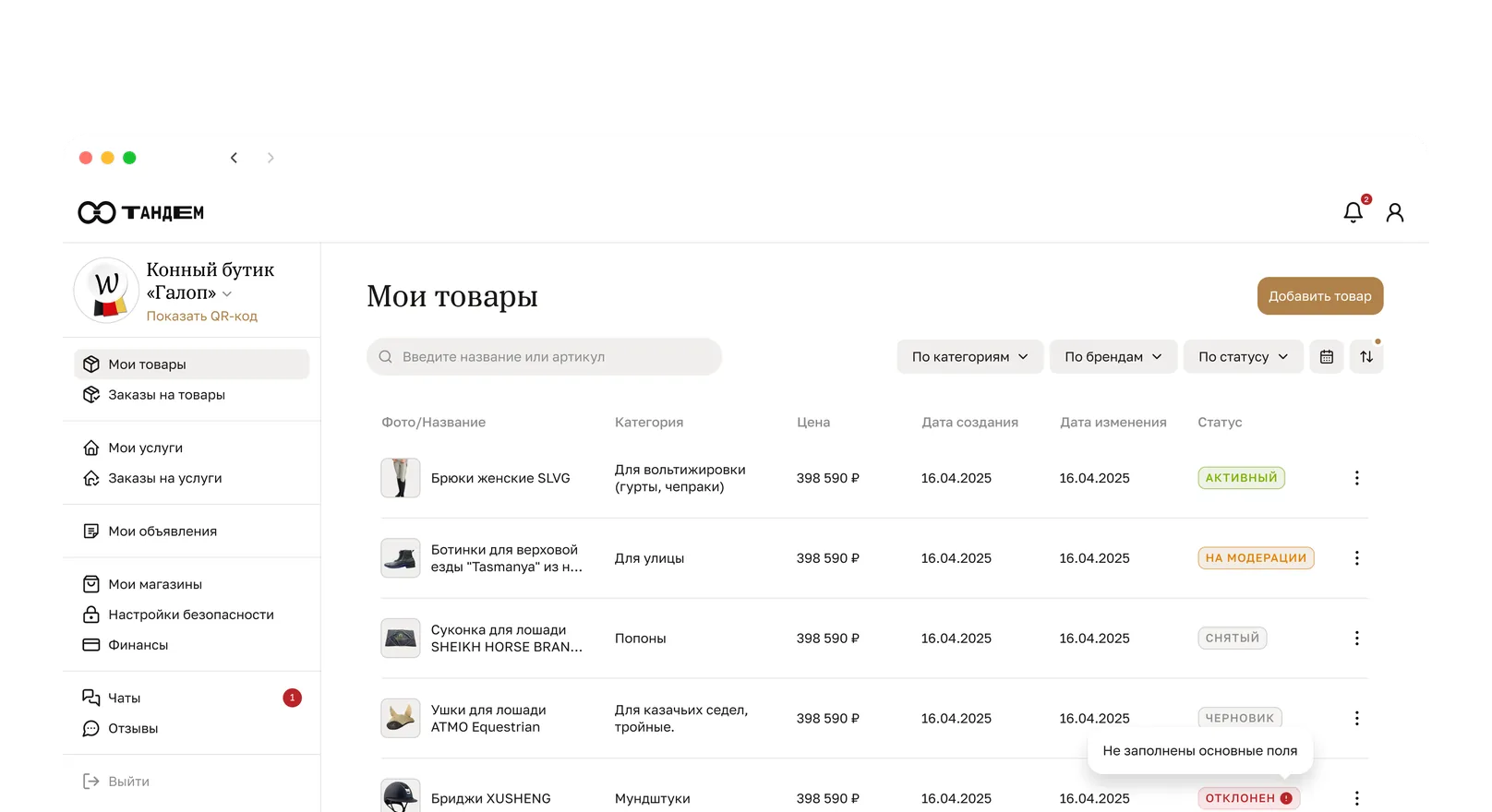
A product has six columns on desktop. On a phone the card answers the two questions that matter first: what state the product is in and what it costs. The category becomes a tag under the title, dates go to the footer, actions hide in a “three dots” menu, and filters move into a sheet.
Rejection reason
On desktop the rejection reason pops up when you hover the status. There is no hover on a phone, so the status became tappable: one tap and you see what to fix.
Finances
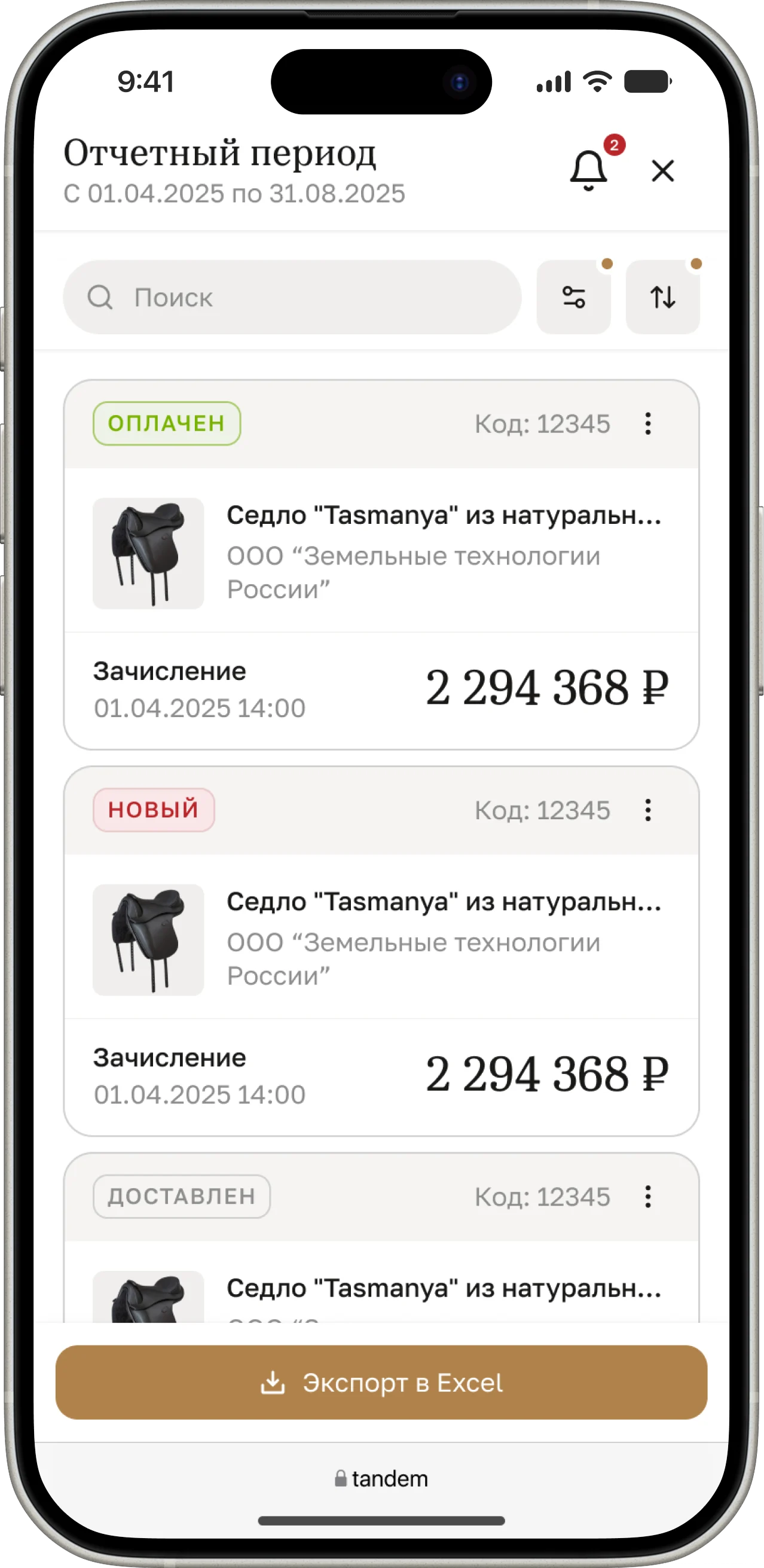
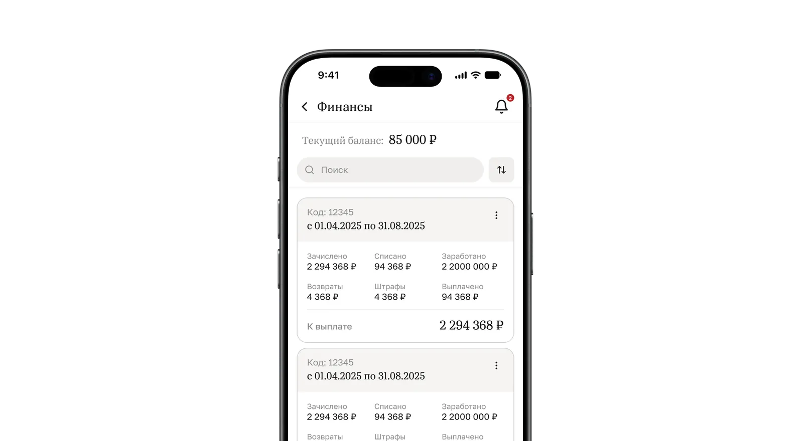
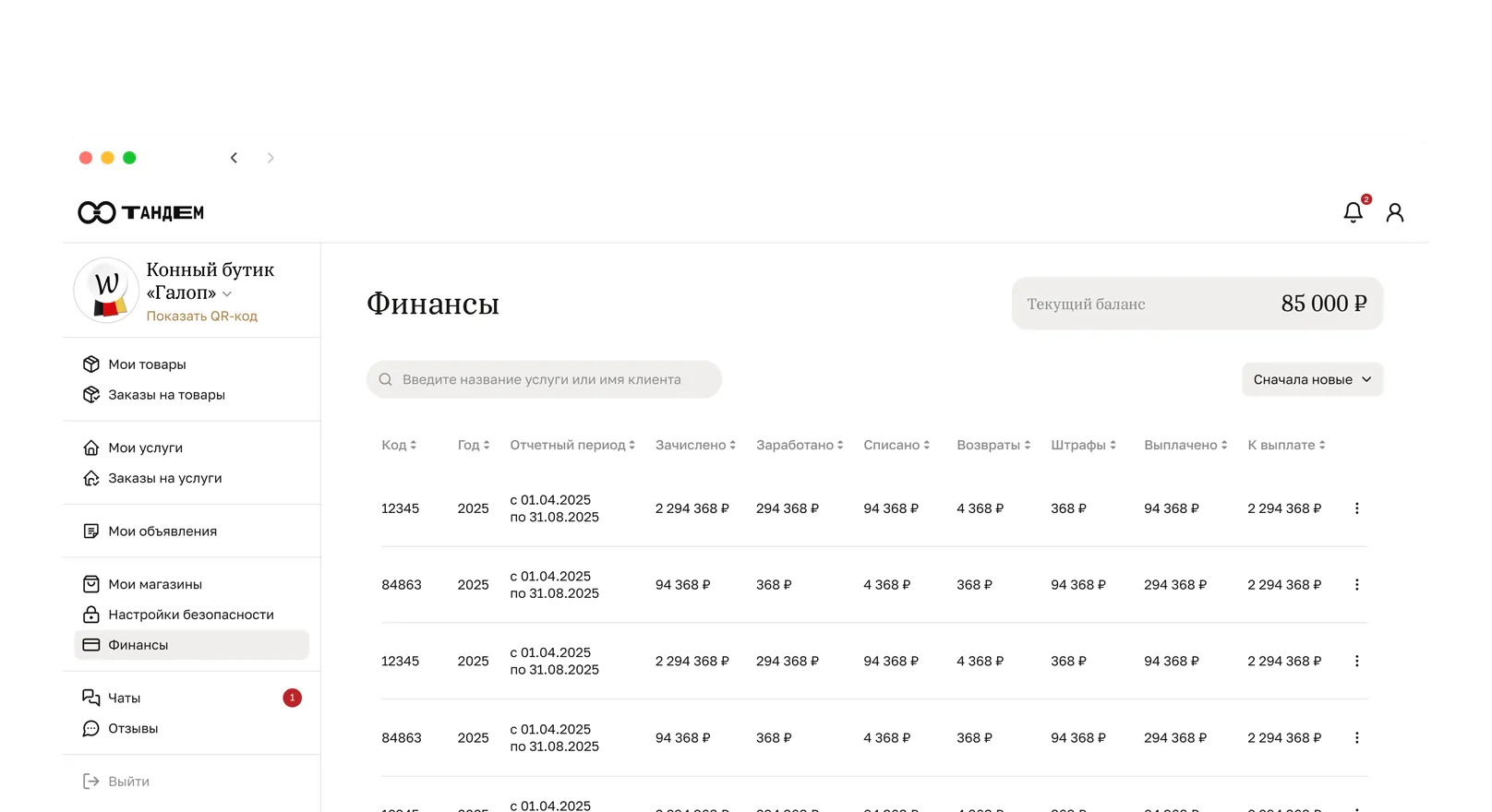
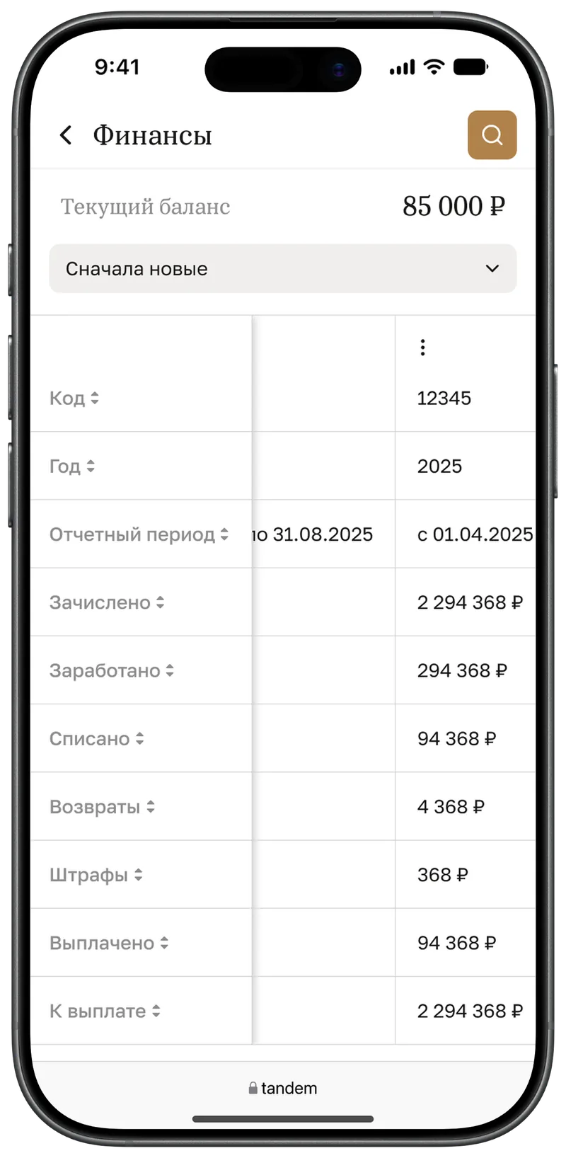
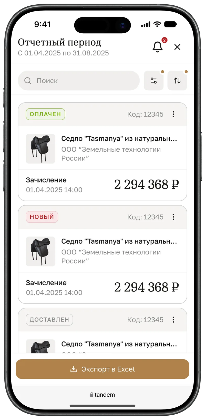
The heaviest table in the dashboard: a reporting period and eight columns of amounts. Stack them plainly and a single card fills the whole screen.
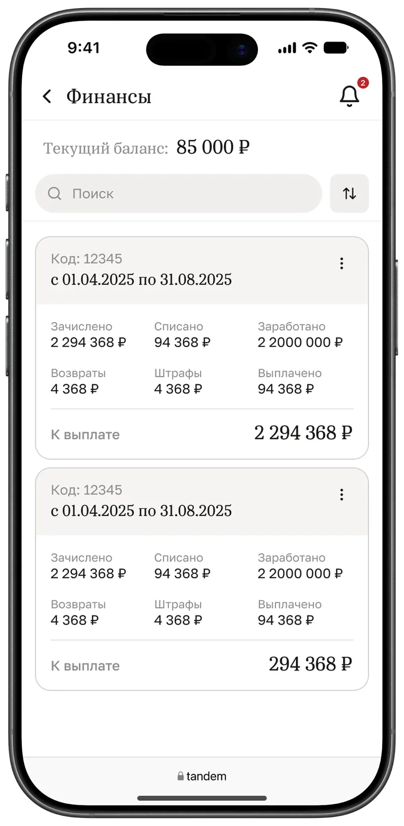
Two display options
We worked through two options. The first is a card with a grid of amounts where the “To be paid” total is set large. The second is a transposed table: columns become rows and periods scroll horizontally. Cards are easier to read on the move; the table wins when several periods need comparing. Inside a period the transactions are cards again — with an export-to-Excel button.
Orders
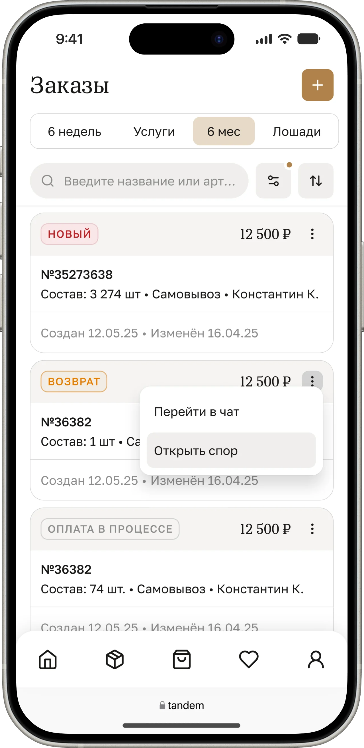
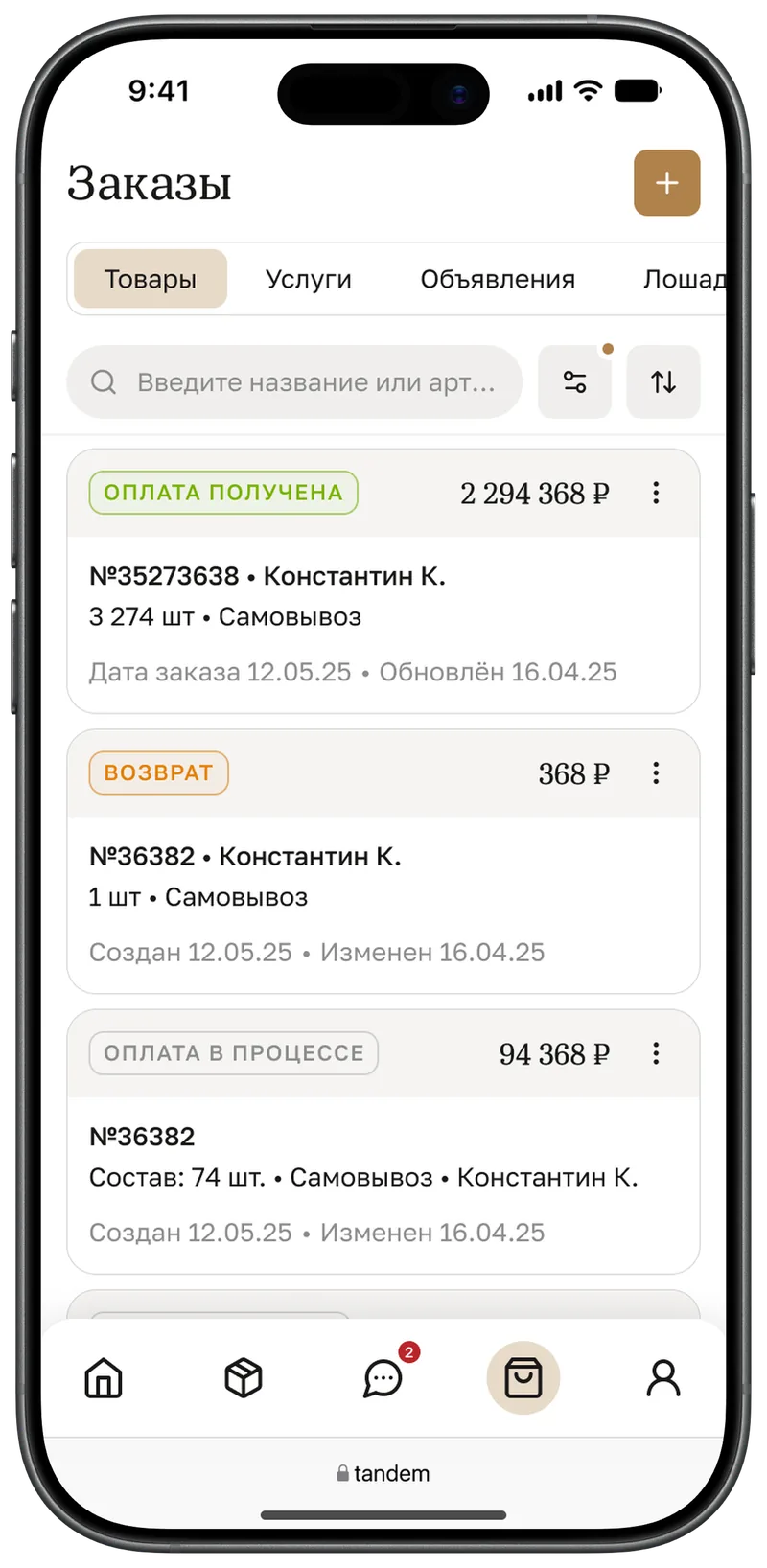
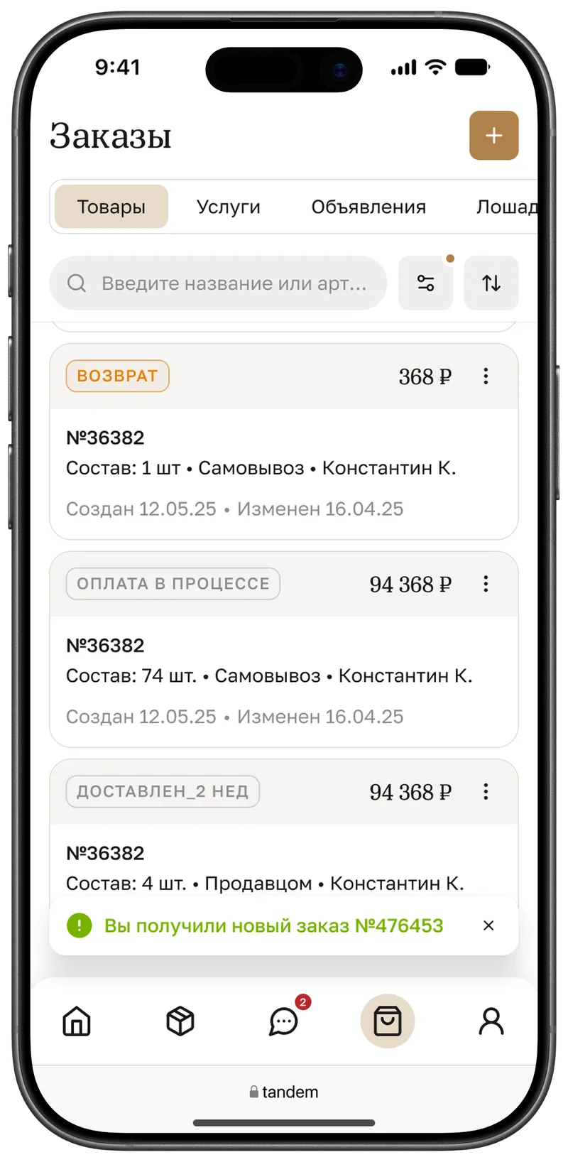
Same principle: payment status and amount in the header, number and buyer in the middle. A new order arrives as a toast, and the card menu lets you confirm, cancel or message the buyer right away.
5. Forms
Creating a product
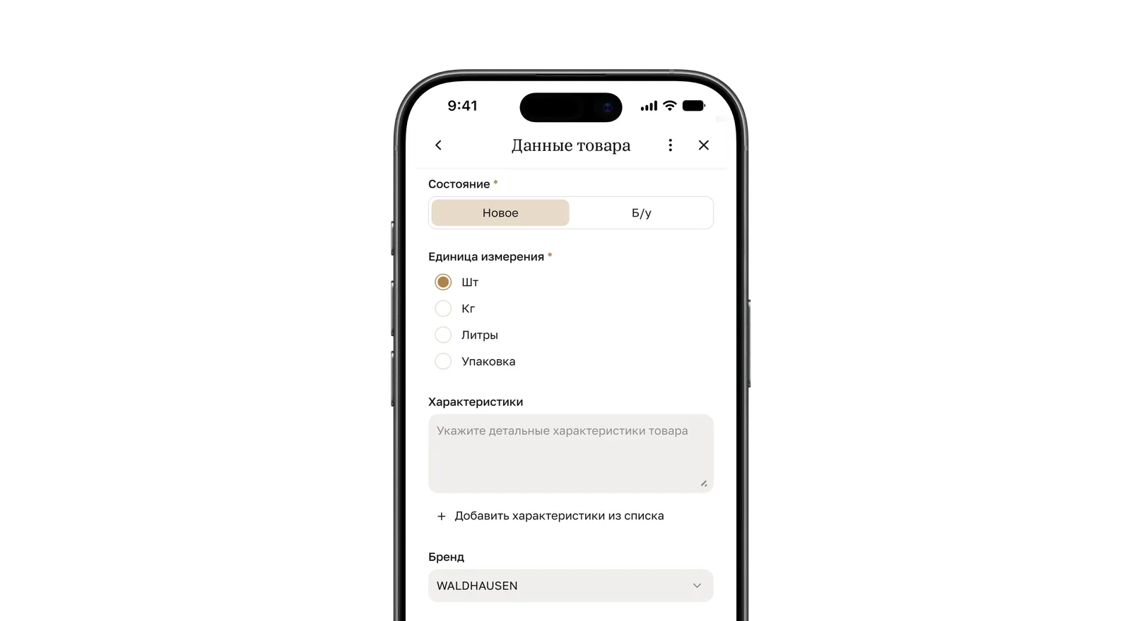
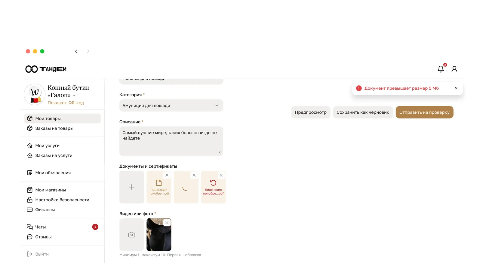
On desktop the form is a long page with buttons in the header. On a phone it is a full-screen view: the title and the close button stay put while the form scrolls beneath them.
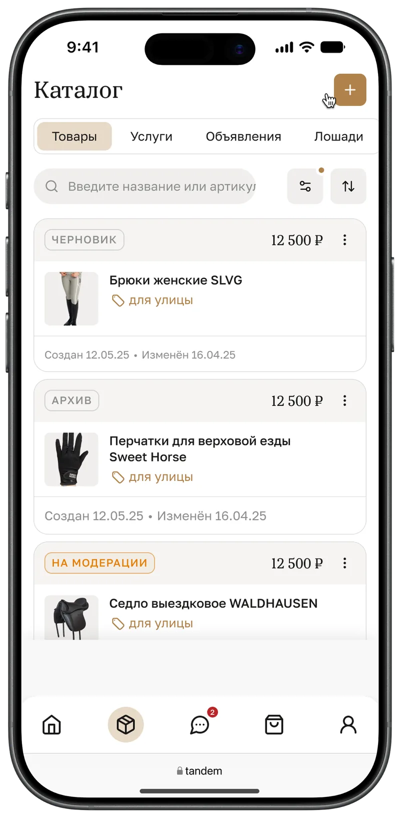
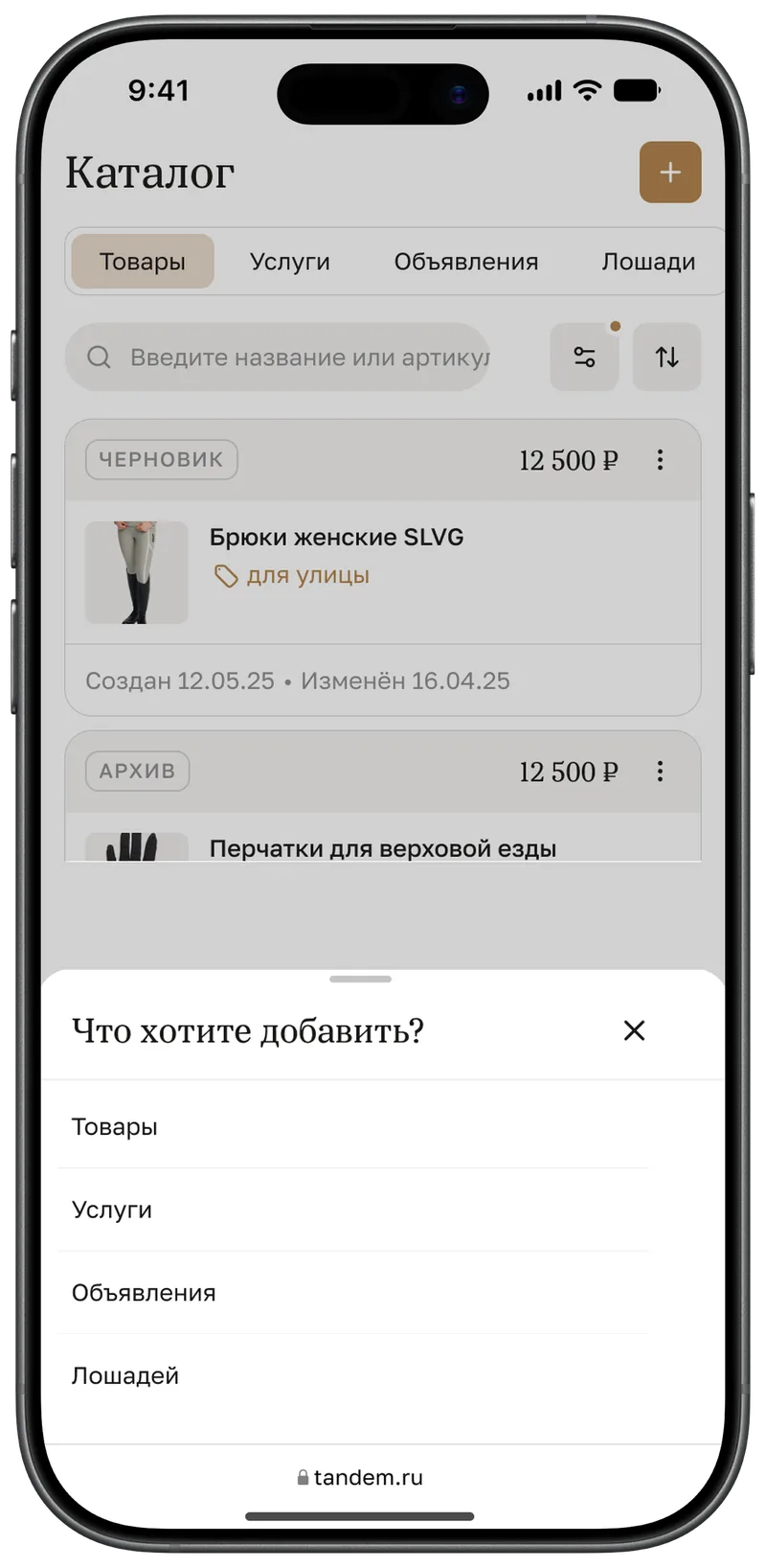
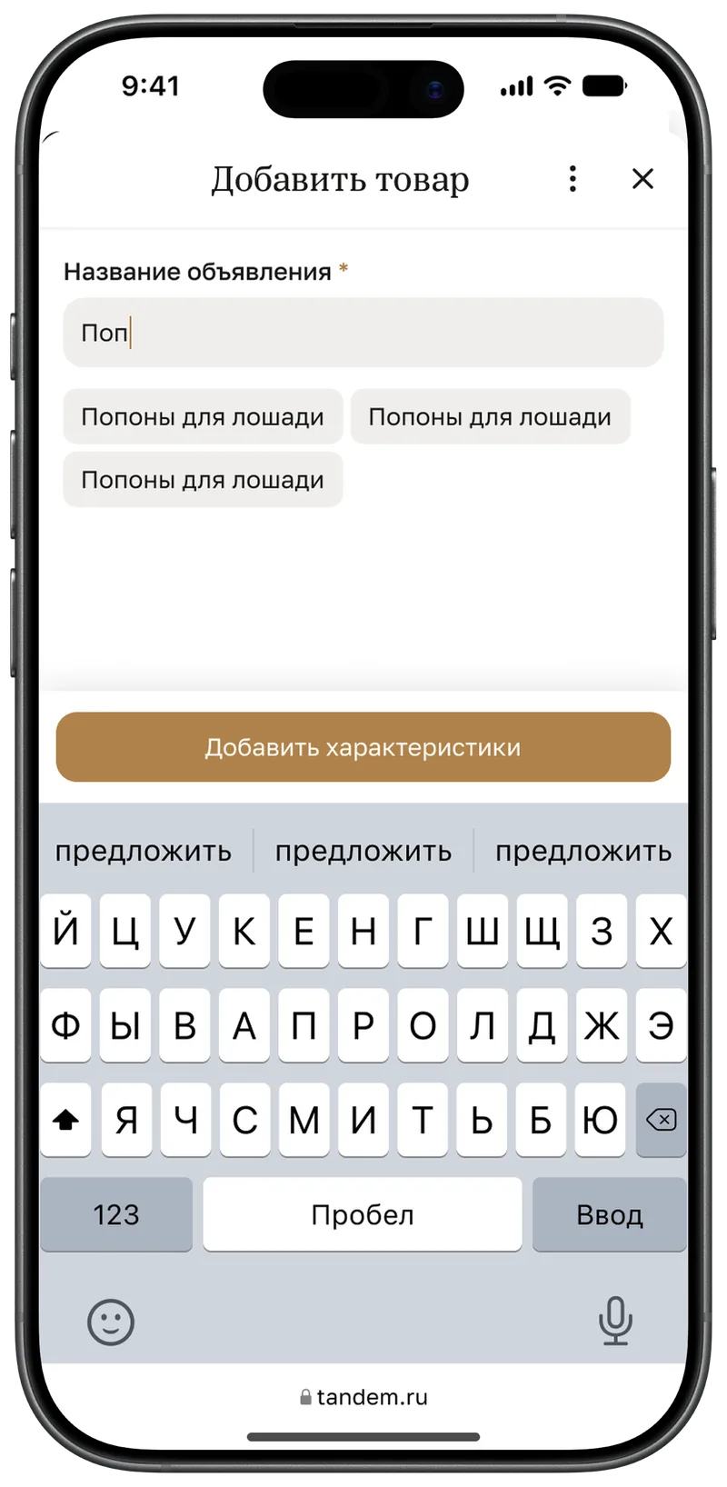
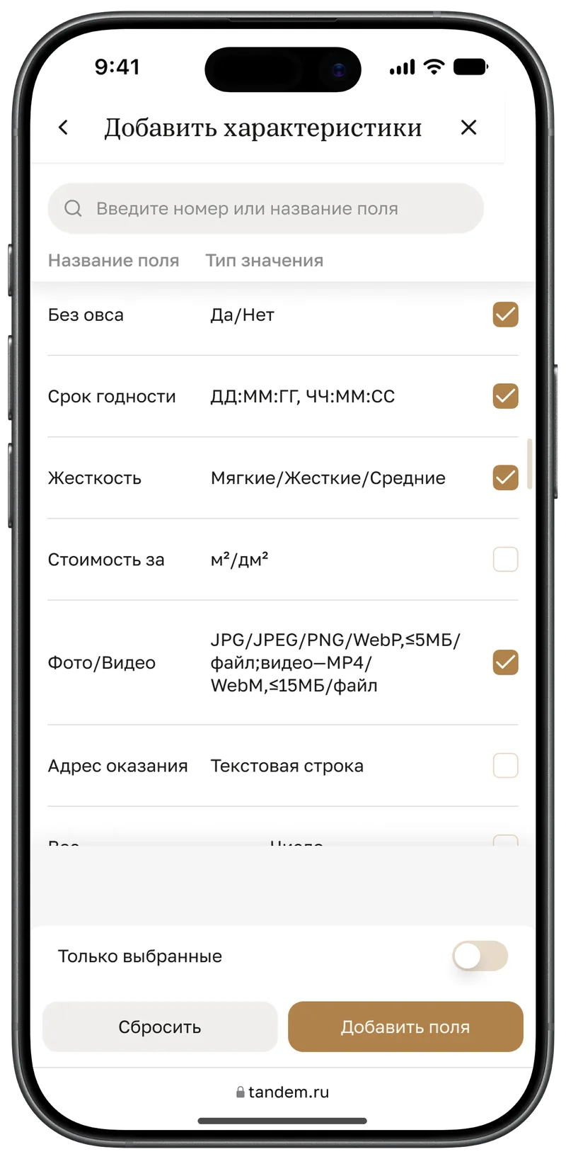
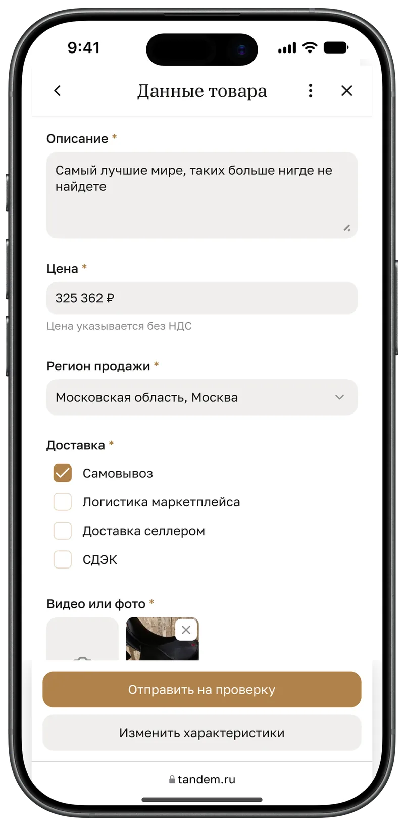
From the plus to a filled-in form
The plus in the catalogue header opens a sheet asking what to add. The first letters of the title suggest matches, and attributes are picked from a reference list on a separate screen — with search, a “Selected only” toggle and pinned buttons.
6. Order detail page
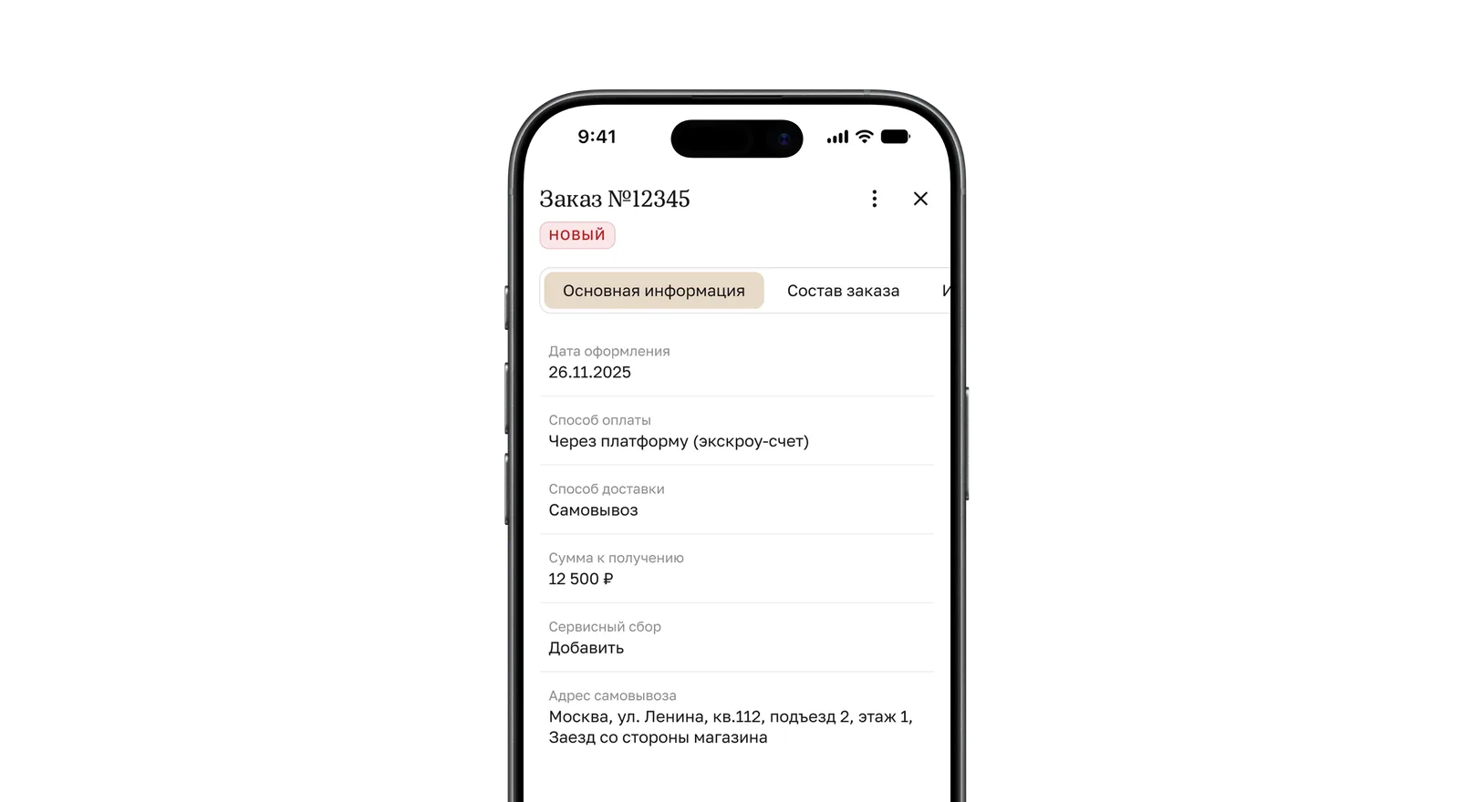
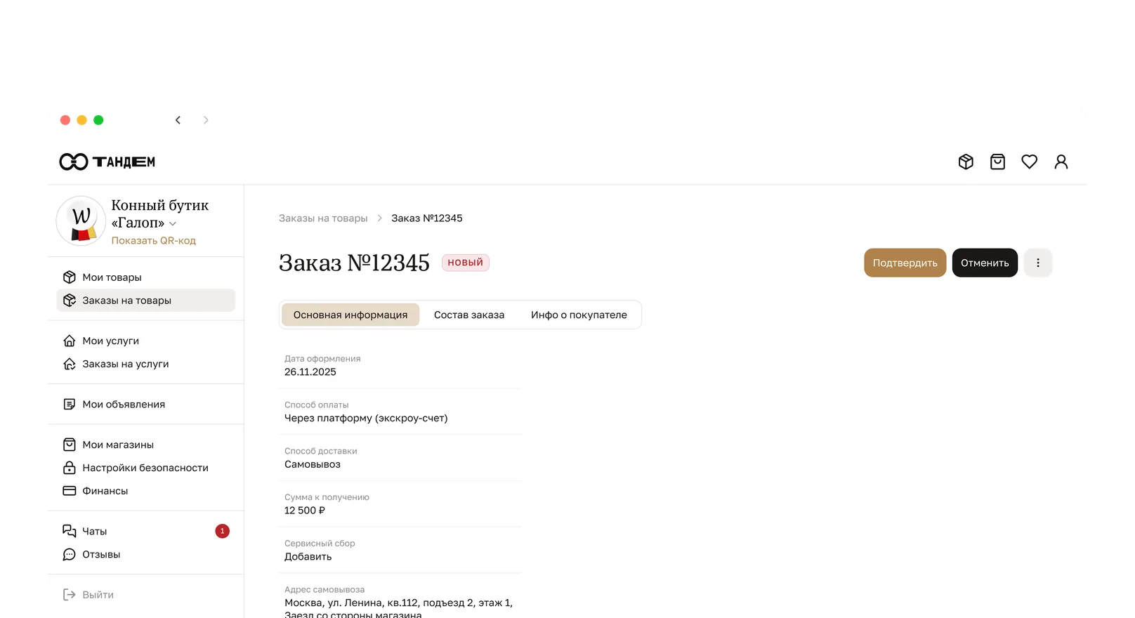
Order
The desktop tabs are kept but scroll horizontally. “Confirm” and “Cancel” are pinned at the bottom, and rare actions hide in a menu.
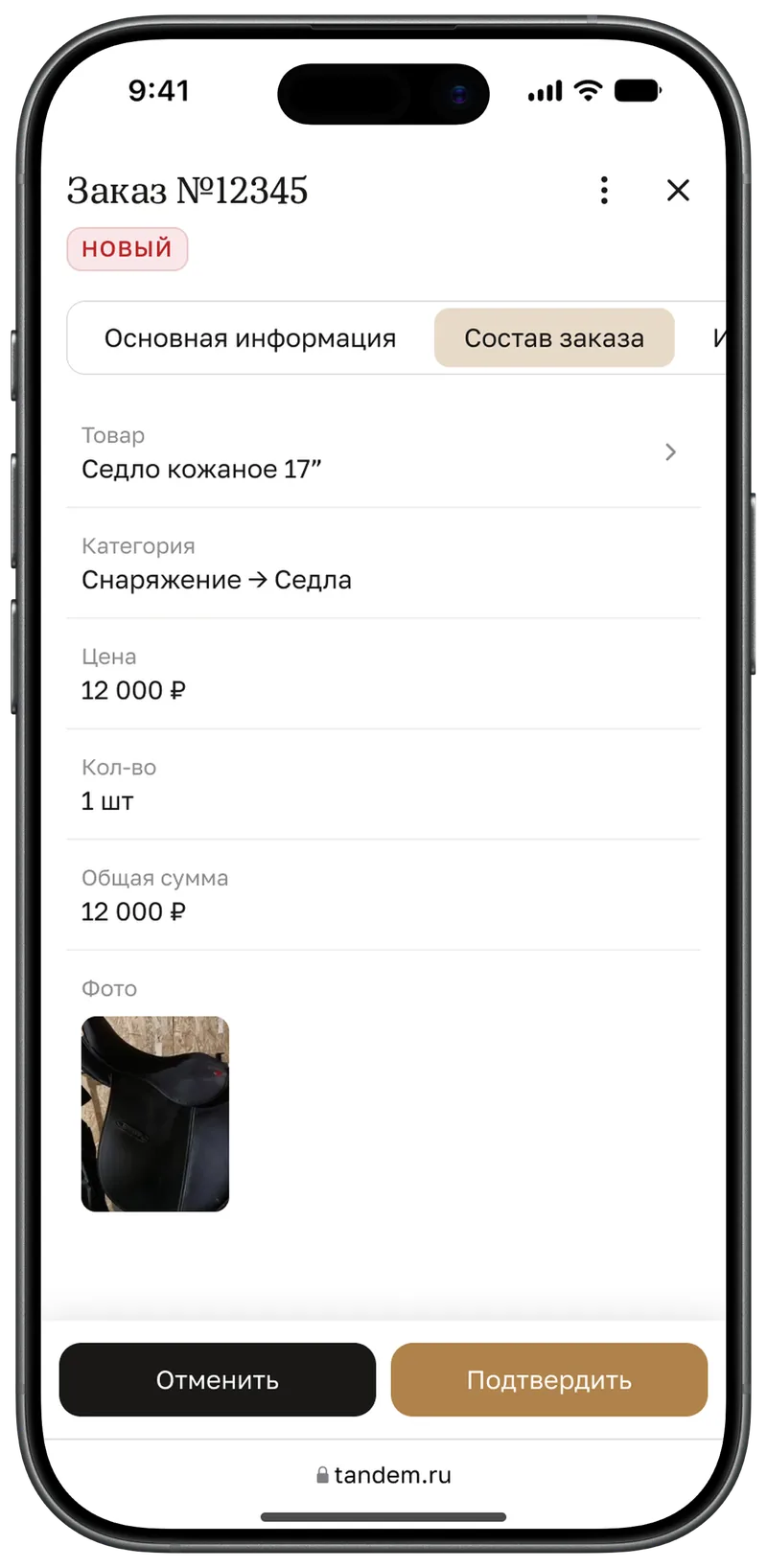
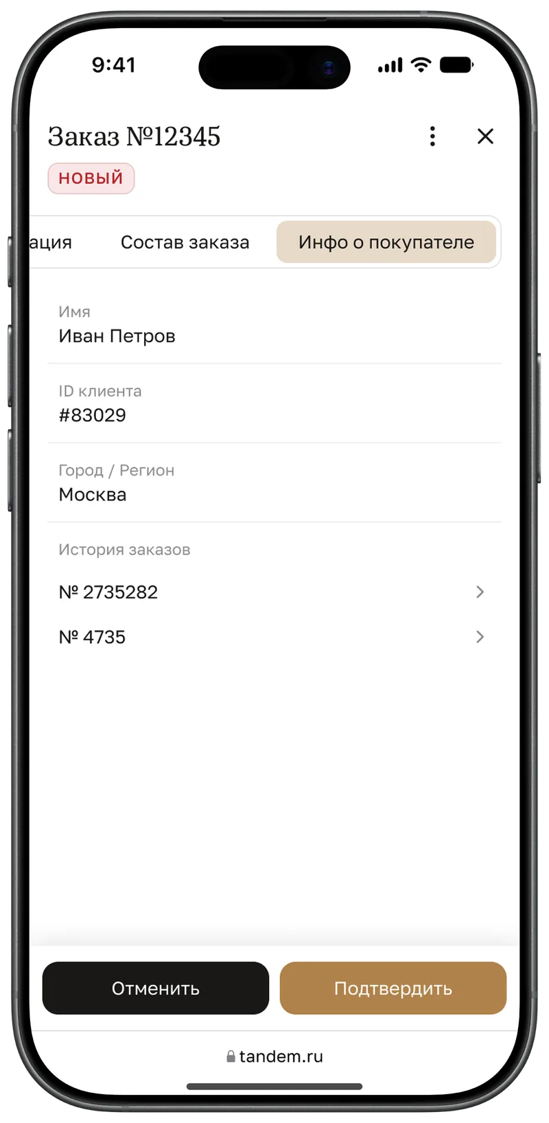
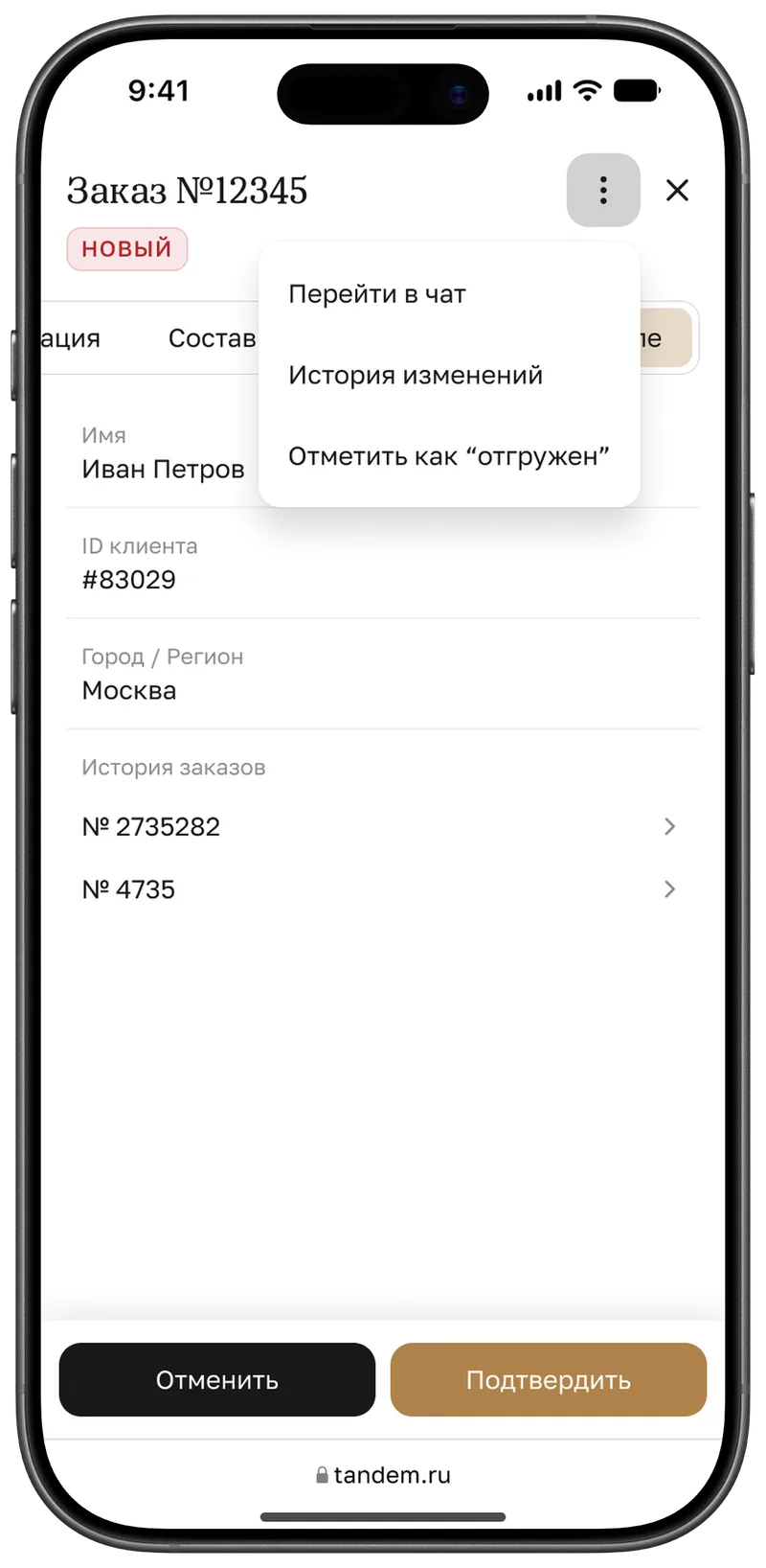
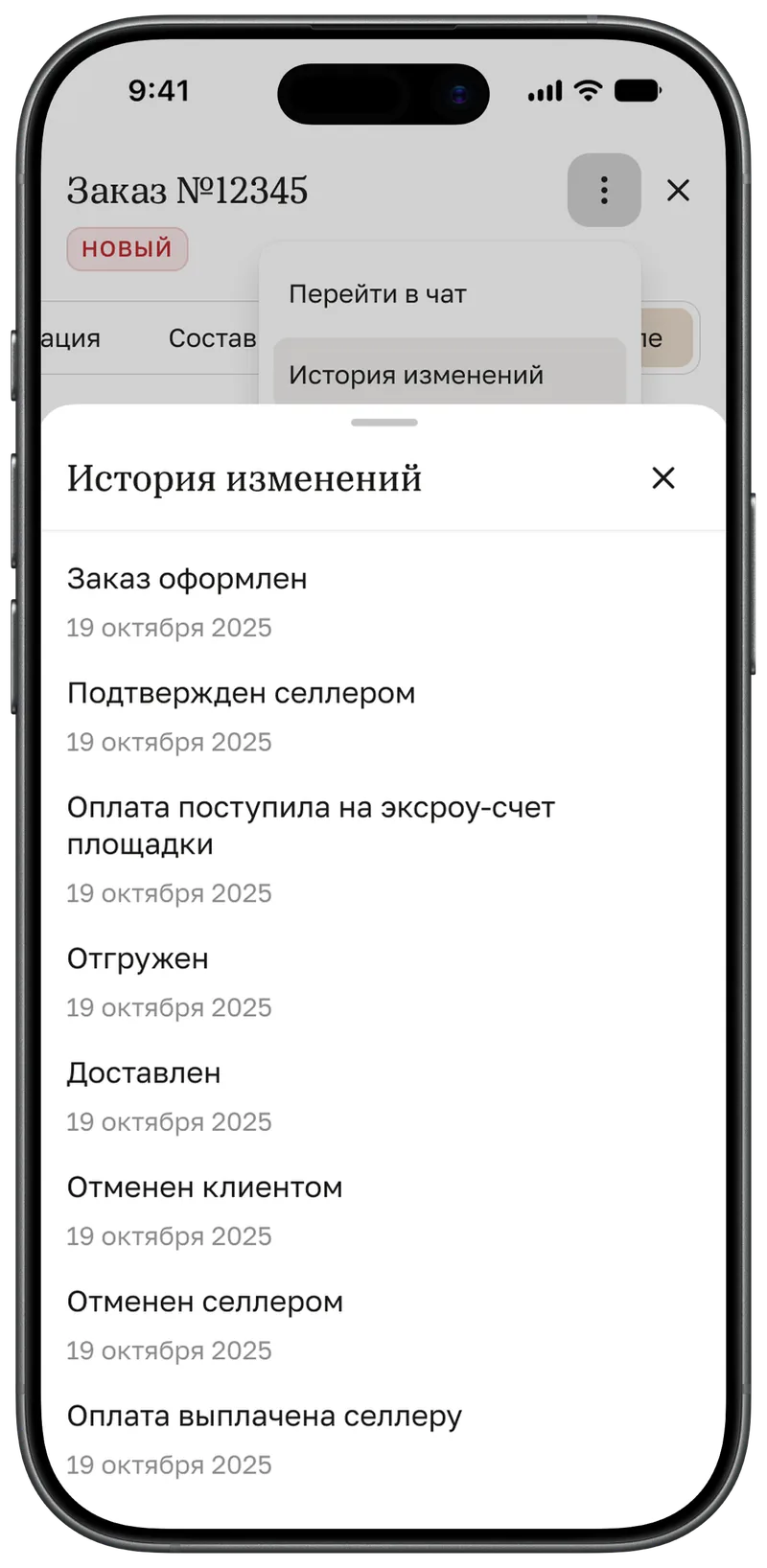
Tabs and actions
Order contents, buyer details with their order history, a menu that opens the chat, and the order’s change log.
7. Stores and addresses
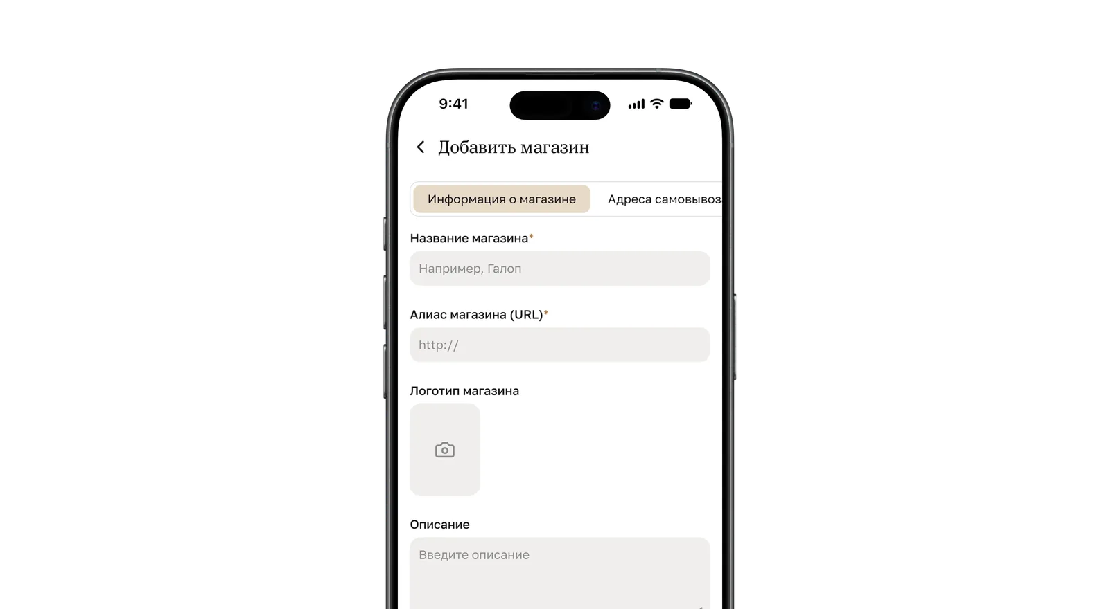
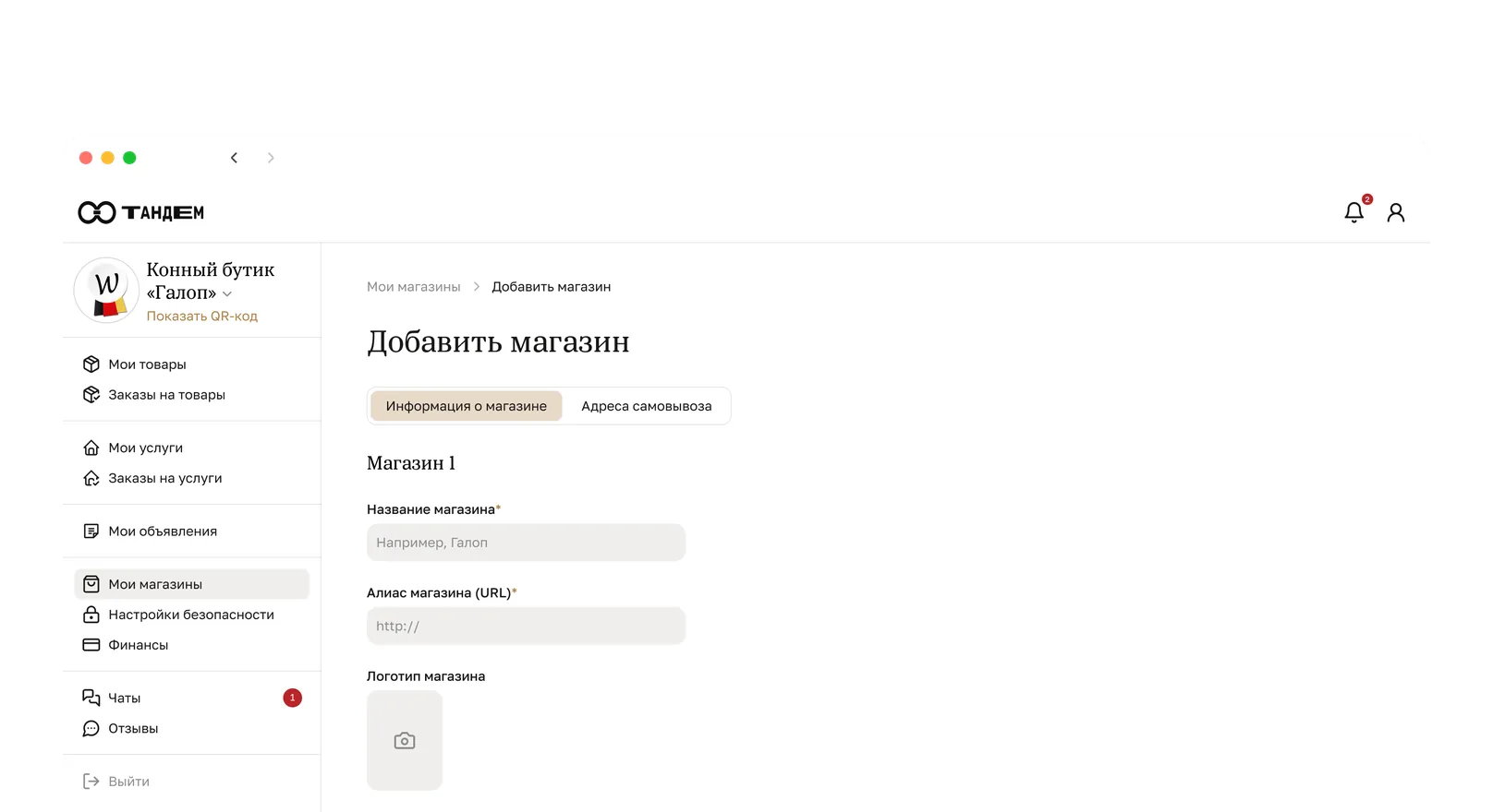
Adding a store
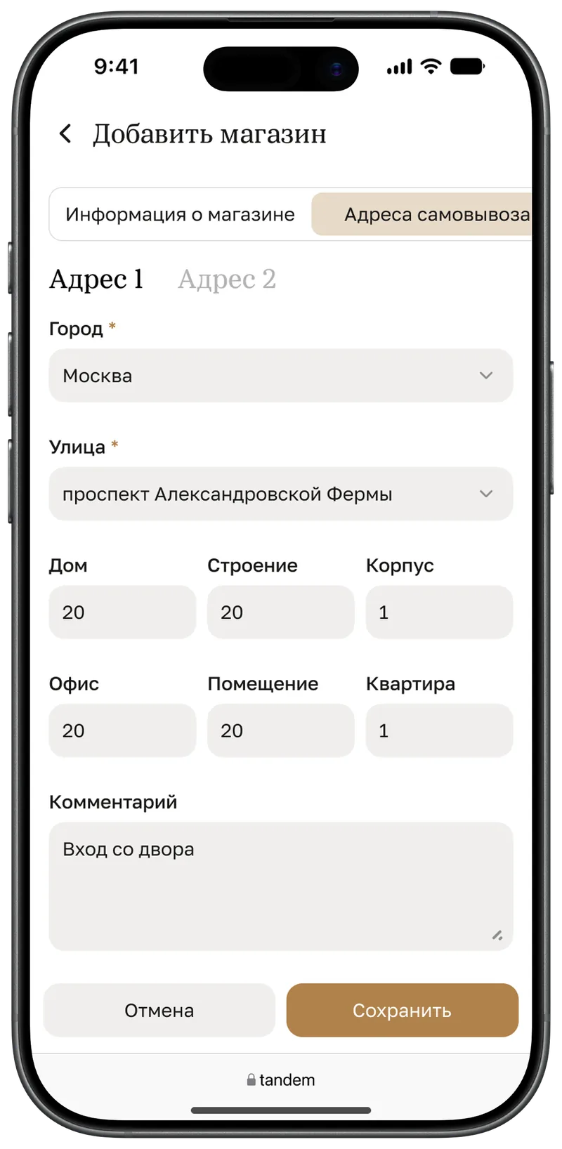
The “Store details” and “Pickup addresses” tabs stay, the form folds into a single column, and the buttons are pinned at the bottom.
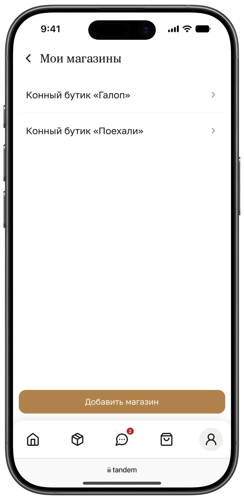
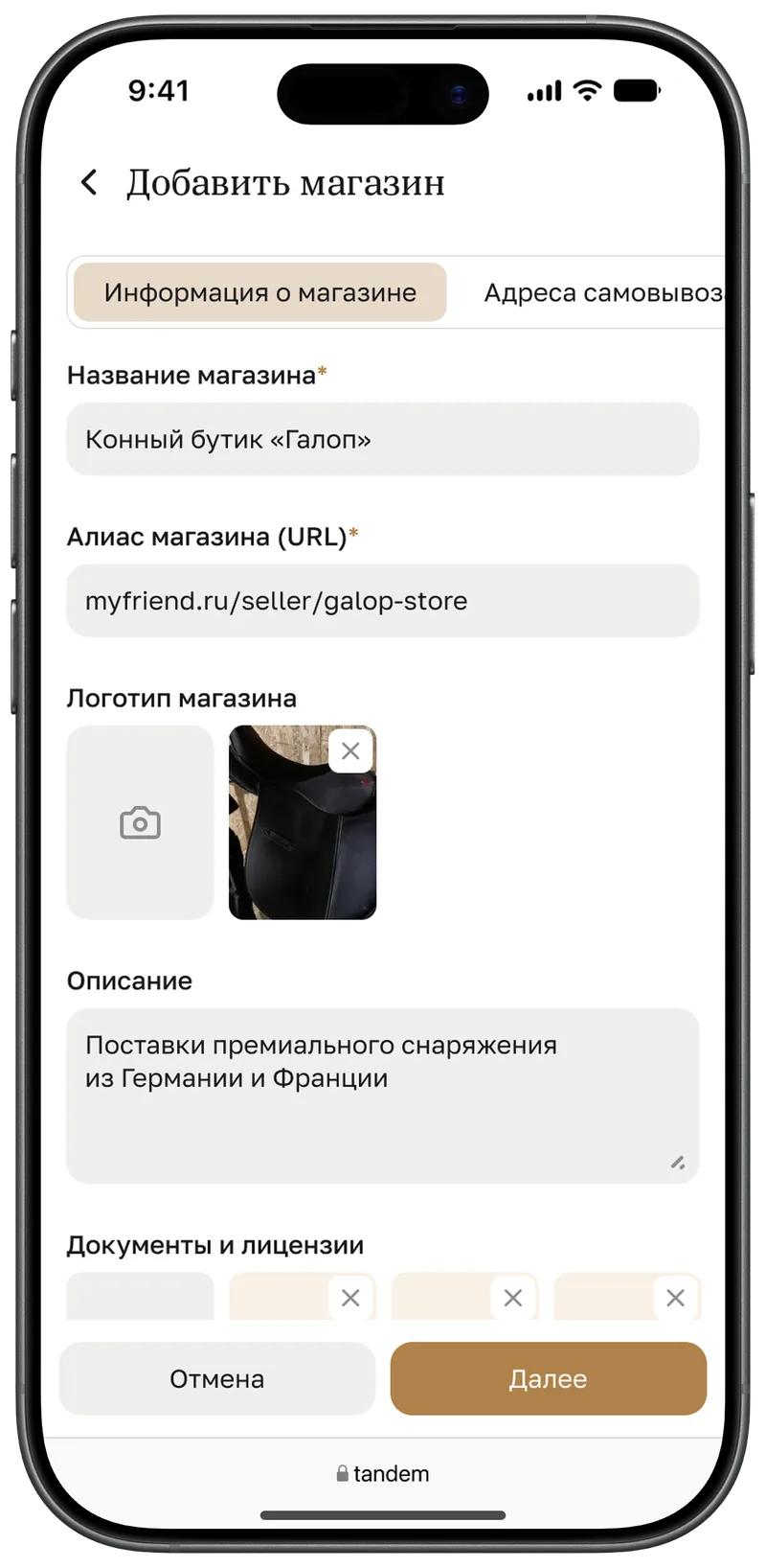
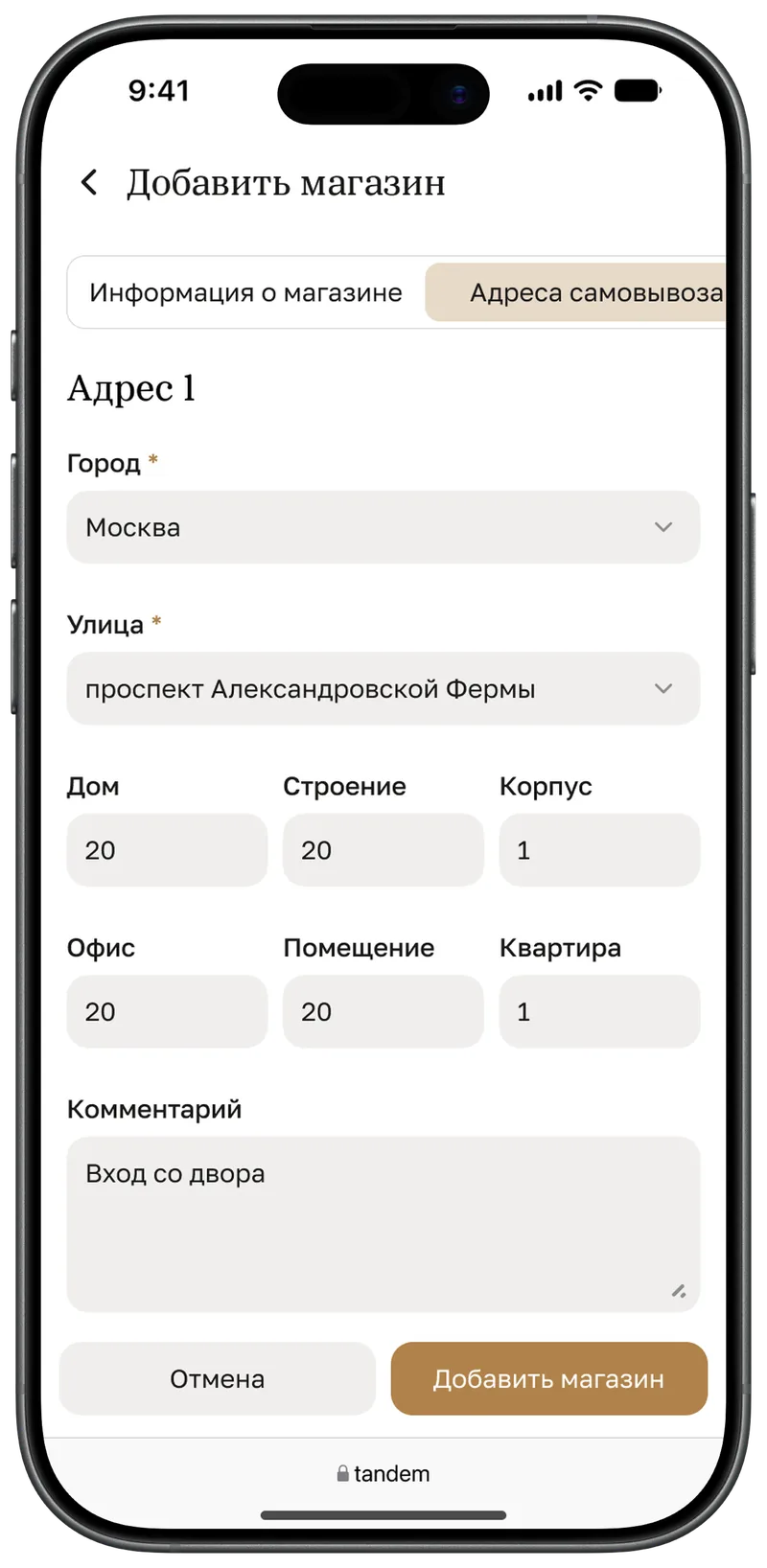
Several stores and addresses
With more than one store the section opens as a list. Pickup addresses switch with tabs, and each has its own opening hours and blocked dates.
8. Wrap-up
What I took away
Adapting isn’t squeezing a screen — it’s rebuilding the hierarchy: on every screen you decide again what matters most. Shared rules saved the most time: the flows were assembled from the same handful of decisions.